As Chris Tucker said in Rush Hour… “Do you understand the words coming out of my mouth?” I hope so but as creatives with technical minds, designers are sometimes guilty of throwing in ‘jargon’ (or buzzwords) when we speak to our clients. We don’t mean it – honest – but these words help us gain clarity from a brief and will also help make sure the designs are fit for purpose.
In this blog, I will be breaking down some of the ‘buzzwords’ that often come up when I’m speaking to clients. It should help you understand us better and you can even impress us by throwing in a few words yourself! Feel free to bookmark this page and use it as a ‘glossary of terms’ to refer back to at a later date.
20 design & illustration buzzwords
Knowing these words will help you to communicate your design requirements accurately, resulting in a quicker turnaround and better fulfilled brief. They may also help you understand why we make certain design decisions… so really, it’s a win for both of us!
Animation
A moving drawing or computer generated image. Animation is a method in which figures are manipulated to appear as moving images. An animation if typically created by an animator.
Body copy
‘Copy‘ is another word for the text used in a document or book. ‘Body copy’ therefore refers to the main chunk of text in said document, so everything other than headings, titles or captions.
Your designer might say: “What font would you like your body copy to be in?“
Brand Identity
The visible elements of a brand. This included the colour palette, fonts, shapes and logo design. Each element helps consumers identify your brand and distinguish from others. Have a look at the brand identities I have developed for clients here.
Carousel
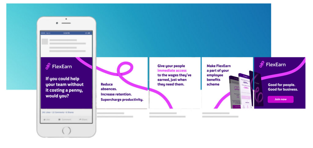
In the context of social media, carousels are posts that have multiple images that viewers can swipe through. These are great for conveying multiple ideas or sharing large chunks of information without over-crowding a single image.

Case
Most people know about upper- and lowercases, but there is also sentence case and title case. Sentence case refers to lines of text starting with a capital letter (a grammatically correct sentence) and ending with a full-stop. Title case refers to a formal way of writing a title where each word starts with a capital letter (a part from joining words) for example, The Magical City of Mumbai.
Colour code
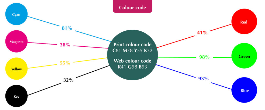
The ink or light colour combination required to produce a specific colour. In print, every colour is made up of a certain percentage of 4 primary ink colours known as CMYK: Cyan, Magenta, Yellow and Key (black). In web, every colour is made up of 3 light colours known as RGB: Red, Green and Blue (For web, the code may also be called Hex). Knowing the code of your desired colour will ensure consistency across your brand.
Your designer might ask: “What is the colour code for your brand’s dark blue?”

Contrast
How much colours look different from each other. High colour contrasts work best for legibility of text, for example, black text on a white background.
Your designer might say: “Those colours won’t work because there isn’t enough contrast”

Crop marks
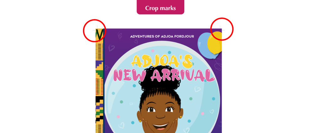
Lines in the corners of your page to show the printer where to trim the paper. Also known as trim marks, they are usually required by commercial/professional printers and will not show on the final printed document.
Your designer might ask: “Does your printer require crop marks?”

EPS
A very high quality vector file. An EPS (Encapsulated PostScript) file is considered the best format for high resolution printing of illustrations or logos. It can be resized from a postage stamp size to a billboard size and would not lose quality!
Flat illustration
A minimalistic approach to illustration. “Flat” design focusses on simplicity and tends to feature plenty of open space, crisp edges and bright colours. See more examples of my flat illustrations here.

Flat plan
A diagram used to plan where the illustrations, images or text will go in a multi-page document like a magazine or book. It is useful when working out the page count and how your content will flow across the pages.
Illustration
A static drawing or computer generated image. A visual interpretation of a story, concept or process usually integrated into printed media such as flyers, magazines, books and teaching materials. An illustration is typically created by an illustrator like me!
Open/design files
Files that can be manipulated/edited using professional design programmes such as Adobe Illustrator or Photoshop. Having these precious files will allow you to take your designer’s creation and give it to someone else to change, essentially compromising their original work, so they will often come at an additional cost.
Your designer might ask: “Would you like to purchase the open files?”
Resolution
The quality of an image. Resolution is measured in either dpi (dots per inch – for print) or ppi (pixels per inch – for web design). The higher the resolution, the better the quality. Screens typically require a minimum of 72ppi, whereas print requires at least 300dpi, which is why it’s so important to tell your designer what the image or design is to be used for.
Reverse
A white or light coloured illustration or logo designed to be placed on black or dark backgrounds. It would usually be the same as the original, coloured version, but edited in a way that will stand out if having a dark background is unavoidable.
Your designer might ask: “Would you like your logo in reverse as well?”

Stock
Another name for paper. There are many types of paper and card to choose from, so it’s important to choose one fit for purpose. You need to consider its colour, thickness/weight (gsm), finish (silk, matte etc), lamination and more! Your designer and/or printer should be able to advise you on this for different purposes.
Typography
The study or production of different fonts. It can also refer to the manipulation of existing fonts or putting complimentary fonts together in a design.

Self-publishing
When an author writes, produces and sells their own book without the use of a publishing house. This route is typically good if you are a new author, want full control over its distribution and design and/or plan on producing small quantities initially (under 2000 copies).
Orphans
Leaving one word one its own on the last line of a paragraph in printed documents. As designers we try our best to avoid these as it’s seen as bad practice and doesn’t look great.
Your designer might say: “I’ve pushed that word down to the next line to avoid having any orphans.”
White space
Space around an image or group of text on a page (not necessarily white). This is needed to stop the page looking to busy and helps readers digest the information easily.
Your designer might say: “I’ve left some white space to avoid over-crowding”
Helpful?
I hope this glossary of terms helps you on your way to creating a killer brief, engaging in slick communication with you designer and impressing friends and family with your new lingo! Of course, if you have any questions or would like to work together on a self-published illustrated book with interesting typography and plenty of white space but no orphans… just get in touch!