There’s more to brands than a logo. Building a visually coherent and identifiable brand is essential for engaging the right audience and communicating your intended message. Below are some of the brand identities I have developed with solid creative direction and leadership…
Softly Shea
Softly Shea is a small business producing handmade body butter pots of shea butter and complimentary simple ingredients.
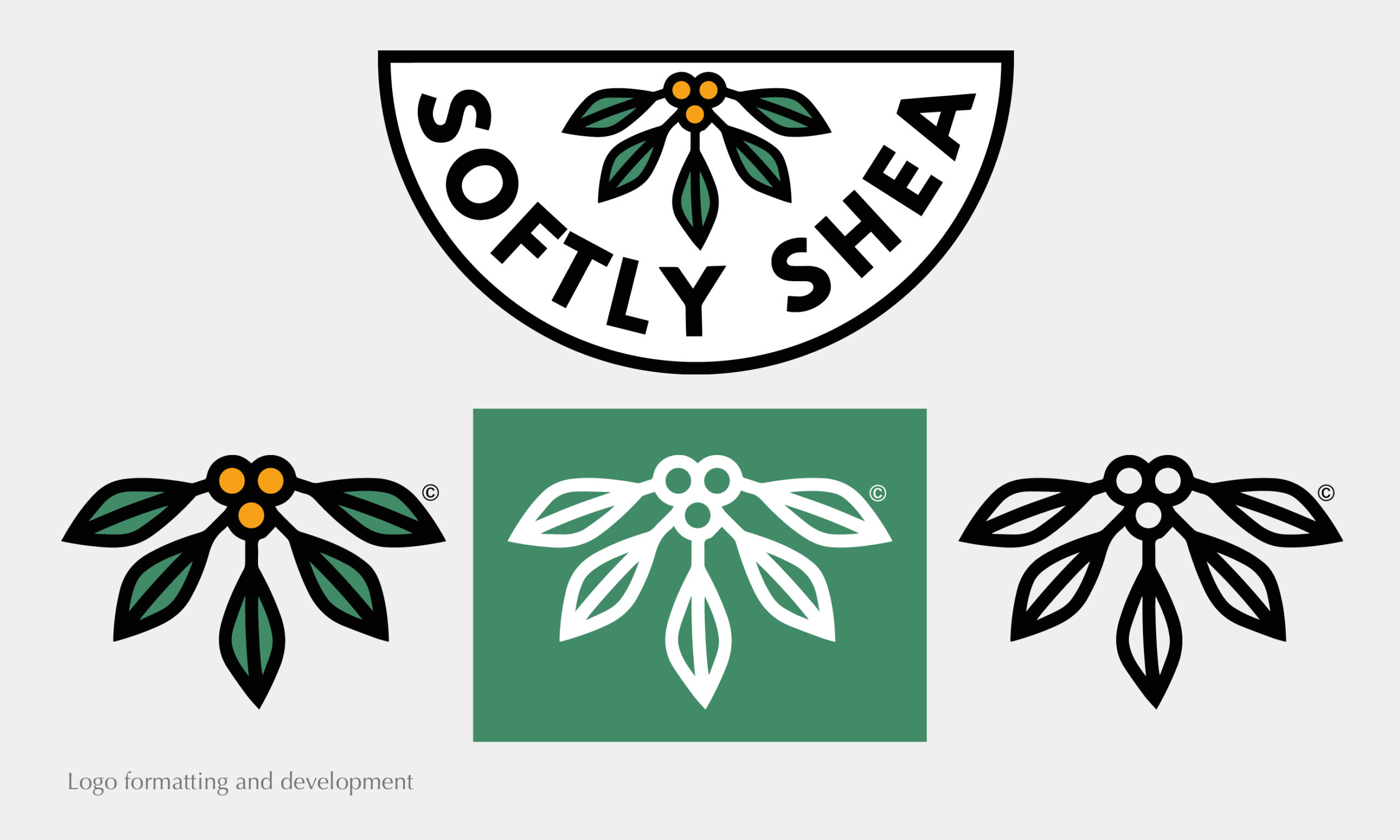
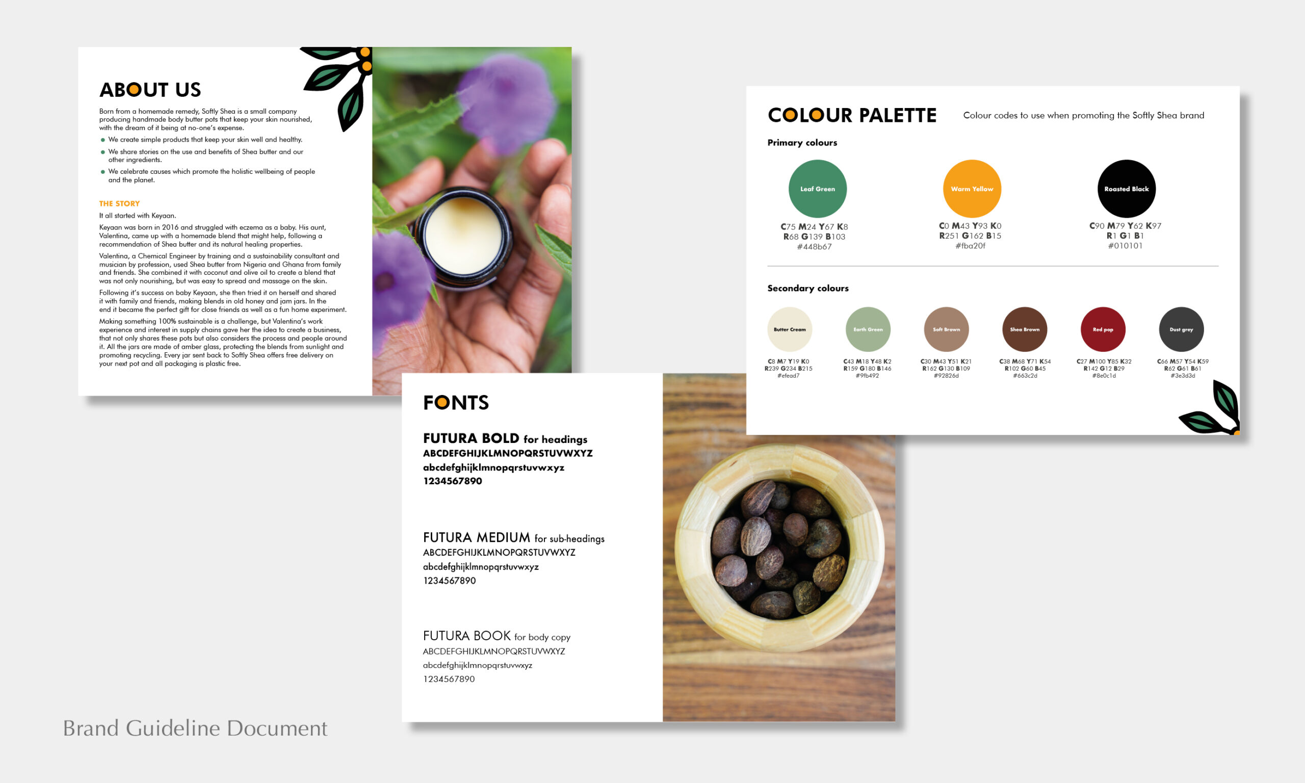
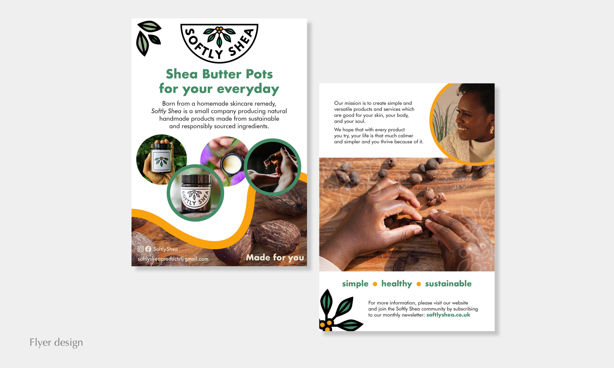
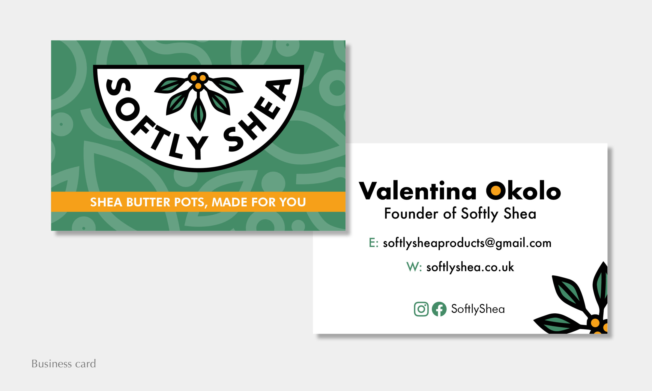
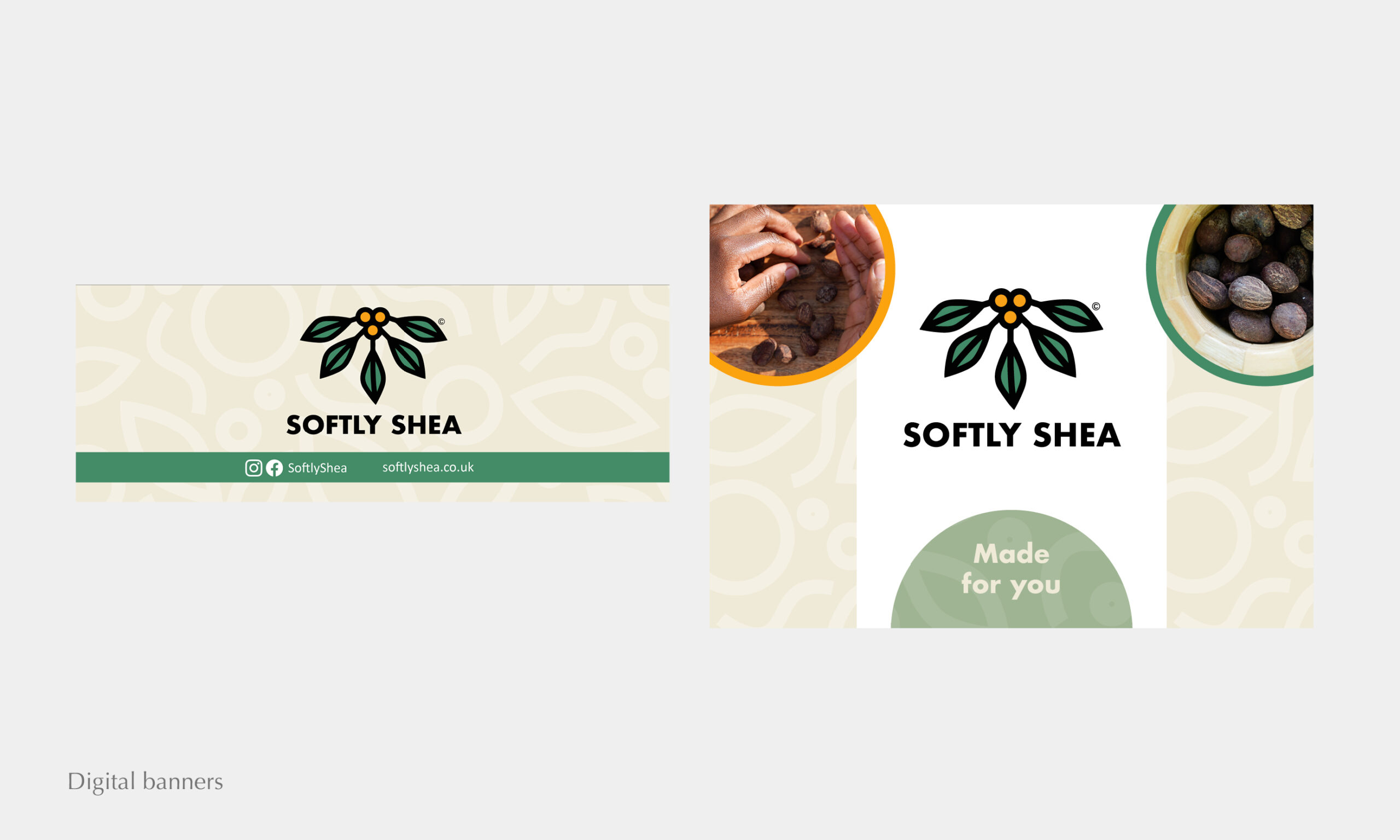
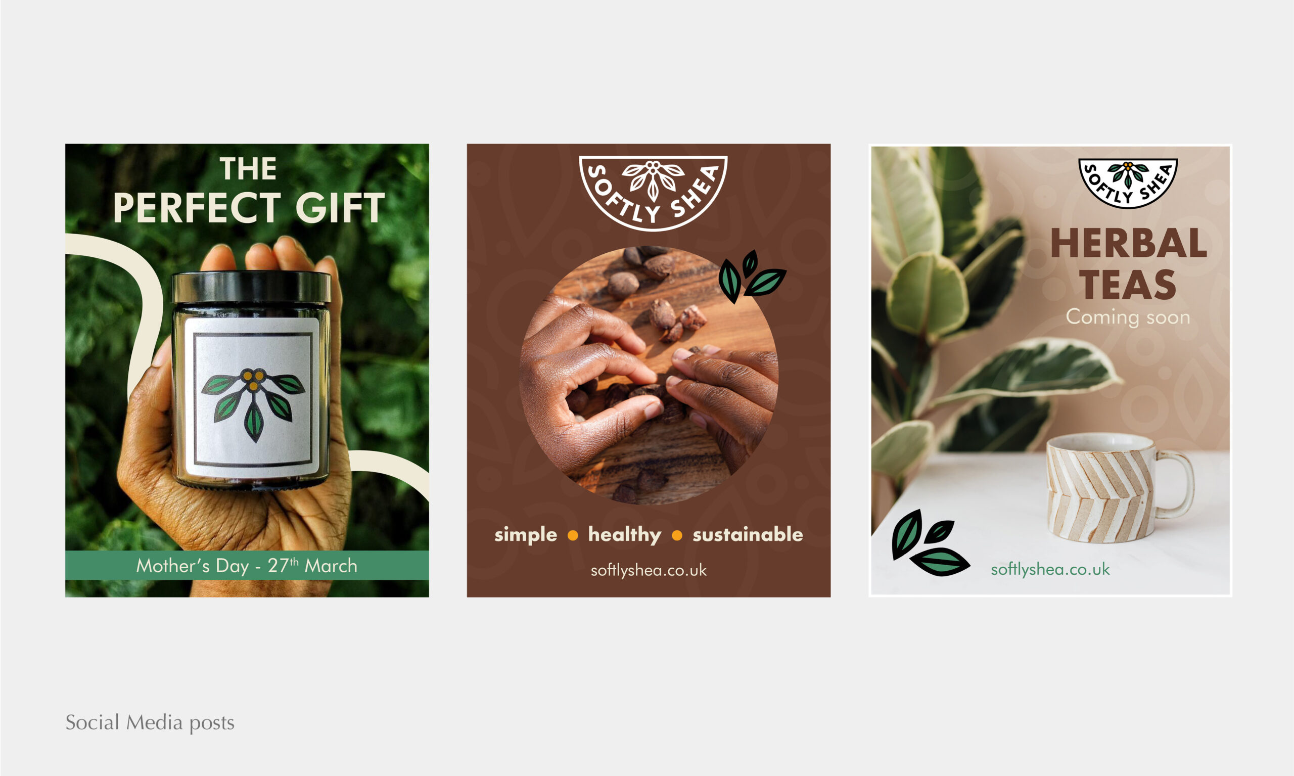
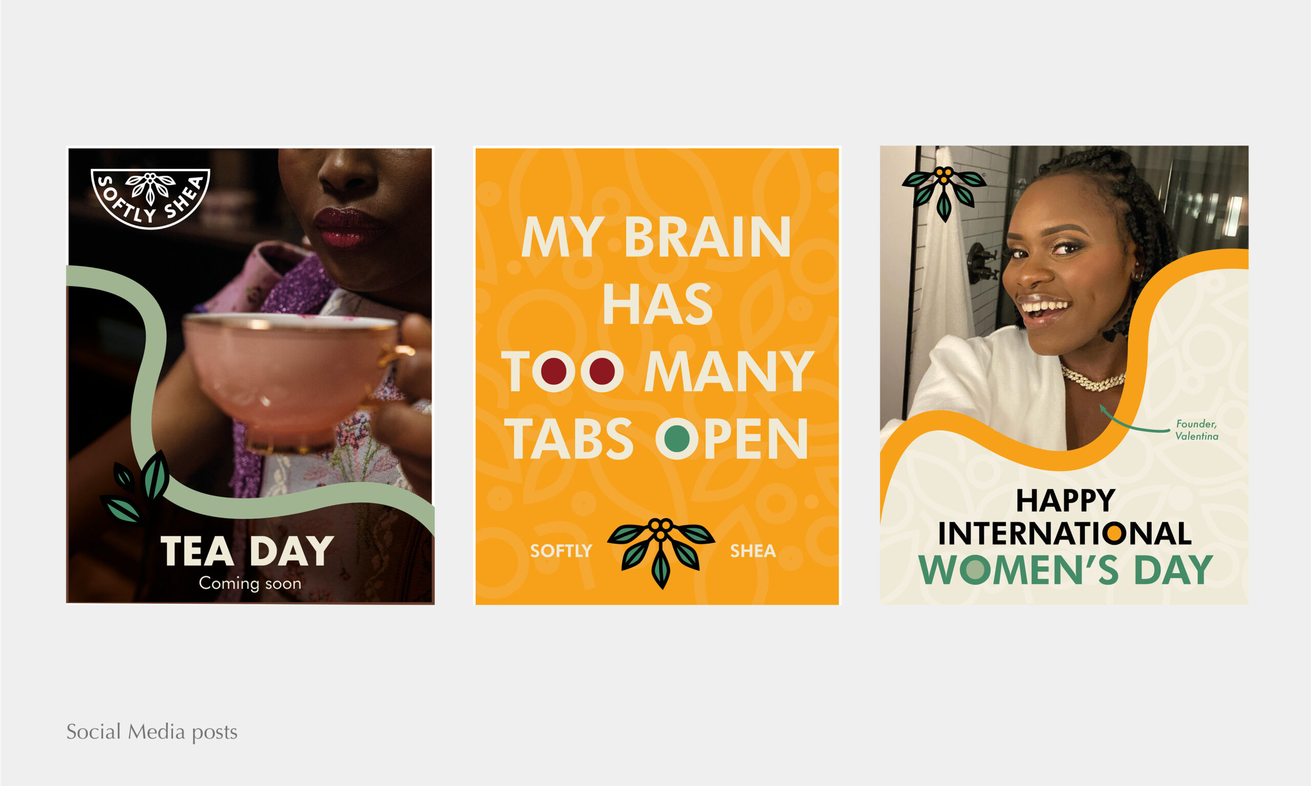


Challenge: This company did not have high-quality versions of their existing logo or brand guidelines, which made it difficult to use the logo on anything larger than the products themselves. They also didn’t have a strong visual identity, making their social media, flyers and marketing materials look inconsistent and disjointed. I was commissioned to replicate their logo and develop the brand’s visual identity across platforms.
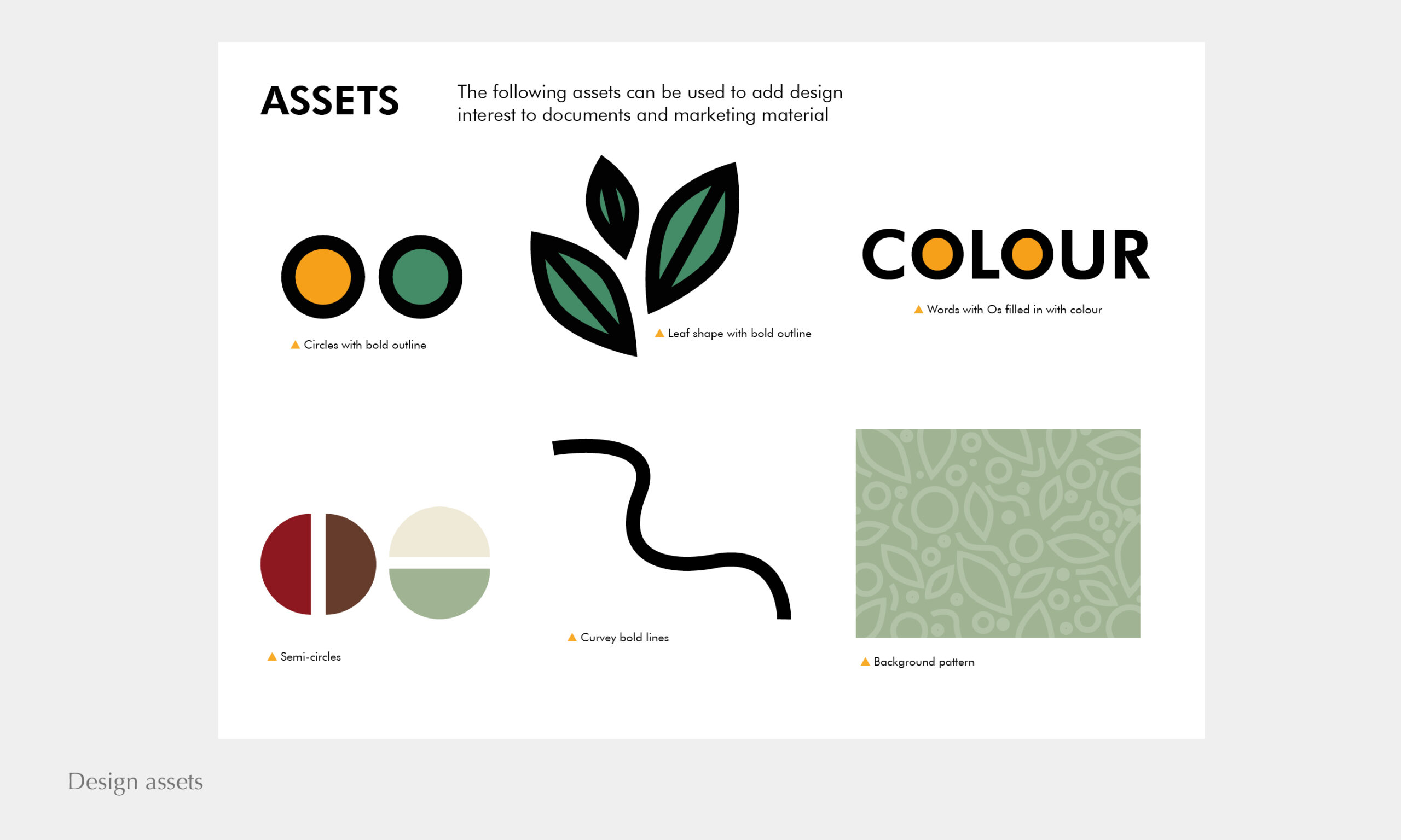
Ideas/Process: I wanted to achieve visuals that complimented Softly Shea’s holistic approach and natural ingredients. I felt it was important to use organic shapes and take elements from the logo to create cohesion i.e. the bold, thick lines and block colours. Being a handmade product, I also wanted to maintain a human-side, with images of the founder, videos of the manufacturing process and real images of the product being used across their social media.
Results:
- Versatile vector versions the logo and logo mark in a variety of colours.
- A bold yet earthy colour palette with primary and secondary colours for dimension and flexibility.
- Typography using filled ‘Os’ as a nod to the circles in the logo mark.
- A brand pattern to reinforce the brand’s identity and to be used on future packaging.
- Flexible social media templates and post designs for the launch of their newly developed branding.
Gender Justice & Society Network
The Gender Justice & Society Network is an intersectional feminist collective of staff and students at Queens University Belfast.
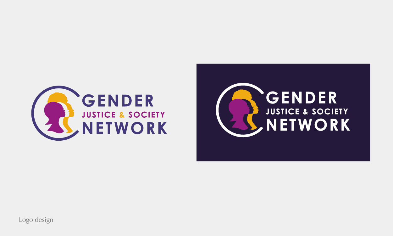
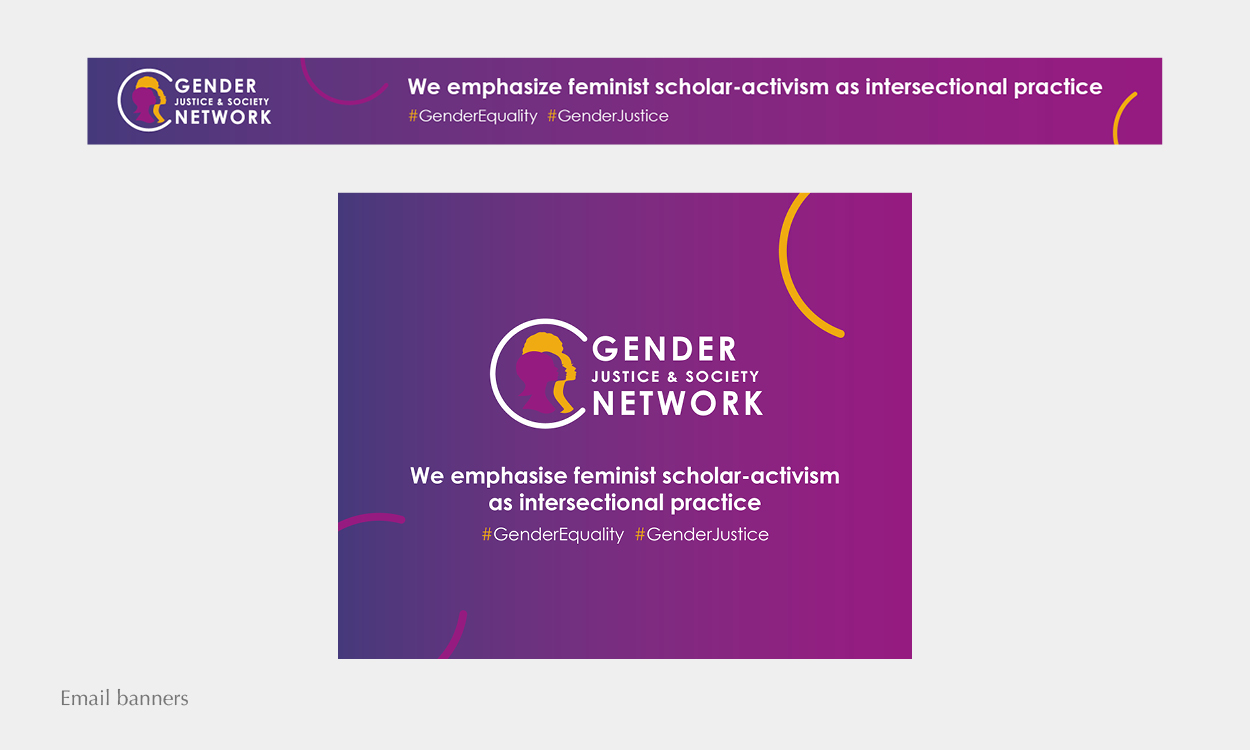
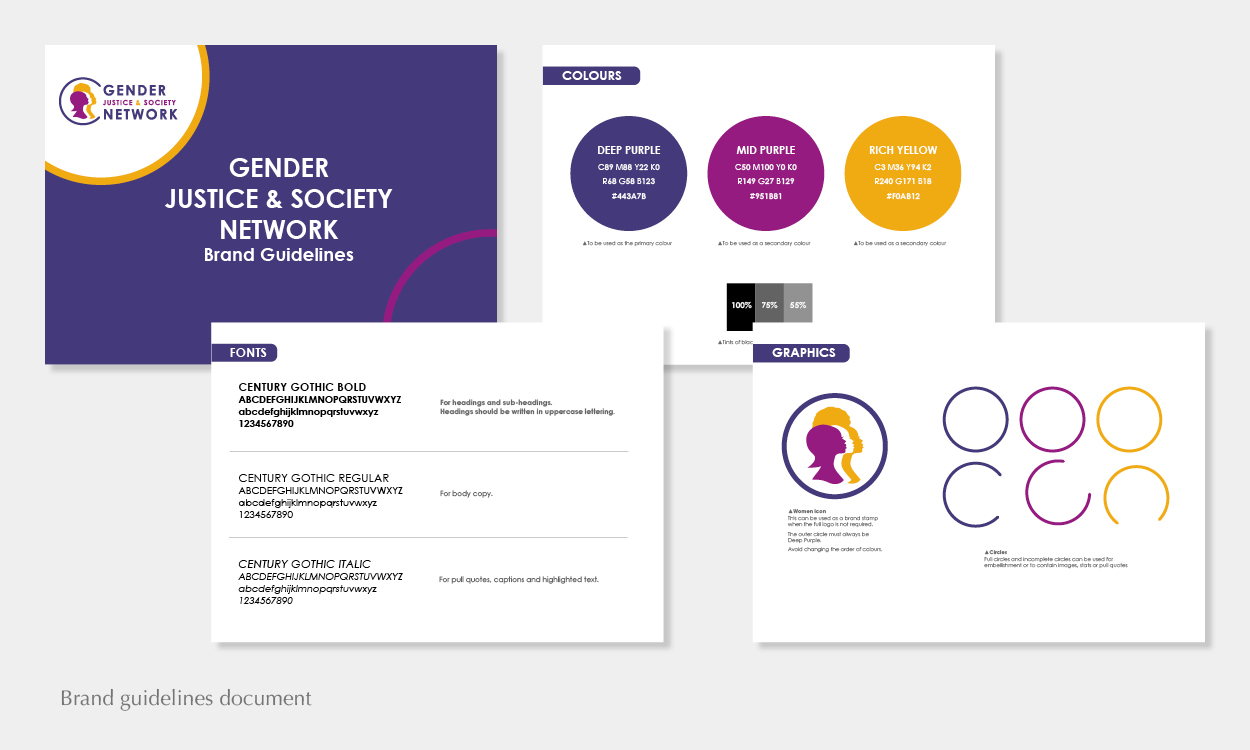
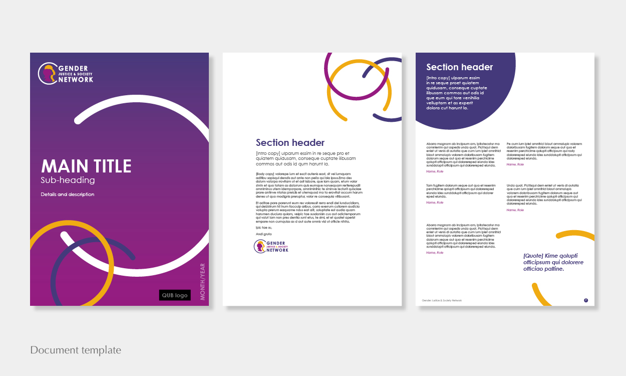
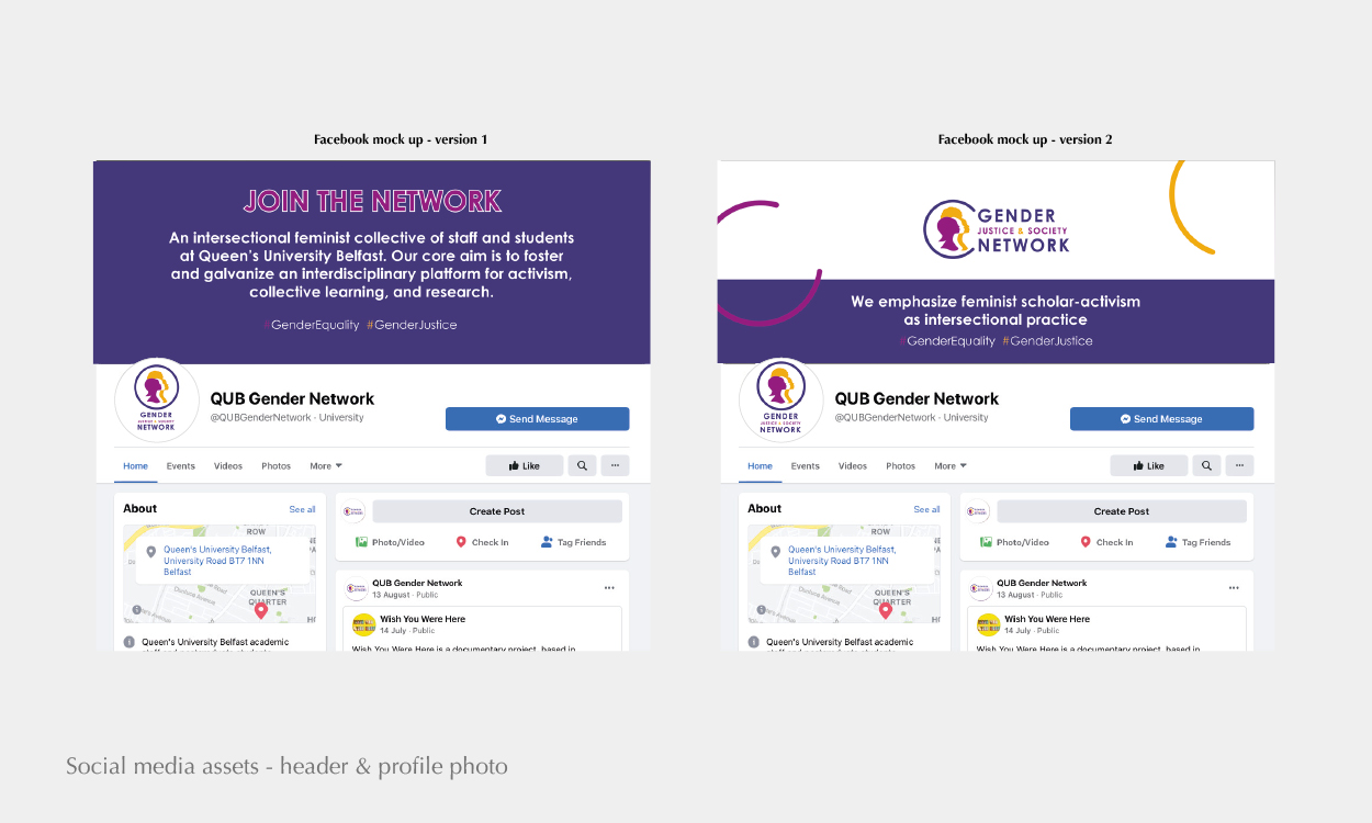
Challenge: They already had a logo but felt as though it was outdated and didn’t represent them effectively. I was commissioned to breathe a new life into their brand by developing new logo and visuals that were cohesive, flexible and strong.
Ideas/Process: I wanted a logo that was very obviously female-centred and racially inclusive. They were previously known as the Gender Network, so I felt that visually highlighting these words would allow for recognition from existing supporters. With the word ‘network’ in mind, circular shapes would represent the unity and movement of the collective.
Results:
- A strong logo and brand mark using purple tones as the main colour, representing power and femininity.
- Clear brand guidelines for future-proof brand visuals.
- Branded email banners for a professional sign-off.
- An increase in student uptake and interest from other professional and non-profit bodies.
Young Mary’s
Young Mary’s is an independent candle and home fragrance company inspired by African life and culture.
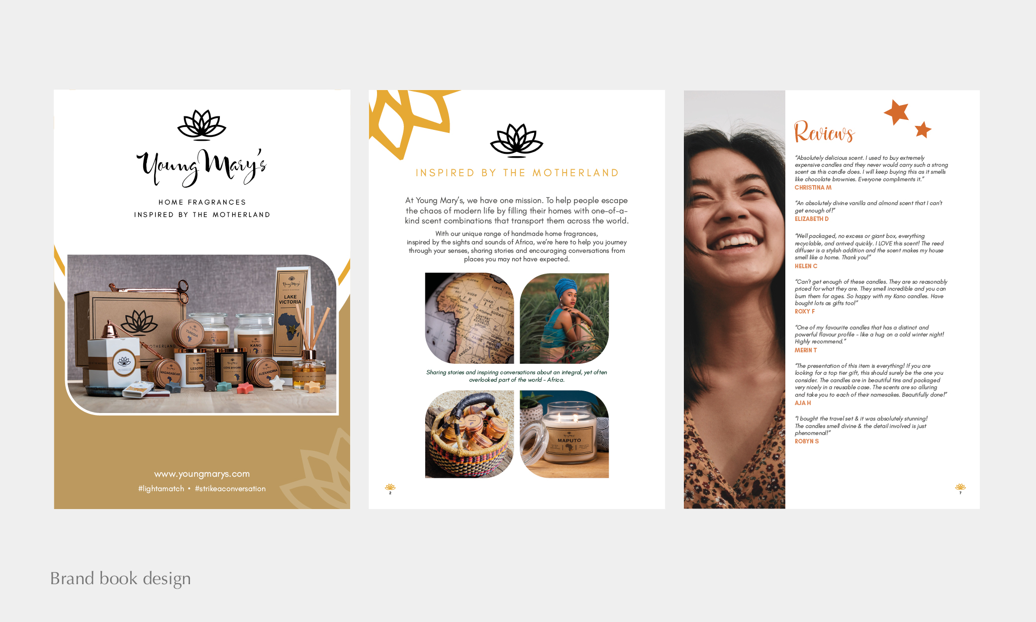
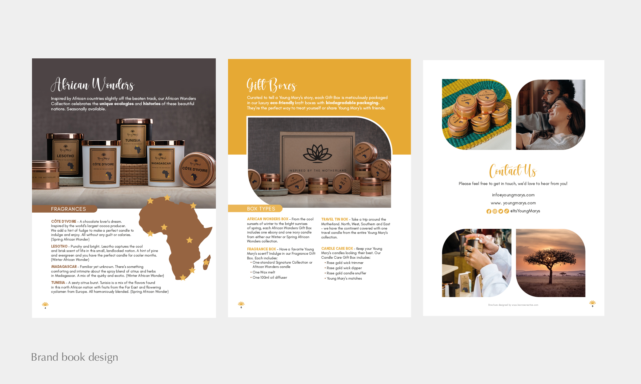
Challenge: Founder Lola needed a brand book to send to customers and wholesalers. She wanted it to include information about the brand, emotive and relevant high-quality photography and be branded in line with her existing products. She felt her website lacked personality, so needed a document that showed the true essence of her brand and would later inspire the website development.
Ideas/Process: As the brand’s packaging was already well-developed, it was important to stay true to this visually. I took elements from the logo and packaging (lotus flowers and stars) and used them as inspiration for graphic decoration. I chose diverse imagery that aided the visual storytelling and kept the colour palette golden and natural.
Results:
- A clean, engaging and informative brochure that acts as inspiration for the future website redesign.
- Increase in wholesale orders and a better understanding of where the brand sits in the home goods market.
Foulkon
Foulkon is a company that provides businesses with cyber security solutions.
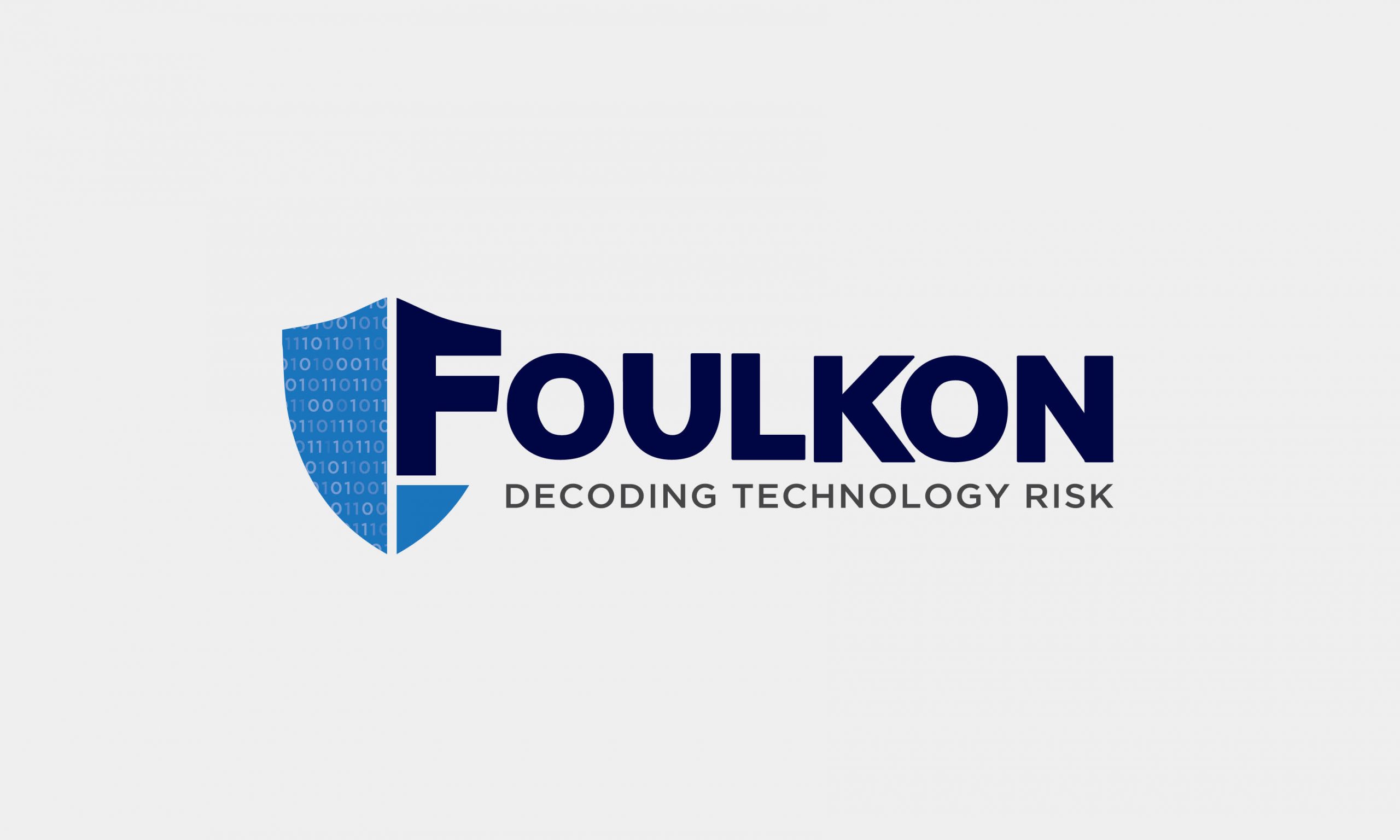
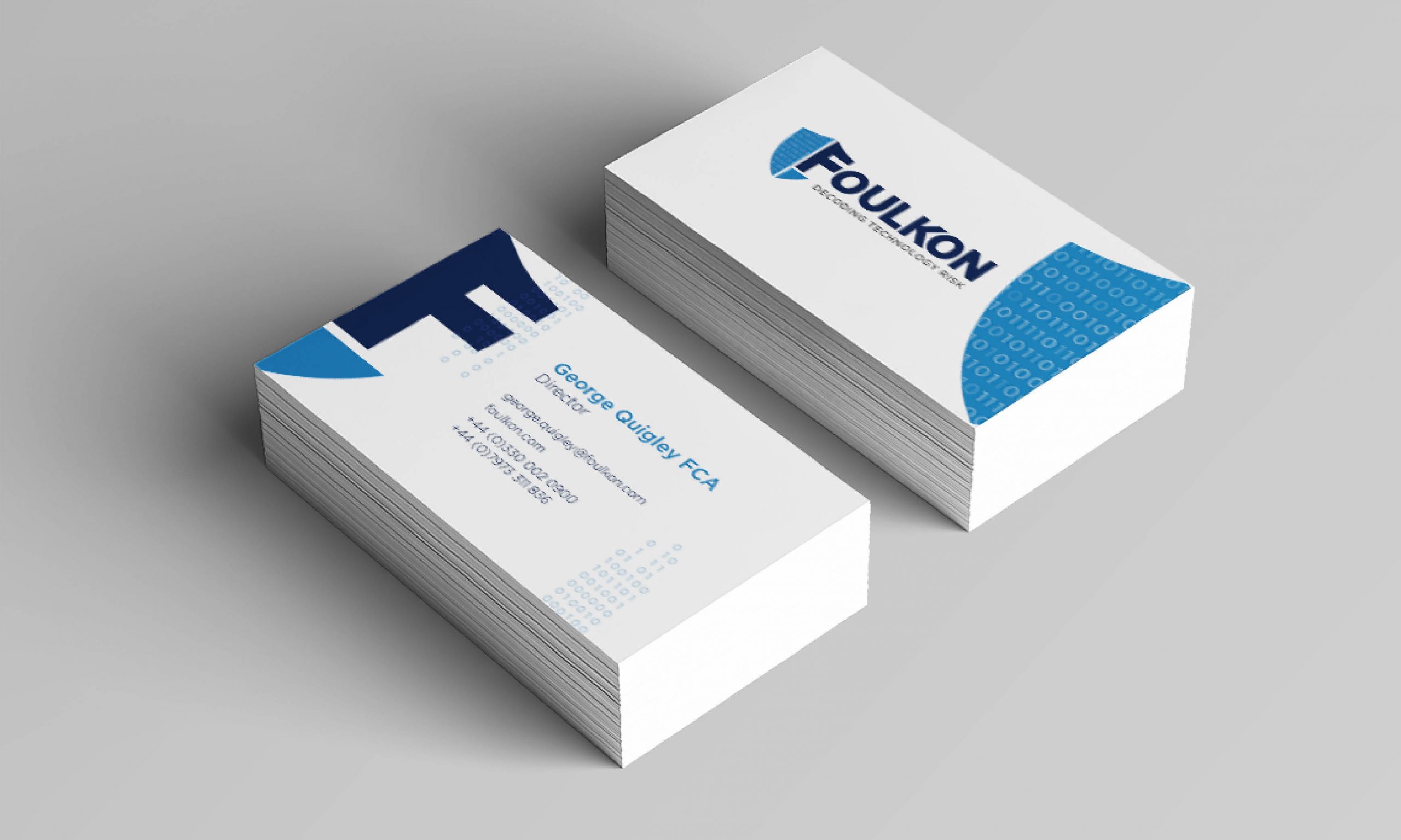
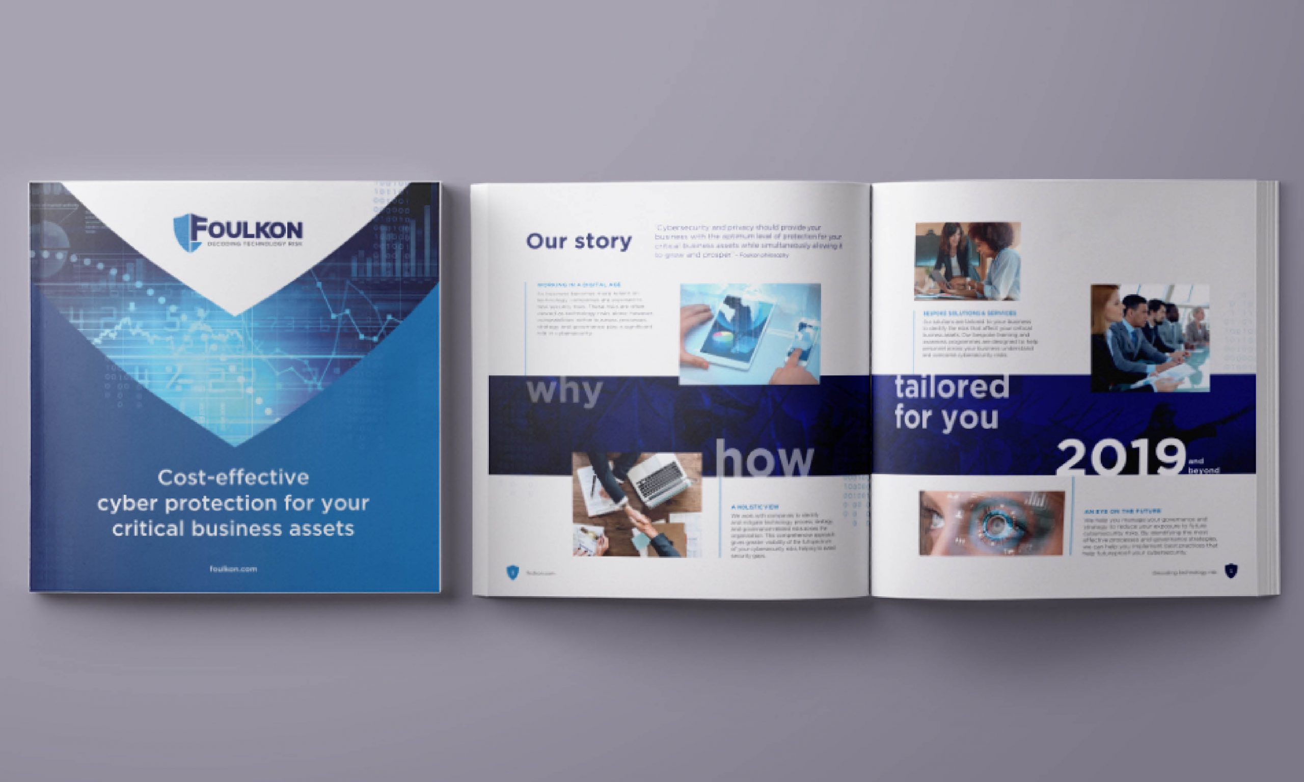
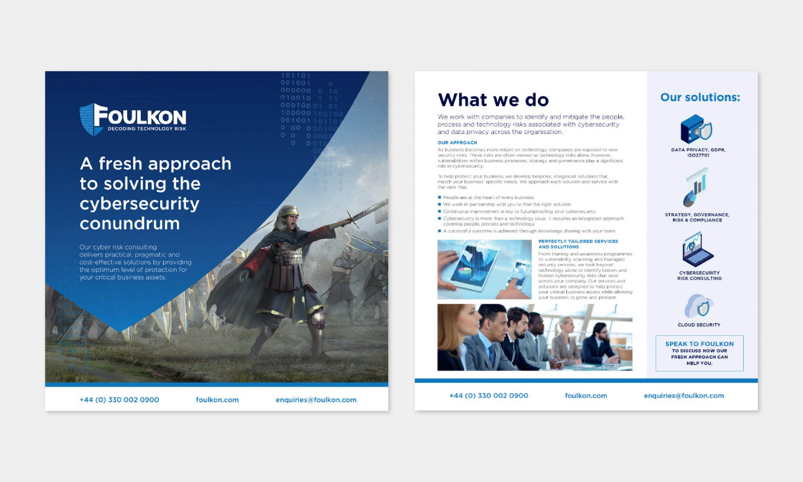
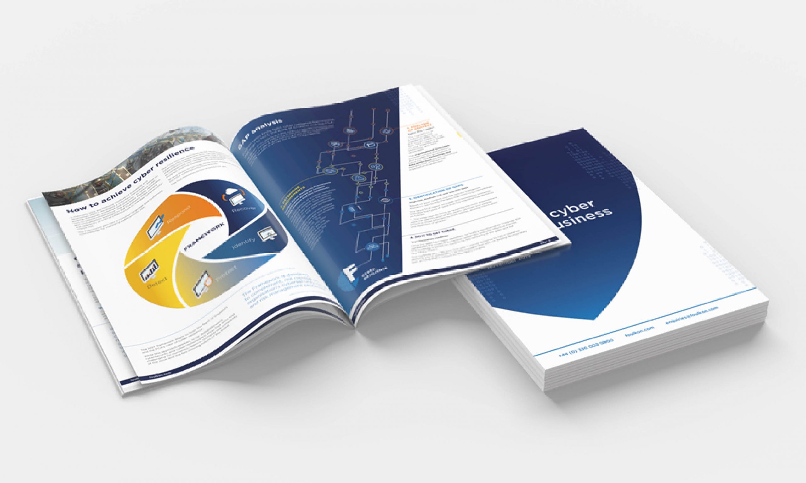
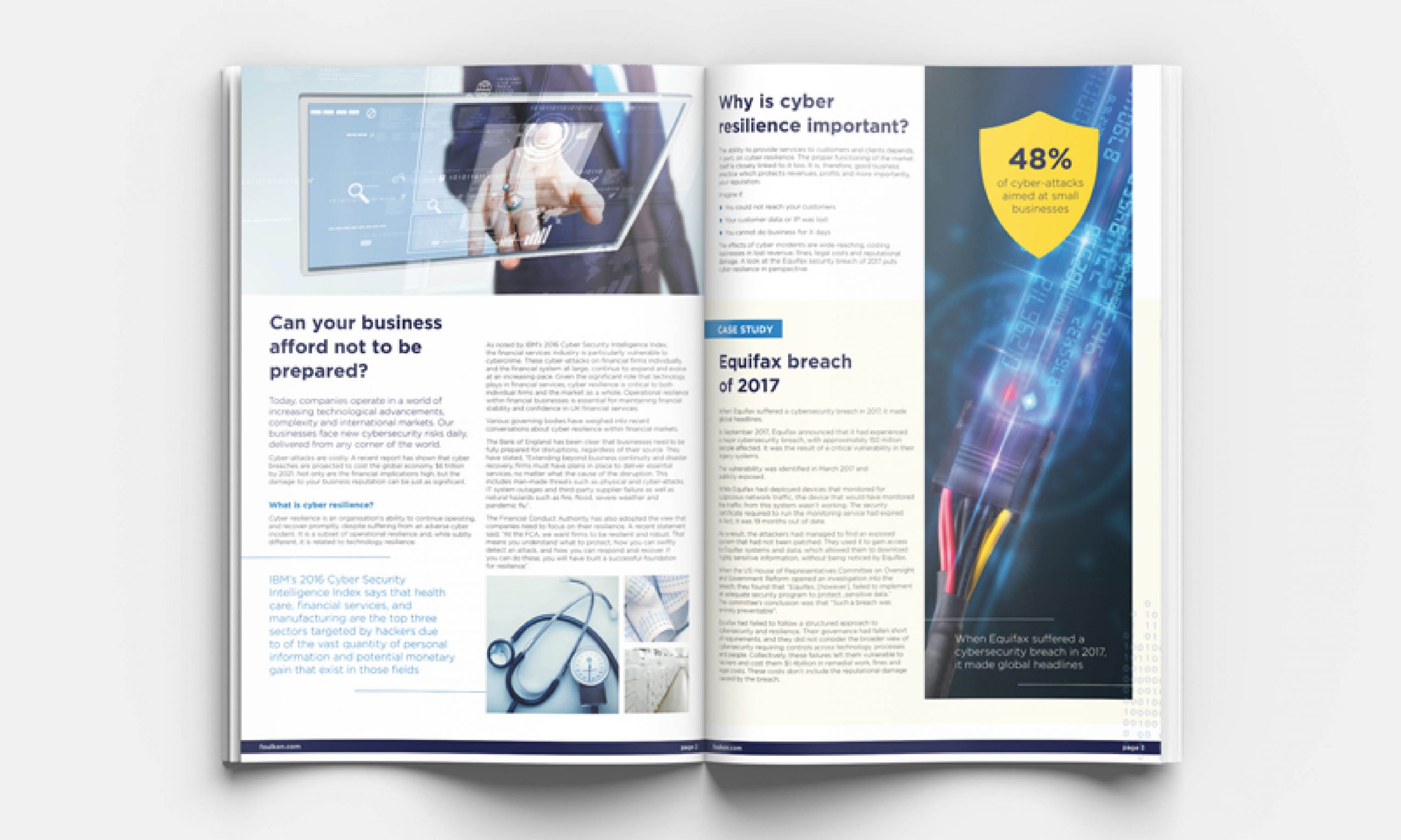
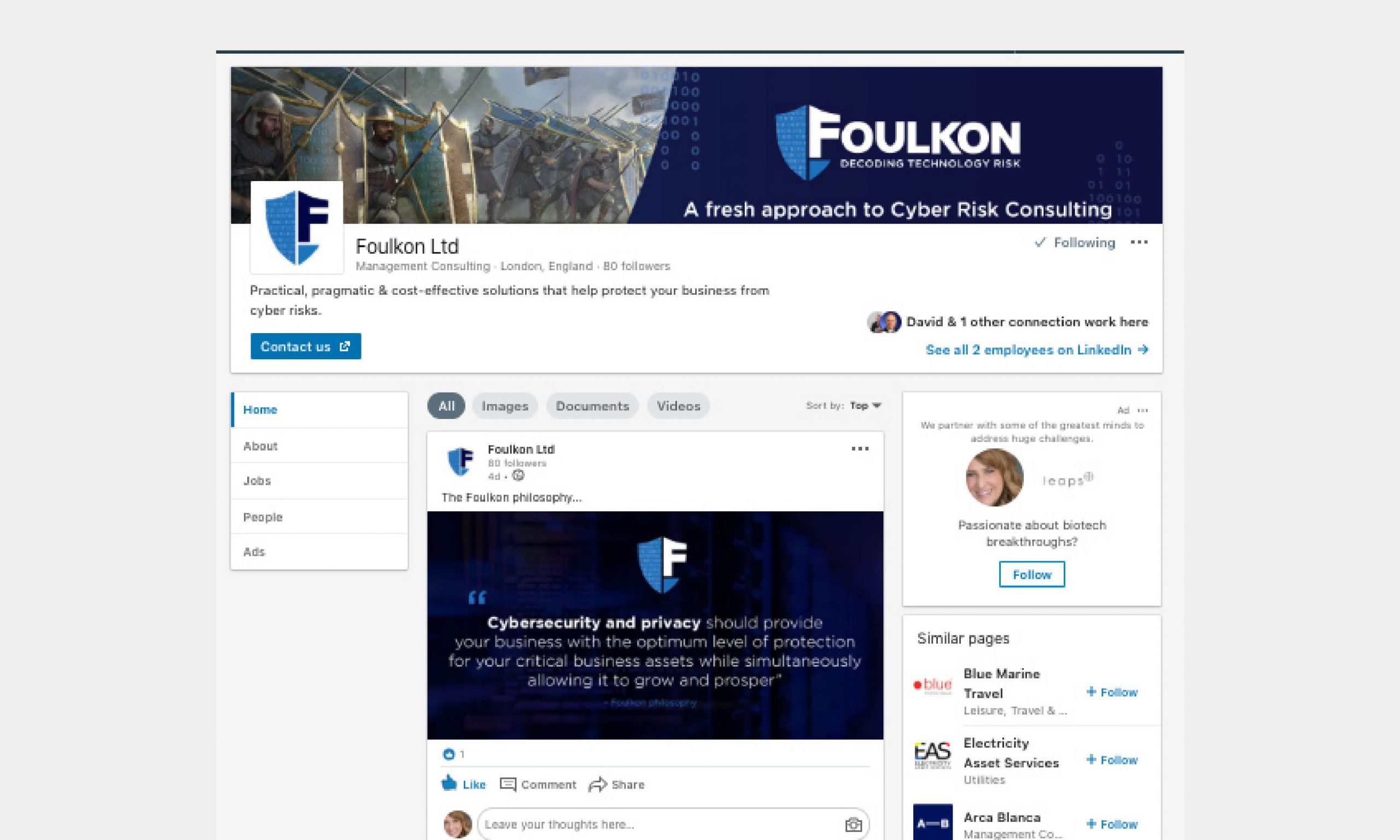
Challenge: Their logo didn’t reflect their industry well and the client felt as though it didn’t look professional. I was part of the team commissioned to designed their new the logo, icons, brand guidelines and my design was chosen to move forward with.
Ideas/Process: Coding is a major part of their business, so I wanted subtly to use binary codes within the logo design and beyond. Including the tagline was important to improve client understanding and the use of a shield suggests protection from high risk situations. Blue tones aligned with professionalism and reliability and fit well amongst similar brands in the industry without being lost.
Results:
- A logo used across white papers, business cards and social media posts.
- Brochures and flyers using the binary coding and shield icons throughout.
- Isometric iconography for a futuristic and technological feel.
- A brand mark that can be pulled from the logo and used on merchandise.
- Increase in client interaction and sales.
Basis
Basis offers help to Public Service organisations.
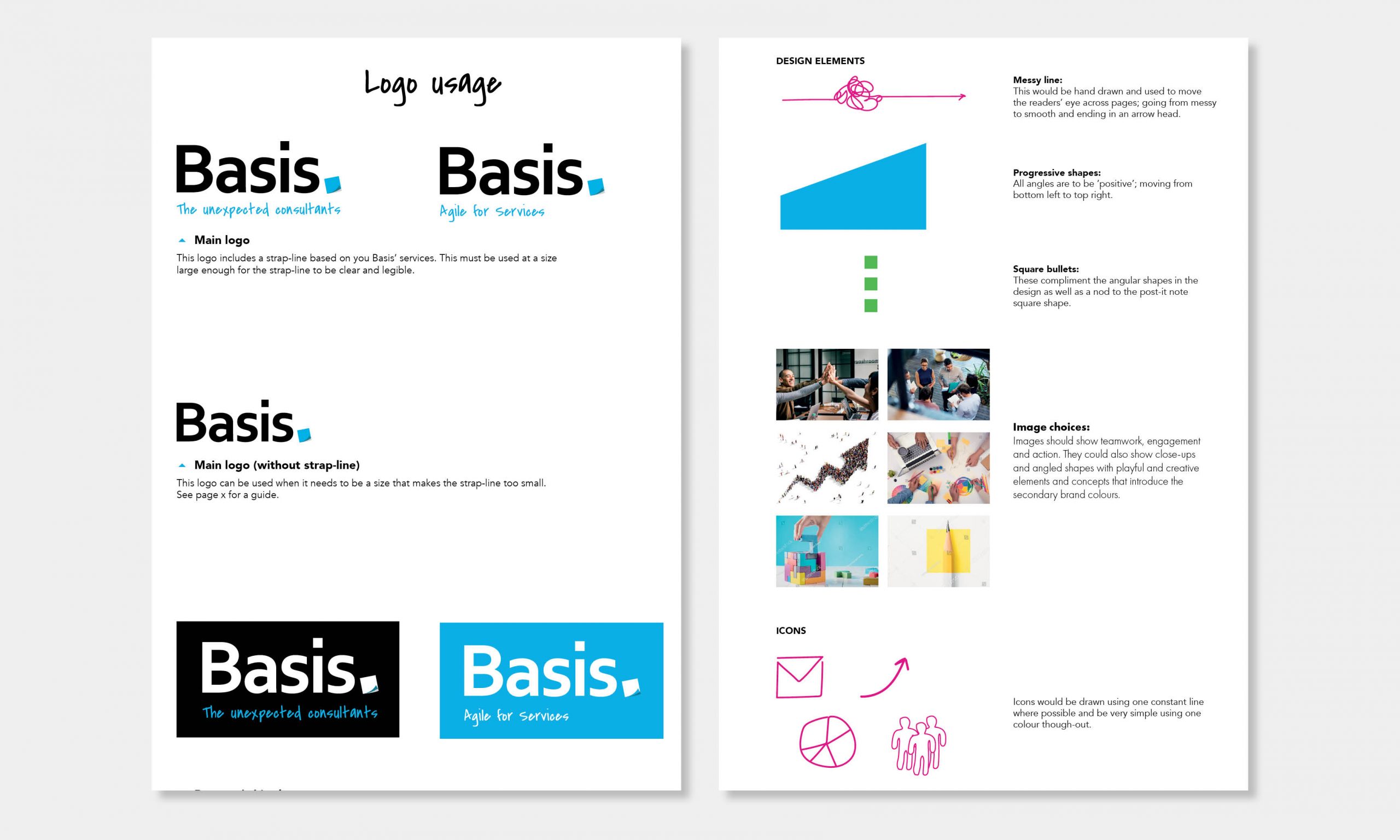
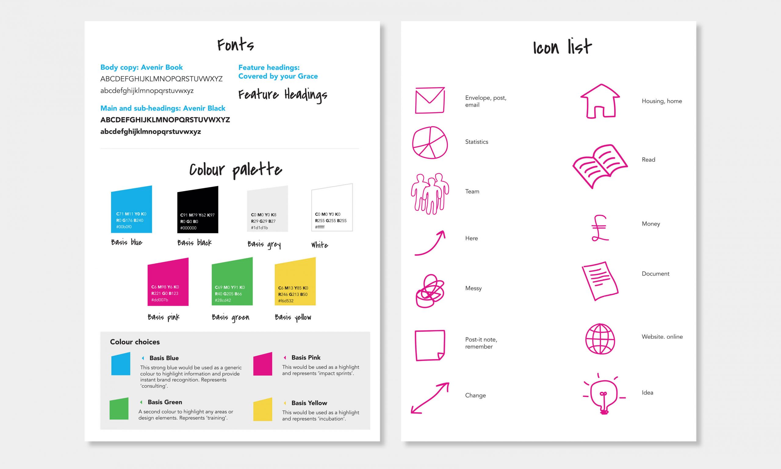
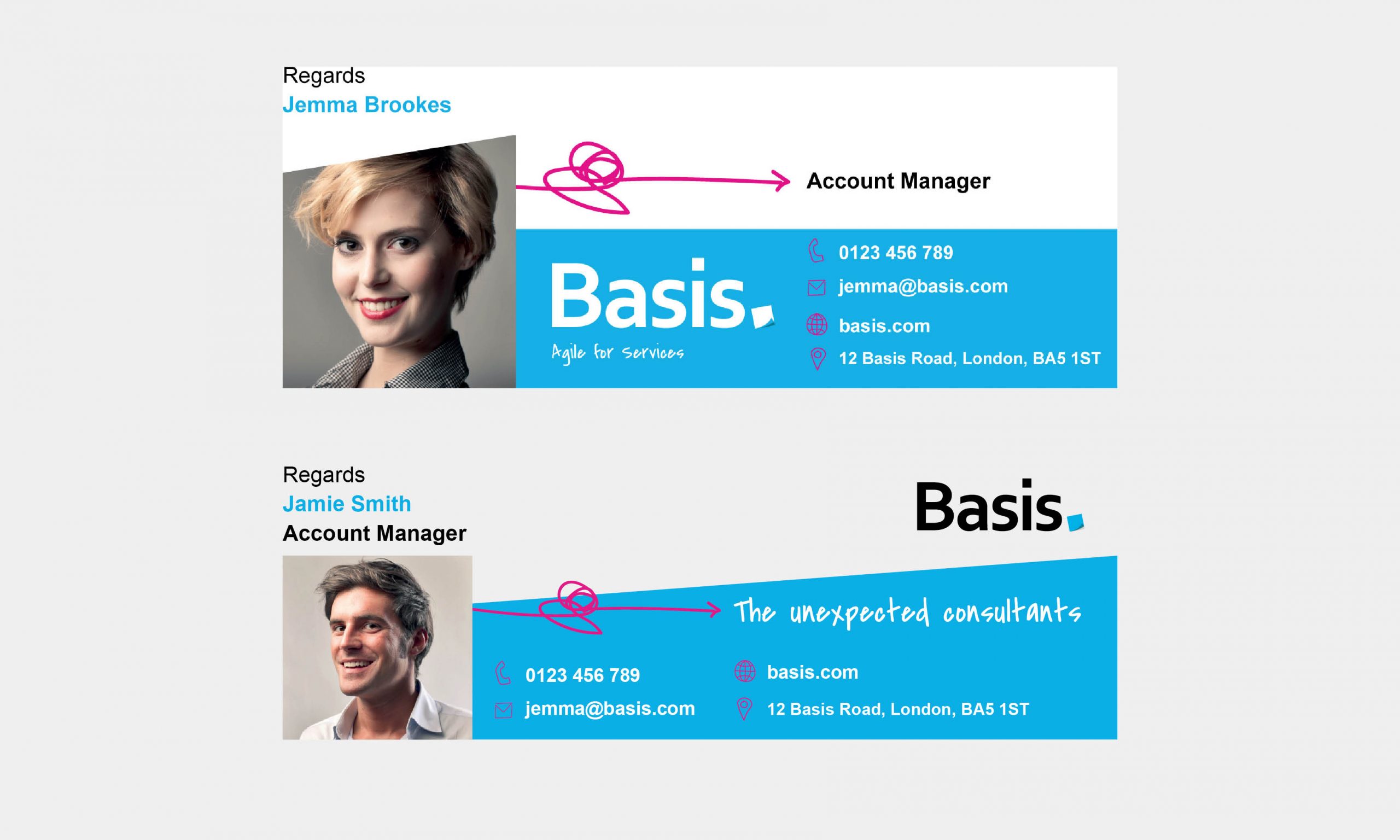
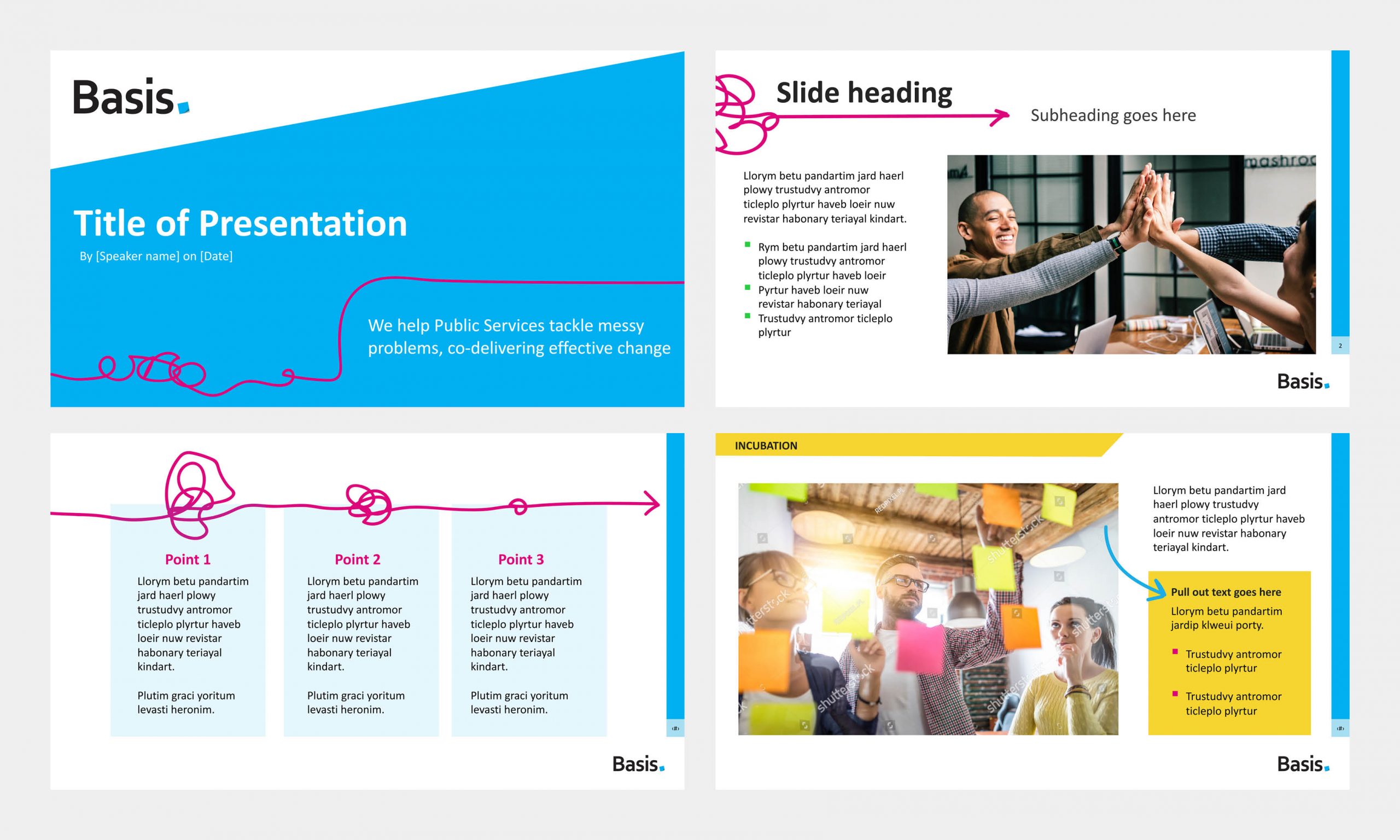
Challenge: To develop their existing logo and create brand guidelines for a more substantial and coherent brand. This would develop into email signature designs, PowerPoint presentation templates, icons, brochures and website page designs.
Ideas/Process: The post-it note was already a feature of their existing logo and they had the tagline of “The unexpected consultants” which both suggest a personal and slightly playful approach to their business. I therefore chose a secondary font that looked handwritten and develop hand drawn icons and design elements.
Results:
- A professional yet playful brand identity.
- Guidelines for colour, font and image usage for a coherent brand.
- PowerPoint/Keynote presentation templates that are flexible and on brand.
A-FROye Hair
A-FROye Hair is a start up company providing hair dressing services to people with afro textured hair as well as training sessions for up-and-coming stylists.
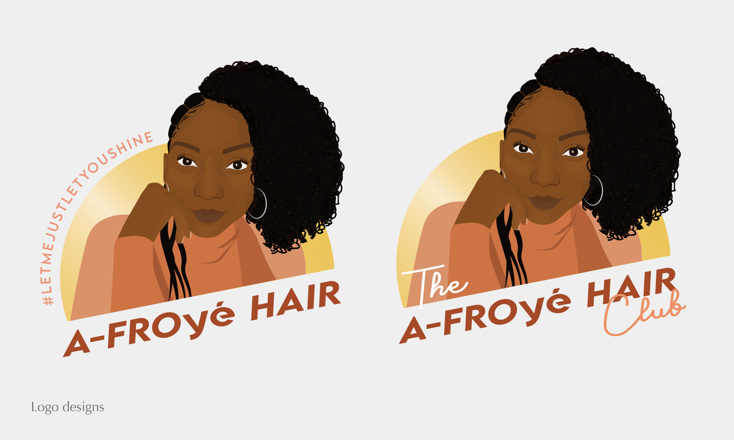
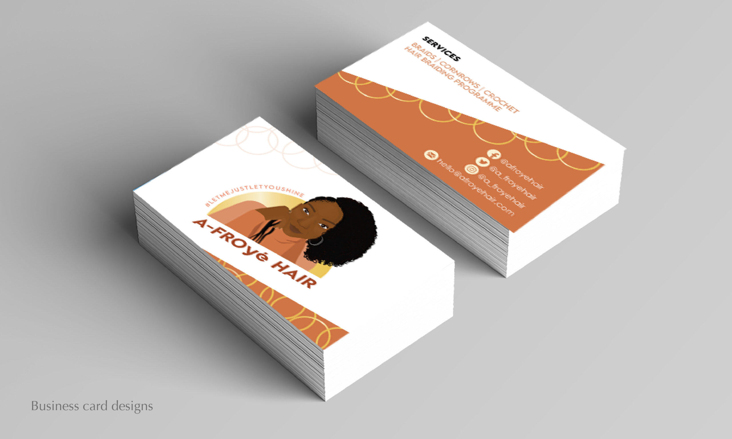
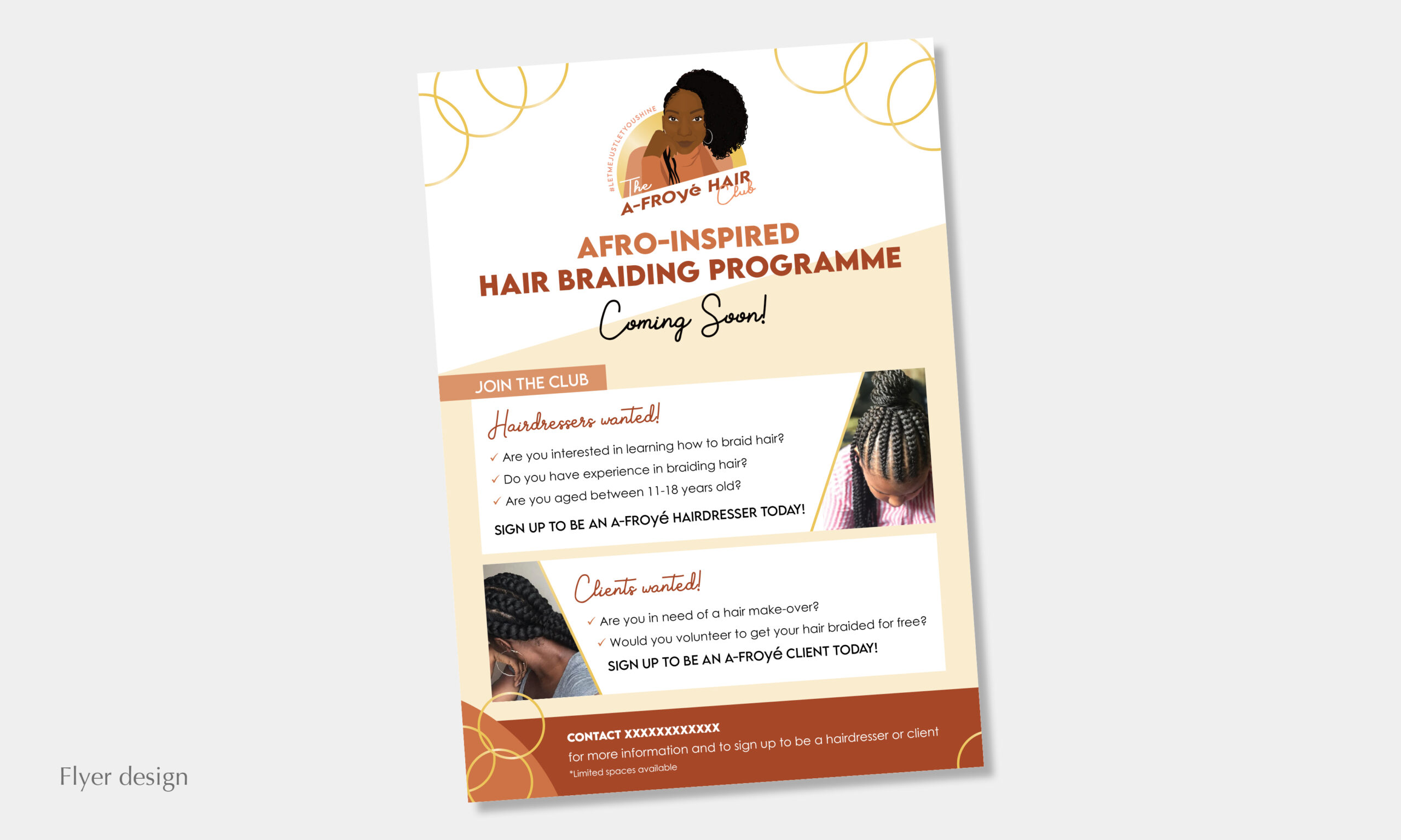
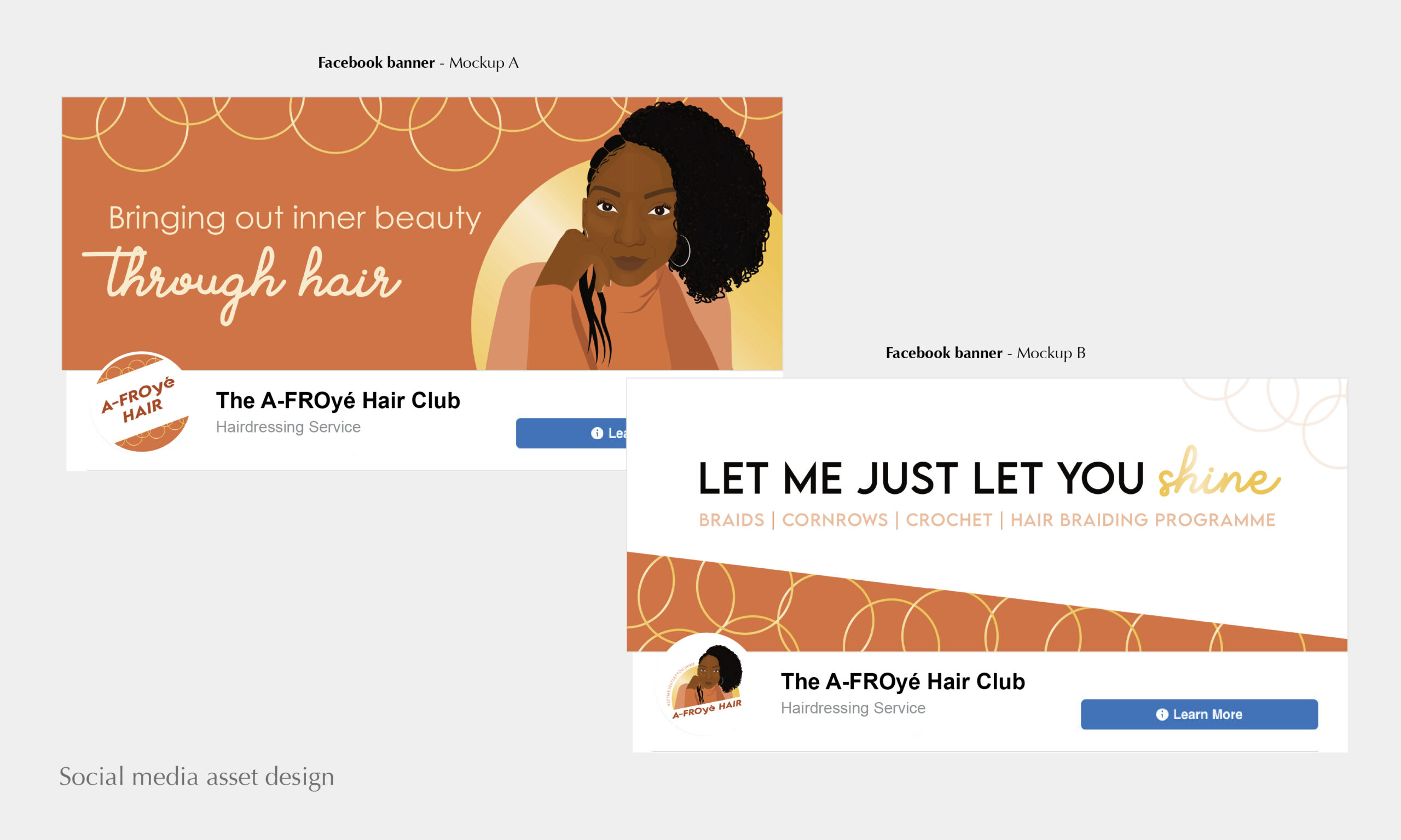
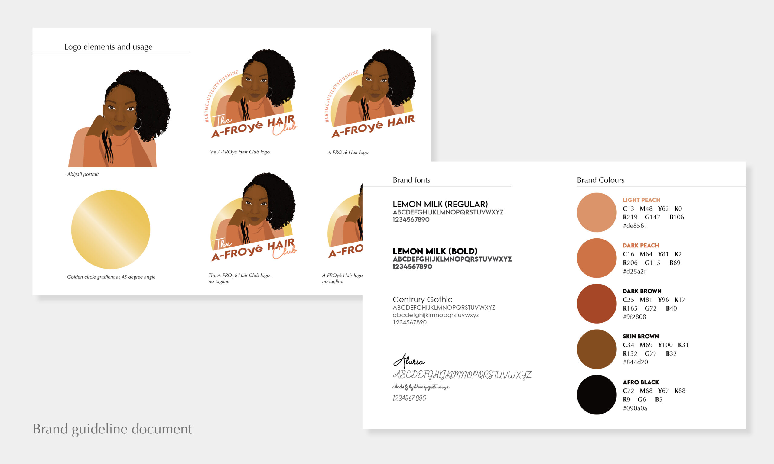
Challenge: Abigail, the creator of A-FROye Hair, commissioned me to develop the logo and all visuals for this new brand. She wanted her face to be the main feature of the logo, showing her hair texture and skin tone. Two logos were required; one main logo and a second for the Club (training sessions), but they needed to be visually connected.
Ideas/Process: I illustrated a realistic avatar of the founder and used the tagline “Let Me Just Let You Shine” as inspiration for the colouring – golden and warm tones.
Results:
- A recognisable logo that worked on social media and business cards.
- A successful launch and sold-out first hair braiding programme.