Month: May 2021

Case Study: Activity book design – rant.academy

Original brief

Client: rant.academy (previously RANT Kids)
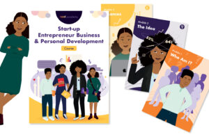
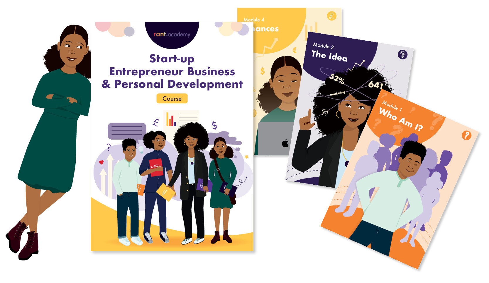
Project: 28-page activity book/workbook design and character illustration
Target audience: 8 – 17 year olds


The project

This client already had an existing brand under the ‘RANT umbrella’ – RANT Kids; a child-friendly empowerment brand that focussed mainly on producing stationary and merchandise. The rant.academy was due to be a new project under this umbrella, with more of an educational focus for young people.

The workbook was briefed in to be a written course that young entrepreneurs could work through. They (or their parents) would purchase the workbook and it would have activities inside that encouraged personal development and instilled business knowledge and tips.

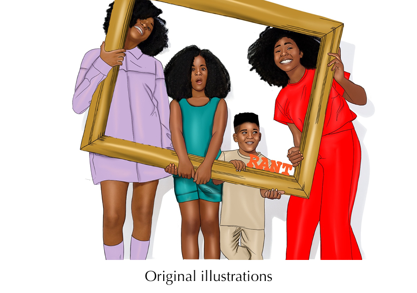
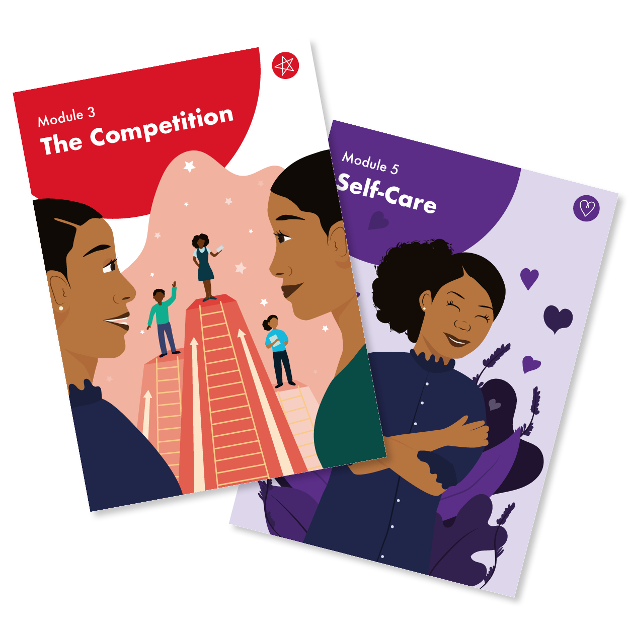
The child characters already existed on previous merchandise for RANT Kids, but I was asked to rework them in my style of illustration. The original illustrations looked good and were well designed but in order to fit the new branding and style of illustrations due to go into the workbook, they needed to be updated.

Challenges and solutions

Challenge: The initial target audience age range was too wide. Having such a wide range meant that the content and the illustrations would struggle to appeal to either end of the spectrum.
Solution: Reduce the target audience age range to those most likely to have an entrepreneurial spirit, be able to fulfil the tasks/activities and appreciate the content. It is now aimed at 10-15 year olds who would benefit most.

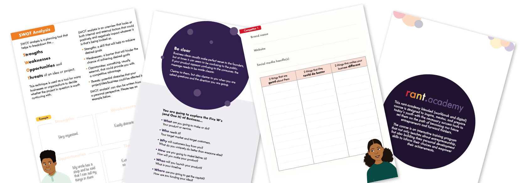
Challenge: Too much content for 28 pages. As I was putting the creating the flat plan and laying out provided content, it was becoming increasingly clear that, in order for there to be enough space for the children to write in their answers, we needed more space.
Solution: Increase the page count to produce a much user-friendly design. This does increase print costs but it will make the workbook more appealing to the users. It is now 56 pages long.

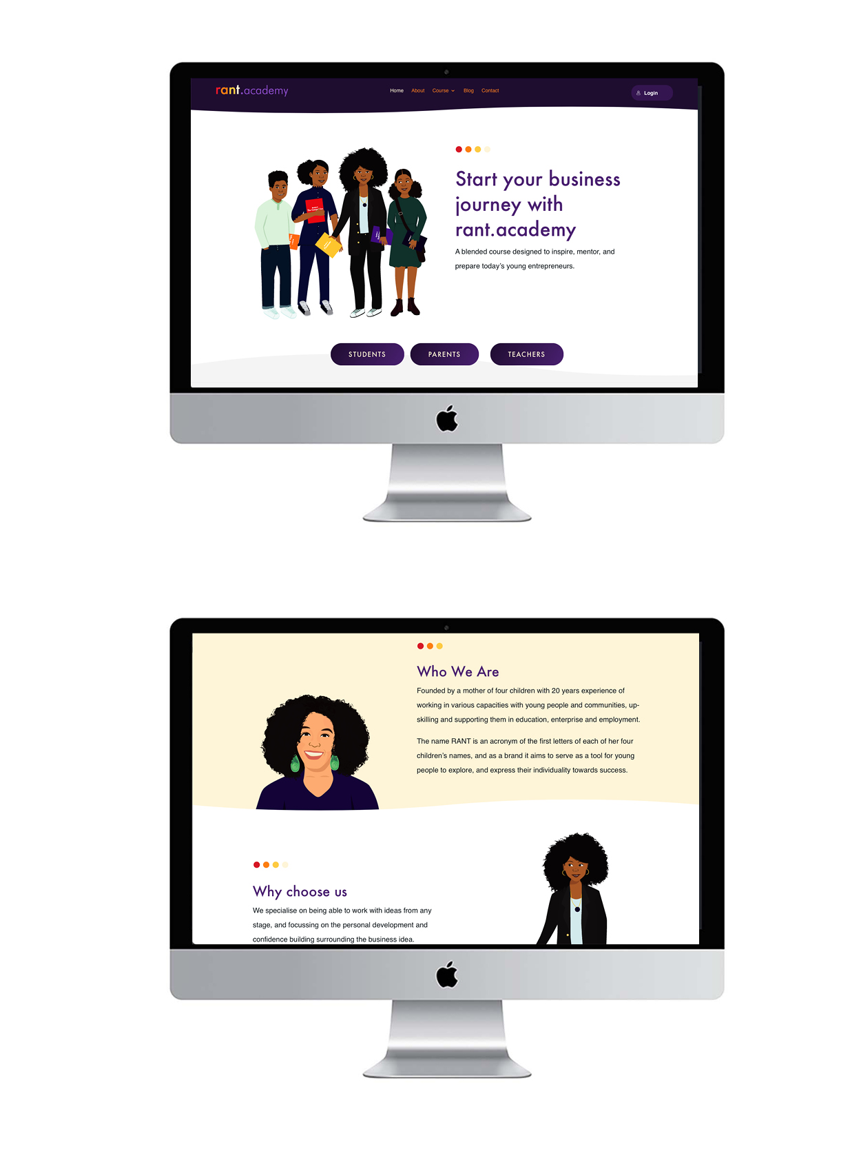
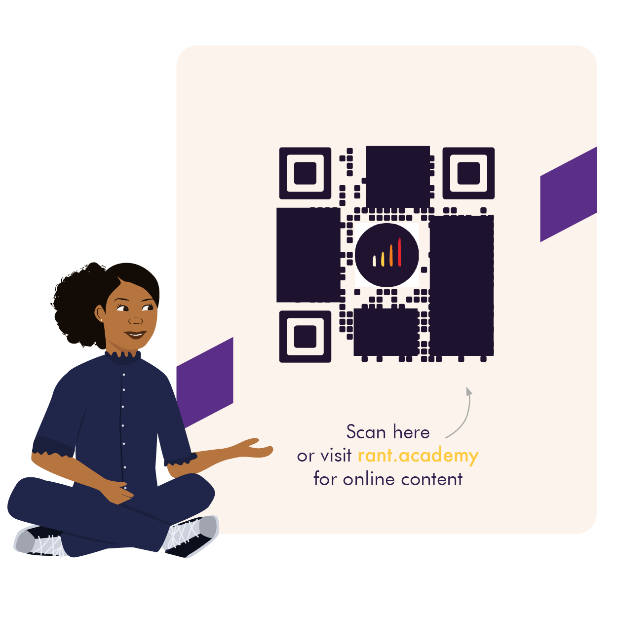
Challenge: The client wanted to later incorporate more interactivity and have a website linked to the course. In order to keep young people engaged in a digital world, the client felt it was important to have an online element to the course. A great idea!
Solution: I recommended a web design agency (Guessdesignhouse.com) who were able to create a functional and well branded site with interactive elements, a shop (to purchase the workbook from) and more information on the brand in general. We then included bespoke QR Codes into the physical book design which took the children to the supporting website at the click of a button. Guess Design House then used my illustrations and icons to make the site visually coherent.

Design decisions

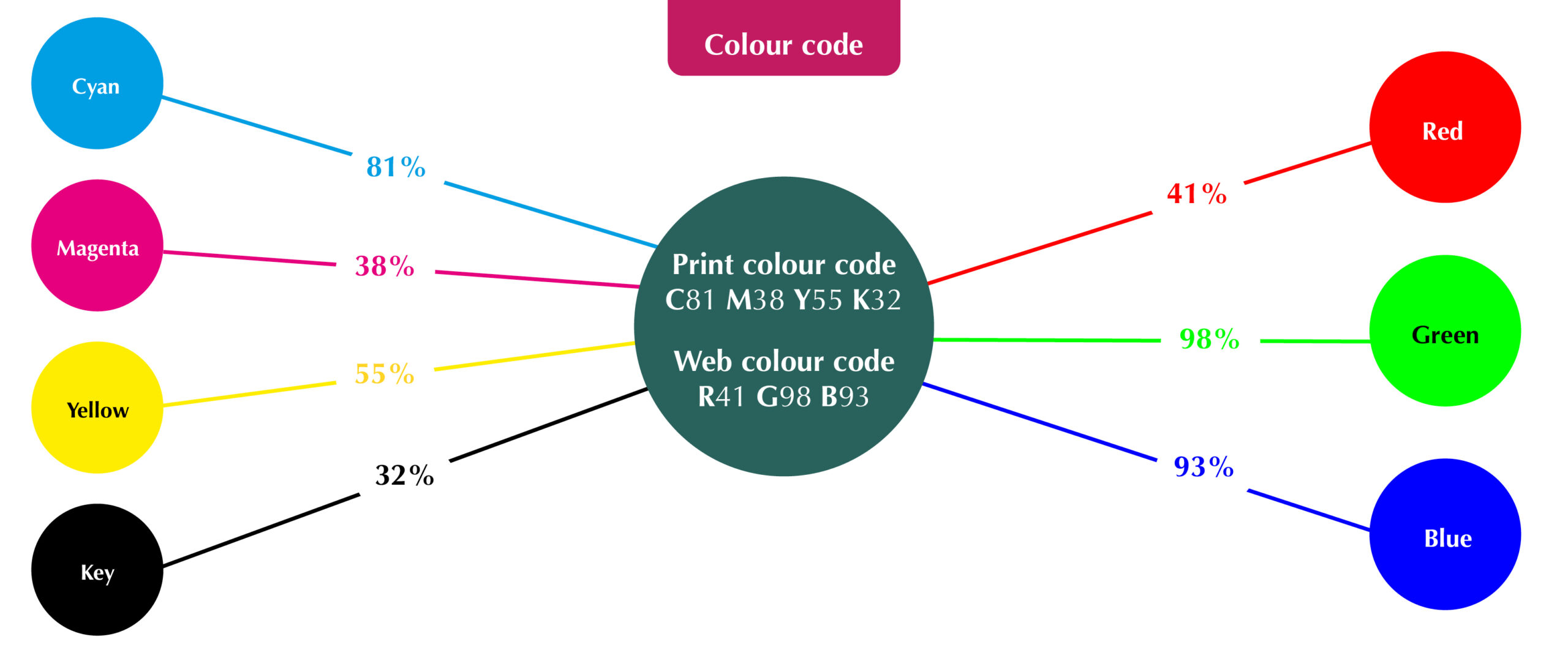
Module colours: I was provided with the 8 brand colours and decided to allocate a different colour for each module for quick visual recognition when flicking through the book.

Page placement: I highlighted to the client that having module cover pages will help the user easily recognise that they are entering a new chapter of the course. These covers are all on the right hand page so, again, it is easy to spot when flicking through.

Contents page: With the book now being over 50 pages and it being something the children will start, leave and come back to, I felt it very important to have page numbers and a contents page. Being user-friendly is very important.

QR Codes: I wanted the QR codes to integrate smoothly into the page designs so I created illustrations to sit around them and got the characters involved.

Icons: Another great way to make quick visual links is to create icons. I went for a hand-drawn feel to relate to the fact that children will refilling the book in by hand.

Video illustrations for animation: The client needed some illustrations to go into the promotional and instructional videos. These were created once the book was complete in a way that could be animated by the web team.


Conclusion

I and the client are extremely happy with the final product. It has had wonderful feedback from the children and young people who have taken part in the course so far and it is a visually striking and functional book. I love the link to the online elements and enjoyed the challenge of making a text heavy document look engaging and inviting.

What the client says:
“Huge shoutout to the insanely talented Leanne Creative for the amazing illustrations and layout of the workbook and bringing my vision to reality.”

Celebrating pride

We should all be proud of who we are, right? But sometimes, straight people take the fact that we can celebrate who we are and who we love freely for granted. For the LGBTQ+ community, it isn’t always that easy with some places in the world still deeming homosexuality and being transgender illegal! Even in the UK, we rarely see this community represented in art and design (specifically the greeting card/stationary industry) in an open and loving way.

In this blog, I will be talking to two people from the LGBTQ+ community about the way they feel they are represented (or not) in creative industries, as well sharing my greeting card deigns that celebrate Black Pride with you all.

Meet the speakers

I’m really excited to be interviewing Nena, a therapeutic counsellor and founder of Crown Mi Ltd from South London and Ashley Conrad, a broadcaster also from South London for this blog. Swipe across to get to know them a bit better…

Ashley
Nena
previous arrow
next arrow

Nena: “I’m a qualified therapeutic counsellor and am passionate about the wellbeing of those who are often ostracised in society. I’m the founder of the Mental Health initiative Crown Mi Ltd. Crown Mi Ltd is dedicated to creating platforms geared toward the empowerment of Queer Black Womxn who require support with their Mental Health in a safe space free from the stigmatic gaze.”

Ashley: “I am a broadcaster and typically specialise in light entertainment. I host a radio show for Gaydio; one of the UK’s biggest LGBT platforms and am on London radio station, Maritime Radio. I also work as an online reporter and presenter. I create entertainment news bulletins for an an online platform and, before the world broke, I attended many events as a video reporter.”

Let’s chat…

Let’s get to know Nena and Ashley’s thoughts on the representation of the LGBTQ+ community. They’ve had different experiences growing up which shows that there has been some progress but there is still work to do…

What have been your experiences within the black or asian community surrounding your sexuality?

Nena: I came out quite late in the game. I spent a large part of my dating life as a heterosexual woman but not from fear of what people would say; I genuinely was only interested in men and wasn’t exposed to Queer relationships.
I started to work on loving myself which allowed me to love someone’s energy regardless of gender (and haven’t looked back btw). 

The older I get, the more I find that acceptance isn’t alway a given. Family/friends from my (Black) community whom I thought saw past my sexuality, showed their true colours. Their acceptance comes with heteronormative beliefs, therefore, it’s important for me to surround myself with humans that love who I am in front of me and behind my back without restrictions. 

Ashley: When I was younger, before I was in the media, my sexuality was quietly accepted… maybe even ignored. No one said anything openly negative or nasty to my face. Later, when I started working in media or attending fashion shows for work, I think it was almost encouraged. Everyone loves and needs positive representation in whatever form that comes in. 

same sex couples

Which industries do you feel represent the LGBTQ+ the most/least and why?

Nena: If I had to choose I would say the community has had a huge impact on the Fashion industry. However, I find that true or genuine ally-ship is questionable nowadays as Pride and “Queerness” have quickly become pawns for capitalist exploitation in the mainstream. 

Ashley: The most – definitely fashion and music and for the least; sport – the stereotypical industries!

Have you seen your sexuality and/or skin tone represented on greeting cards before? If so, in what way?

Nena: There was a black-owned business in Catford  that used to sell many black greeting cards (sadly they have closed down during the pandemic), which I spent many times purchasing greeting cards and bookmarks – anything Black really. However, seeing black cards that celebrate same sex couples or celebrate my love is a very new thing and greatly appreciated. 

Ashley: Growing up, definitely. When we would go shopping in certain areas as a child, I’d see black people on greetings cards and it was always something of amazement and it felt incredibly special to receive one. 

What do you think of the Pride cards designed by Leanne Creative?

Nena: I think the Pride Cards designed by Leanne Creative are amazing. It was lovely receiving the ‘My Queen’ card as a Valentine’s card from my fiancée last year. I felt like our love was important and celebrated. 

Ashley: I adore them! It’s about time. Looking at LGBT media, it’s still very very white ,so seeing a card that represents me is amazing. I feel included.

Is there any imagery/wording you’d like to see more on greeting cards?

Nena: Would love to see wording around fiancé/fiancée birthday/Christmas/anniversary. Congratulations to the happy couple wedding cards. 

Have you supported or heard of UK Black Pride UK and Stonewall UK?

Nena: Yes, I’ve heard of both UK Black Pride and Stonewall UK. I’ve had the pleasure of attending many events that have been delivered by both organisations. 

Ashley: Yes to both!

Tell us about your proudest moment!

Nena: There have been many, but to name a couple, I will say when I arrived at a place of complete acceptance around being gay and letting my mum know was one of them. Also, sharing a written piece at a Queer event regarding my personal experience with Mental Health and having others identify is another. 

Ashley: I don’t believe that has come yet; there’s still so much more I want to do!


Representing love

Last year, I released two greeting cards featuring illustrated portraits of same-sex couples. It was an initiative inspired by ParliREACH and ParliOUT. ParliREACH is a Workplace Equality Network (WEN) established to increase awareness and appreciation of race, ethnicity and cultural heritage issues in Parliament. It aims to provide a platform where under-represented groups can find support and where equality objectives can be progressed. ParliOUT is another WEN in support of LGBT (lesbian, gay, bisexual, transgender) people in Parliament, with the goal of making LGBT role models more visible and accessible.

£1 from the sale of each of these cards goes to the UK Black Pride charity – Europe’s largest celebration for LGBTQI+ people of African, Asian, Caribbean, Latin American and Middle Eastern-descent. UK Black Pride is a safe space to celebrate diverse sexualities, gender identities, cultures, gender expressions and backgrounds and they foster, represent and celebrate Black LGBTQI+ and QTIPOC culture through education, the arts, cultural events and advocacy.

A further 50p from each sale goes to Stonewall UK – a charity aims to let all lesbian, gay, bi and trans people, in the UK and abroad, know they’re not alone. Stonewall UK believes we’re stronger united, so partner with organisations that help create change for the better.


As a designer who prides myself with creating representative greeting cards and gifts, I am committed to expanding my range and shedding light on representation issues. As it’s Pride month coming up (June), please share this post, buy some cards, follow my guest’s Instagram pages and let’s make it the most prideful month ever!

“There is no such thing as a single-issue struggle because we do not live single-issue lives. Our struggles are particular, but we are not alone.”

Audre Lorde

Mental Health Awareness Week – Social media anxiety

Hi guys! I hope you’re all feeling great but if you aren’t, I’m hoping this blog will help you feel a little better.

As you may know, it’s Mental Health Awareness Week (10th – 16th May 2021) – a week where we discuss and highlight the importance of taking care of our minds as well as our bodies. In this blog, I will be talking about the anxiety some of us may face as entrepreneurs or small business owners who use social media to promote ourselves. I really want to talk about this specifically, as its something I’ve struggled with in the past.

Social media & business anxiety

Lockdown has been a huge challenge for a lot of us, with people losing their jobs on an unprecedented scale. This mass unemployment has lead to many of us having to start or grow our own businesses to keep ourselves afloat and a lot of that has been done through social media as it’s now an essential tool to reach audiences/customers.

So, we start our business pages with enthusiasm and hope, posting images of our products or services whilst telling the world “WE HAVE ARRIVED!” A few moments later, we are confronted by the fact that there are hundreds, if not thousands of other businesses out there, doing similar work and we instantly start to question our significance in our chosen industries.

Over the next few weeks, we keep pushing and promoting our work but can’t stop scrolling through that Instagram discovery feed. We see image after image of our peers and competitors doing well and gaining more and more exposure, but if things aren’t going so well for us just yet, insecurity rears its ugly head and we start to doubt ourselves and, once again, question our abilities. 

Sound familiar? Yea, it does to me too!

As humans, we can’t help but compare ourselves to others (especially on social media) but if these feelings aren’t dealt with in a healthy way, this constant comparison can have a negative affect on our mental state. Because of this, it is so important to curate a strong and positive sense of professional- and self-worth in order to maintain good mental health, otherwise it could lead to to so many issues such as low self-esteem, anxiety, depression and OCD. 

If you see someone winning, celebrate and learn from them but it’s so important to maintain a sense of value in your own journey too. As successful as someone presents, they too have a story, and the snippet that is shown on social media is just a tiny percentage of the reality. They too may have started out slowly and felt the same way as you do a few months or years ago, so there’s no reason why you can’t be successful in your own time too! Social media is basically a highlight reel, so to compare your real life to their reel life” can be pretty unfair to yourself, right? So cut yourself some slack. If you’re working hard, continuing to learning and taking steps to improve your business, then your win is coming too… trust me! I used to think to myself “Why aren’t my designs being featured in magazines too? (crying face emoji)” …then a few months later… two features in the space a month and that shut me up real quick (LOL), so now I trust the process!

My advice to anyone reading this who feels like their mental health is being affected by comparison on social media is to give yourself a break. Talk to real people you trust who can share rounded experiences and come back with an understanding that you are on your own perfect path and that everyone’s highlights have back stories. It’s so important to celebrate wins, but in reality we don’t all win all the time… and guess what… that’s ok! 

Mother Nature’s healing touch 

This year’s theme for Mental Health Awareness Week is nature and I have to admit it’s been a real blessing for me during lockdown. When things got overwhelming mentally, we would go for walks in parks or woods and I found myself appreciating wildlife a lot more. For me, just being around trees, water and animals makes me feel calmer and in tune with my emotions and always has done. I love the sound of running water and find comfort in the smell of fresh soil. I even have a tattoo that symbolises the beauty of nature and natural human beauty.

According to the Mental Health Foundation, 45% of us reported that being in green spaces had been vital for our mental health over the lockdown period, so I’m glad it’s being recognised as a natural stimulant for positive mental health. Being in nature is also a great form of escapism and helps you put your problems into perspective… it’s a huge world out there! 

“Nature is our great untapped resource for a mentally healthy future.”

Mark Rowland, CEO of the Mental Health Foundation

So every now and then, why not take a few hours or days away from social media (I know its hard if you run an online business but…), explore your local park, sit in the garden, grown a houseplant from an avocado seed (like I did!) and enjoy the calming reality of nature! Step away from seeing others as unhealthy competition but instead use it as healthy inspiration, because after all, a flower doesn’t care how pretty its neighbour is, it still blooms just as beautifully as it’s meant to!


If you are in need of any professional support or want to learn of ways you can help those who need it, please always reach out and contact the below services:

Mindmind.org.uk

Mental Health Foundationmentalhealth.org.uk

NHSnhs.uk


If you’d like to get updates on when I release new blogs, please subscribe to my newsletter.

Understanding your designer

As Chris Tucker said in Rush Hour… “Do you understand the words coming out of my mouth?” I hope so but as creatives with technical minds, designers are sometimes guilty of throwing in ‘jargon’ (or buzzwords) when we speak to our clients. We don’t mean it – honest – but these words help us gain clarity from a brief and will also help make sure the designs are fit for purpose.

In this blog, I will be breaking down some of the ‘buzzwords’ that often come up when I’m speaking to clients. It should help you understand us better and you can even impress us by throwing in a few words yourself! Feel free to bookmark this page and use it as a ‘glossary of terms’ to refer back to at a later date.

20 design & illustration buzzwords

Knowing these words will help you to communicate your design requirements accurately, resulting in a quicker turnaround and better fulfilled brief. They may also help you understand why we make certain design decisions… so really, it’s a win for both of us!

Animation
A moving drawing or computer generated image. Animation is a method in which figures are manipulated to appear as moving images. An animation if typically created by an animator.

Body copy
Copy‘ is another word for the text used in a document or book. ‘Body copy’ therefore refers to the main chunk of text in said document, so everything other than headings, titles or captions.
Your designer might say: “What font would you like your body copy to be in?

Brand Identity
The visible elements of a brand. This included the colour palette, fonts, shapes and logo design. Each element helps consumers identify your brand and distinguish from others. Have a look at the brand identities I have developed for clients here.

Carousel
In the context of social media, carousels are posts that have multiple images that viewers can swipe through. These are great for conveying multiple ideas or sharing large chunks of information without over-crowding a single image.

Case
Most people know about upper- and lowercases, but there is also sentence case and title case. Sentence case refers to lines of text starting with a capital letter (a grammatically correct sentence) and ending with a full-stop. Title case refers to a formal way of writing a title where each word starts with a capital letter (a part from joining words) for example, The Magical City of Mumbai.

Colour code
The ink or light colour combination required to produce a specific colour. In print, every colour is made up of a certain percentage of 4 primary ink colours known as CMYK: Cyan, Magenta, Yellow and Key (black). In web, every colour is made up of 3 light colours known as RGB: Red, Green and Blue (For web, the code may also be called Hex). Knowing the code of your desired colour will ensure consistency across your brand.
Your designer might ask: “What is the colour code for your brand’s dark blue?”

Contrast
How much colours look different from each other. High colour contrasts work best for legibility of text, for example, black text on a white background.
Your designer might say: “Those colours won’t work because there isn’t enough contrast”

Crop marks
Lines in the corners of your page to show the printer where to trim the paper. Also known as trim marks, they are usually required by commercial/professional printers and will not show on the final printed document.
Your designer might ask: “Does your printer require crop marks?”

EPS
A very high quality vector file. An EPS (Encapsulated PostScript) file is considered the best format for high resolution printing of illustrations or logos. It can be resized from a postage stamp size to a billboard size and would not lose quality!

Flat illustration
A minimalistic approach to illustration. “Flat” design focusses on simplicity and tends to feature plenty of open space, crisp edges and bright colours. See more examples of my flat illustrations here.

Flat plan
A diagram used to plan where the illustrations, images or text will go in a multi-page document like a magazine or book. It is useful when working out the page count and how your content will flow across the pages.

Illustration
A static drawing or computer generated image. A visual interpretation of a story, concept or process usually integrated into printed media such as flyers, magazines, books and teaching materials. An illustration is typically created by an illustrator like me!

Open/design files
Files that can be manipulated/edited using professional design programmes such as Adobe Illustrator or Photoshop. Having these precious files will allow you to take your designer’s creation and give it to someone else to change, essentially compromising their original work, so they will often come at an additional cost.
Your designer might ask: “Would you like to purchase the open files?”

Resolution
The quality of an image. Resolution is measured in either dpi (dots per inch – for print) or ppi (pixels per inch – for web design). The higher the resolution, the better the quality. Screens typically require a minimum of 72ppi, whereas print requires at least 300dpi, which is why it’s so important to tell your designer what the image or design is to be used for.

Reverse
A white or light coloured illustration or logo designed to be placed on black or dark backgrounds. It would usually be the same as the original, coloured version, but edited in a way that will stand out if having a dark background is unavoidable.
Your designer might ask: “Would you like your logo in reverse as well?”

Stock
Another name for paper. There are many types of paper and card to choose from, so it’s important to choose one fit for purpose. You need to consider its colour, thickness/weight (gsm), finish (silk, matte etc), lamination and more! Your designer and/or printer should be able to advise you on this for different purposes.

Typography
The study or production of different fonts. It can also refer to the manipulation of existing fonts or putting complimentary fonts together in a design.

Self-publishing
When an author writes, produces and sells their own book without the use of a publishing house. This route is typically good if you are a new author, want full control over its distribution and design and/or plan on producing small quantities initially (under 2000 copies).

Orphans
Leaving one word one its own on the last line of a paragraph in printed documents. As designers we try our best to avoid these as it’s seen as bad practice and doesn’t look great.
Your designer might say: “I’ve pushed that word down to the next line to avoid having any orphans.”

White space
Space around an image or group of text on a page (not necessarily white). This is needed to stop the page looking to busy and helps readers digest the information easily.
Your designer might say: “I’ve left some white space to avoid over-crowding”


Helpful?

I hope this glossary of terms helps you on your way to creating a killer brief, engaging in slick communication with you designer and impressing friends and family with your new lingo! Of course, if you have any questions or would like to work together on a self-published illustrated book with interesting typography and plenty of white space but no orphans… just get in touch!