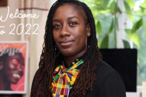
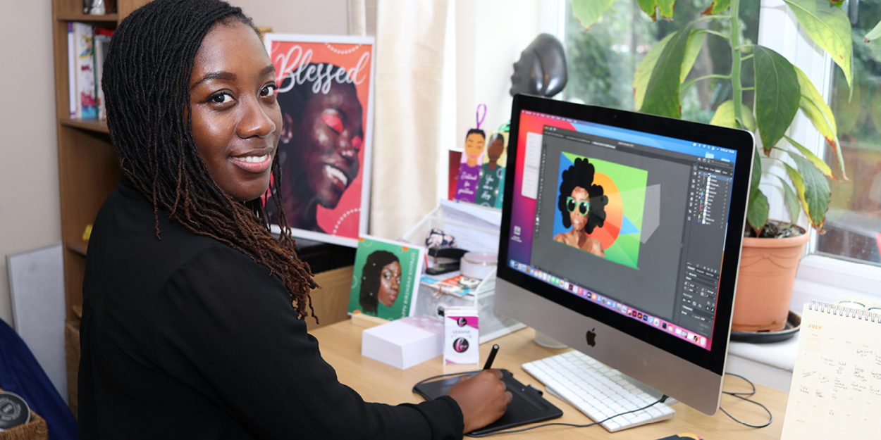
2020 and 2021 both seemed to go by quickly and slowly at the same time and now we are in 2022, still feeling a little confused about what the future holds in terms of the dreaded virus, work and lifestyles! Despite this, I am determined to make as many plans as I can and stay positive, so my first post of the year is my way of putting my goals and plans into the universe and working towards making them happen.
2022 goals
Develop new and personalised products
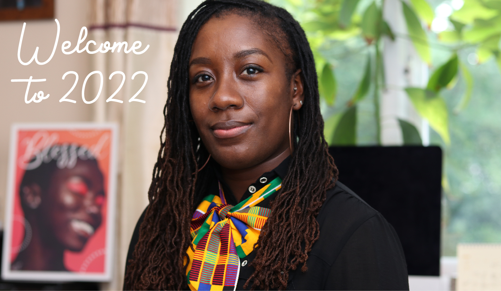
I was fortunate enough to get a Cricut Explore 3 for Christmas! It’s something I’ve wanted for a very long time and I know that it will open up my possibilities of creating personalised items and expanding my range of products in general.
I can’t wait to start using it and if you have any suggestions of what you’d like to see in my collection, please get in touch.
Collaborate with more brands
Building connections, relationships and friendships are great ways to learn, achieve and grow as an entrepreneur and business owner. I hope to meet more and more like-minded people and build innovative ways to expand together.
Create more videos
I’d like to build on my YouTube videos and become more active on TikTok, so it’s time to get out my ring light and regain my confidence in front of the camera. I’ll be producing fun and entertaining videos and finding ways to incorporate my love of dance into them. Who knows, I might end up being a TikTok sensation!
Review my service prices
As a graphic designer and illustrator, I’m constantly learning new skills, developing existing skills and updating my tools in order to produce relevant, high-quality and impressive work.
Over the past few months, my skills and efficiency has improved after training, practicing and purchasing tools to allow for more styles of illustration for example, so this will be reflected in my new rates. I still promise a friendly and professional service but with more detail and features! Exciting!
Avoid burnout
Sometimes we need to say “no” in order to make time for recovery. Last year, I often worked until 2am and started up again early in the morning, so I want to make sure that I factor in some down-time and not take on too much, in both my personal and professional life.
Now it’s in the universe, here’s to a successful, fun, inspirational, educational and love-filled year ahead! What are your goals for 2022?
As Chris Tucker said in Rush Hour… “Do you understand the words coming out of my mouth?” I hope so but as creatives with technical minds, designers are sometimes guilty of throwing in ‘jargon’ (or buzzwords) when we speak to our clients. We don’t mean it – honest – but these words help us gain clarity from a brief and will also help make sure the designs are fit for purpose.
In this blog, I will be breaking down some of the ‘buzzwords’ that often come up when I’m speaking to clients. It should help you understand us better and you can even impress us by throwing in a few words yourself! Feel free to bookmark this page and use it as a ‘glossary of terms’ to refer back to at a later date.
20 design & illustration buzzwords
Knowing these words will help you to communicate your design requirements accurately, resulting in a quicker turnaround and better fulfilled brief. They may also help you understand why we make certain design decisions… so really, it’s a win for both of us!
Animation A moving drawing or computer generated image. Animation is a method in which figures are manipulated to appear as moving images. An animation if typically created by an animator.
Body copy ‘Copy‘ is another word for the text used in a document or book. ‘Body copy’ therefore refers to the main chunk of text in said document, so everything other than headings, titles or captions. Your designer might say: “What font would you like your body copy to be in?“
Brand Identity The visible elements of a brand. This included the colour palette, fonts, shapes and logo design. Each element helps consumers identify your brand and distinguish from others. Have a look at the brand identities I have developed for clients here.
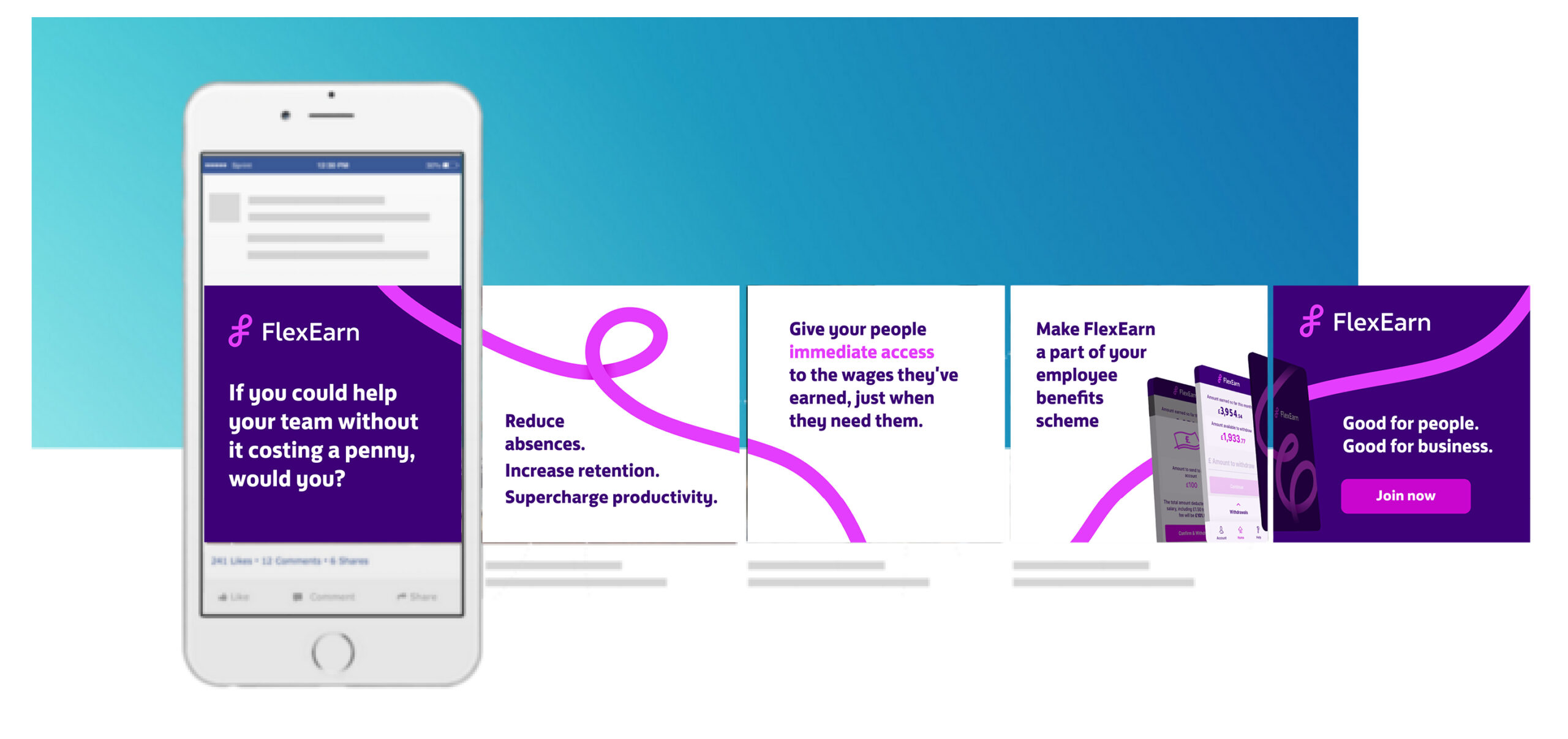
Carousel In the context of social media, carousels are posts that have multiple images that viewers can swipe through. These are great for conveying multiple ideas or sharing large chunks of information without over-crowding a single image.
Case Most people know about upper- and lowercases, but there is also sentence case and title case. Sentence case refers to lines of text starting with a capital letter (a grammatically correct sentence) and ending with a full-stop. Title case refers to a formal way of writing a title where each word starts with a capital letter (a part from joining words) for example,The Magical City of Mumbai.
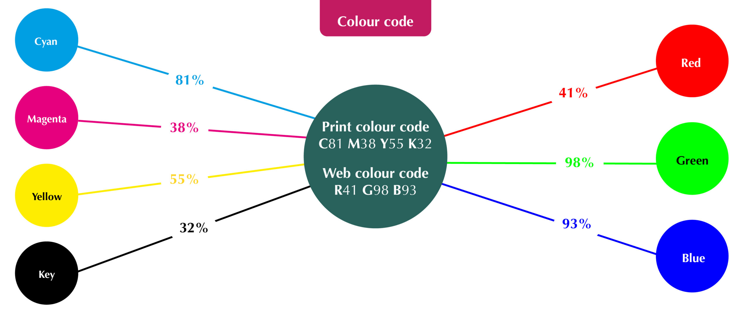
Colour code The ink or light colour combination required to produce a specific colour. In print, every colour is made up of a certain percentage of 4 primary ink colours known as CMYK: Cyan, Magenta, Yellow and Key (black). In web, every colour is made up of 3 light colours known as RGB: Red, Green and Blue (For web, the code may also be called Hex). Knowing the code of your desired colour will ensure consistency across your brand. Your designer might ask: “What is the colour code for your brand’s dark blue?”
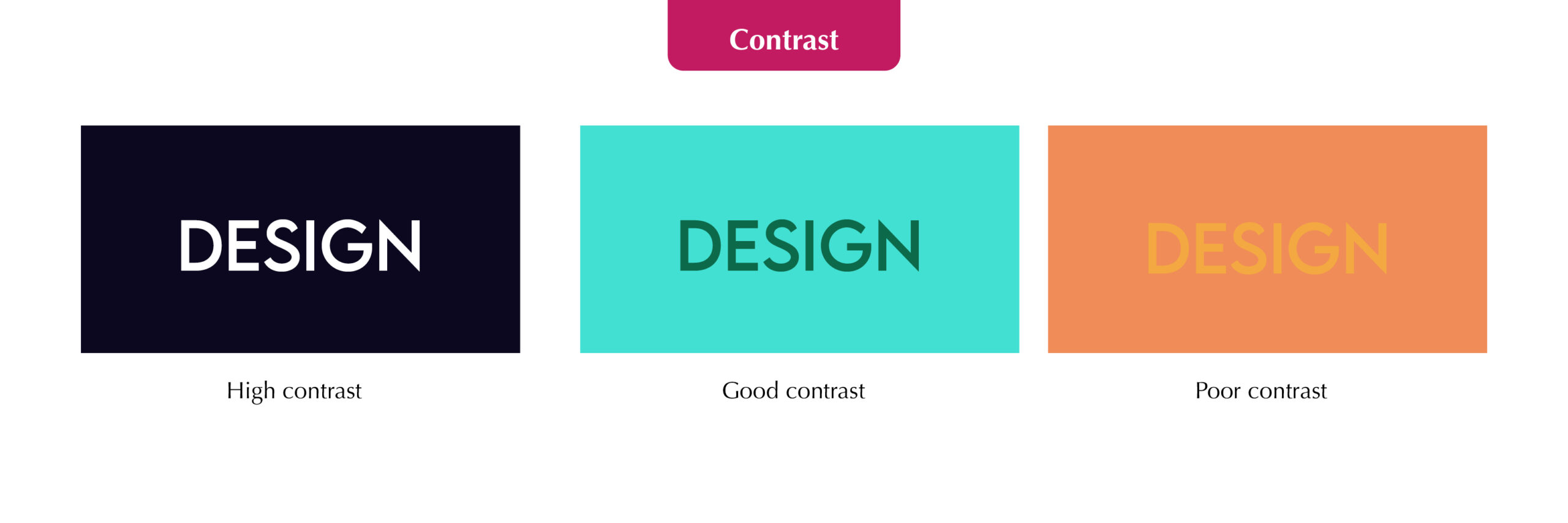
Contrast How much colours look different from each other. High colour contrasts work best for legibility of text, for example, black text on a white background. Your designer might say: “Those colours won’t work because there isn’t enough contrast”
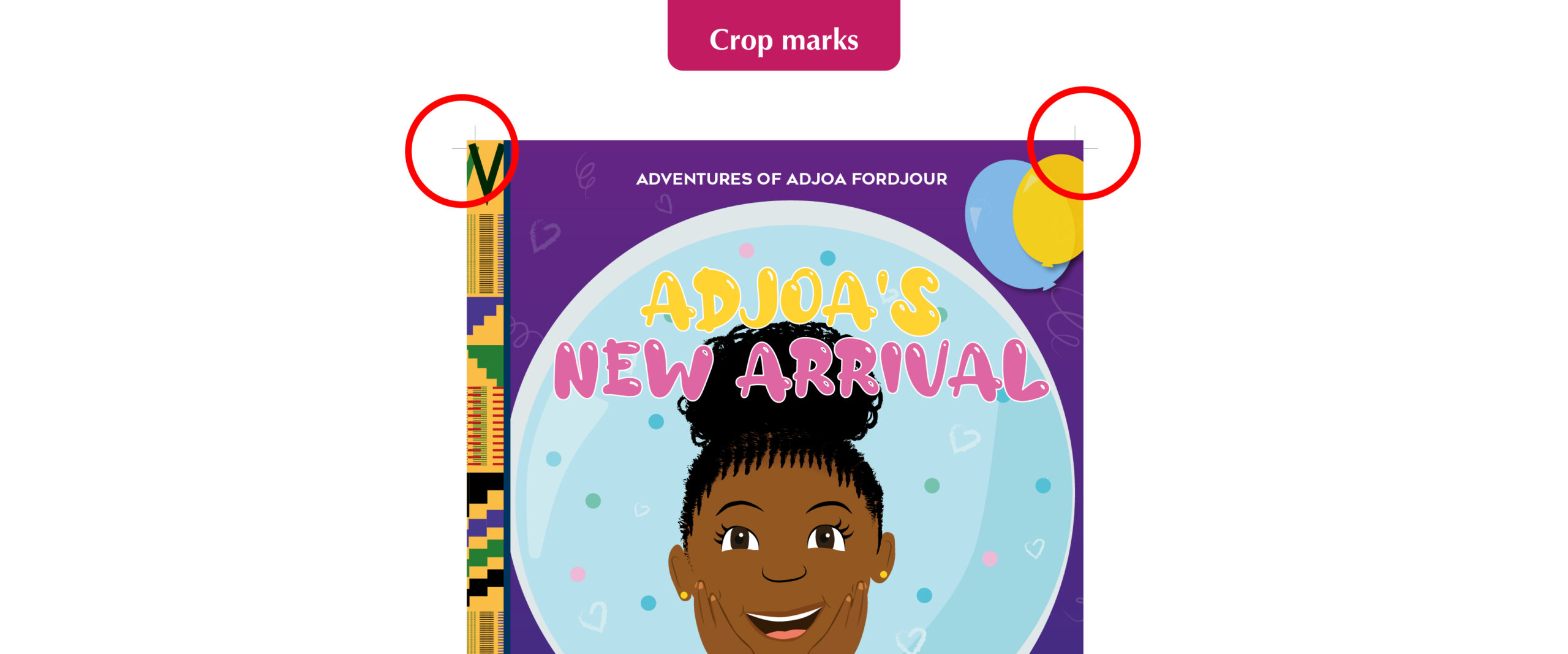
Crop marks Lines in the corners of your page to show the printer where to trim the paper. Also known as trim marks, they are usually required by commercial/professional printers and will not show on the final printed document. Your designer might ask: “Does your printer require crop marks?”
EPS A very high quality vector file. An EPS (Encapsulated PostScript) file is considered the best format for high resolution printing of illustrations or logos. It can be resized from a postage stamp size to a billboard size and would not lose quality!
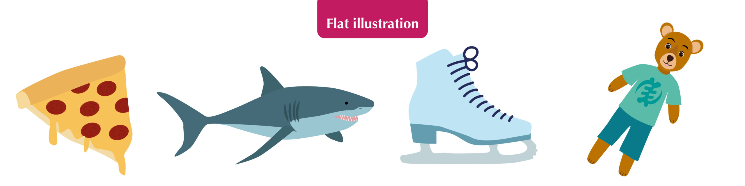
Flat illustration A minimalistic approach to illustration. “Flat” design focusses on simplicity and tends to feature plenty of open space, crisp edges and bright colours. See more examples of my flat illustrations here.
Flat plan A diagram used to plan where the illustrations, images or text will go in a multi-page document like a magazine or book. It is useful when working out the page count and how your content will flow across the pages.
Illustration A static drawing or computer generated image. A visual interpretation of a story, concept or process usually integrated into printed media such as flyers, magazines, books and teaching materials. An illustration is typically created by an illustrator like me!
Open/design files Files that can be manipulated/edited using professional design programmes such as Adobe Illustrator or Photoshop. Having these precious files will allow you to take your designer’s creation and give it to someone else to change, essentially compromising their original work, so they will often come at an additional cost. Your designer might ask: “Would you like to purchase the open files?”
Resolution The quality of an image. Resolution is measured in either dpi (dots per inch – for print) or ppi (pixels per inch – for web design). The higher the resolution, the better the quality. Screens typically require a minimum of 72ppi, whereas print requires at least 300dpi, which is why it’s so important to tell your designer what the image or design is to be used for.
Reverse A white or light coloured illustration or logo designed to be placed on black or dark backgrounds. It would usually be the same as the original, coloured version, but edited in a way that will stand out if having a dark background is unavoidable. Your designer might ask: “Would you like your logo in reverse as well?”
Stock Another name for paper. There are many types of paper and card to choose from, so it’s important to choose one fit for purpose. You need to consider its colour, thickness/weight (gsm), finish (silk, matte etc), lamination and more! Your designer and/or printer should be able to advise you on this for different purposes.
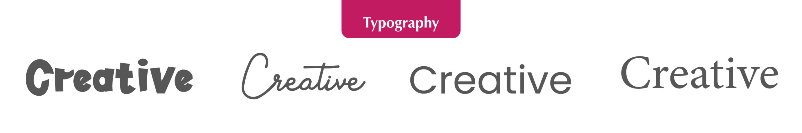
Typography The study or production of different fonts. It can also refer to the manipulation of existing fonts or putting complimentary fonts together in a design.
Self-publishing When an author writes, produces and sells their own book without the use of a publishing house. This route is typically good if you are a new author, want full control over its distribution and design and/or plan on producing small quantities initially (under 2000 copies).
Orphans Leaving one word one its own on the last line of a paragraph in printed documents. As designers we try our best to avoid these as it’s seen as bad practice and doesn’t look great. Your designer might say: “I’ve pushed that word down to the next line to avoid having any orphans.”
White space Space around an image or group of text on a page (not necessarily white). This is needed to stop the page looking to busy and helps readers digest the information easily. Your designer might say: “I’ve left some white space to avoid over-crowding”
Helpful?
I hope this glossary of terms helps you on your way to creating a killer brief, engaging in slick communication with you designer and impressing friends and family with your new lingo! Of course, if you have any questions or would like to work together on a self-published illustrated book with interesting typography and plenty of white space but no orphans… just get in touch!
I’ve been a professional graphic designer for just over seven years but always had a creative mind from a very young age. I grew up loving to dance, write short stories, paint pictures and sketch animals and fictional characters.
When I left college, I decided to enrol in a Graphic Design Foundation Diploma at the University of Arts. I then went on to do a degree in Dance and Media Cultural studies at Kingston University where I learnt more about the theories and strategies behind media production and marketing. This degree opened my eyes to different techniques for advertising, animation and brand development and I fell even more in love with graphic design during a design module.
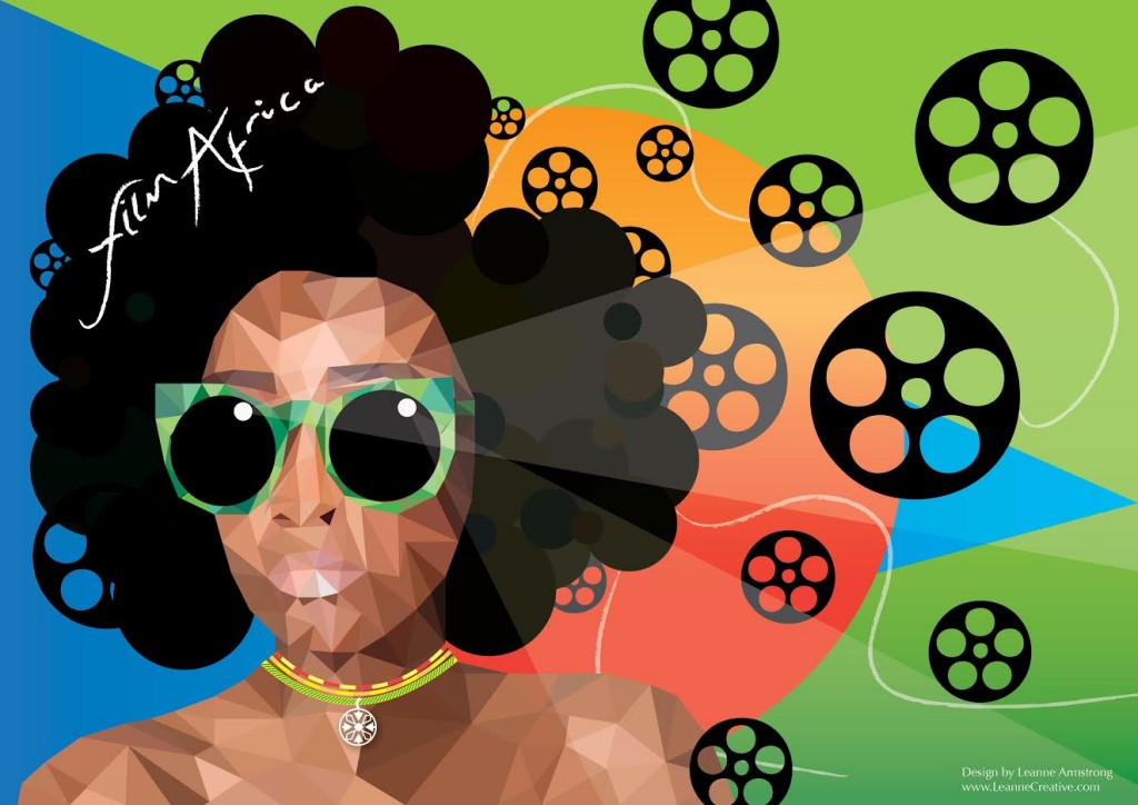
Fast forward to 2016 and I entered a design competition for Film Africa, where designers across the world were tasked to create artwork for the front cover of their programme. The above artwork was my submission and I was selected by industry professionals to be one of the top three designers! It then went to a public social media vote and I came second place.
Seeing as this was my first attempt at bespoke illustration, I was extremely proud of myself and my passion for illustration (portraits in particular) grew, leading me to start designing my own collection of greeting cards.
What is Illustration?
Illustration us a strand of design that can be broadly classified into two categories: traditional illustration and modern illustration. Traditional refers to hand-drawn using pencils, pens, paint and paper etc, whereas modern illustration, which I do, is created using software such as Adobe Photoshop and Illustrator on a computer – although my work often does start off with a pencil sketch.
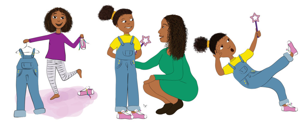
The Magic Bubble Wand by Barbara Adu-Darko. Illustrated by Leanne Creative
Illustrations are pieces of imagery that accompany text to aid understanding or visualisation. They could also simply be purely decorative and used in anything from books to magazines, annual reports to posters, video games and films. Illustrations are an effective way to communicate with readers in a creative and visually descriptive way – as they say… an image can paint 1,000 words!
What’s my style?
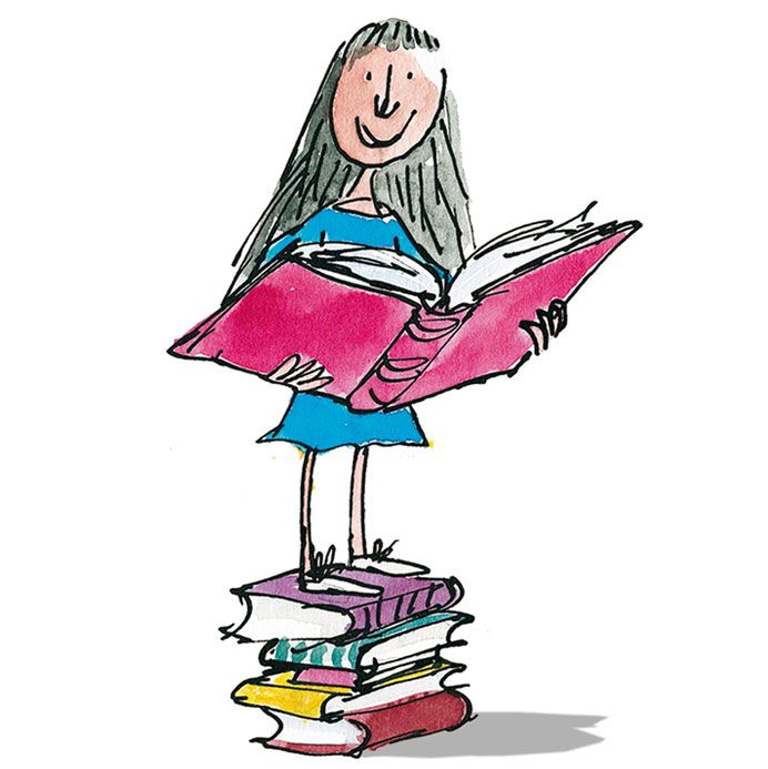
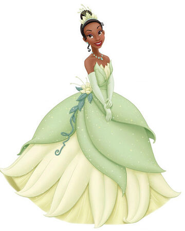
Many illustrators have their own unique style of working and drawing. For example, the work of Quentin Blake, Matt Groening, Dr Seuss and of course Disney, are all recognisable simply by their illustration styles.
Matilda by Quentin Blake
Princess Tiana by Disney
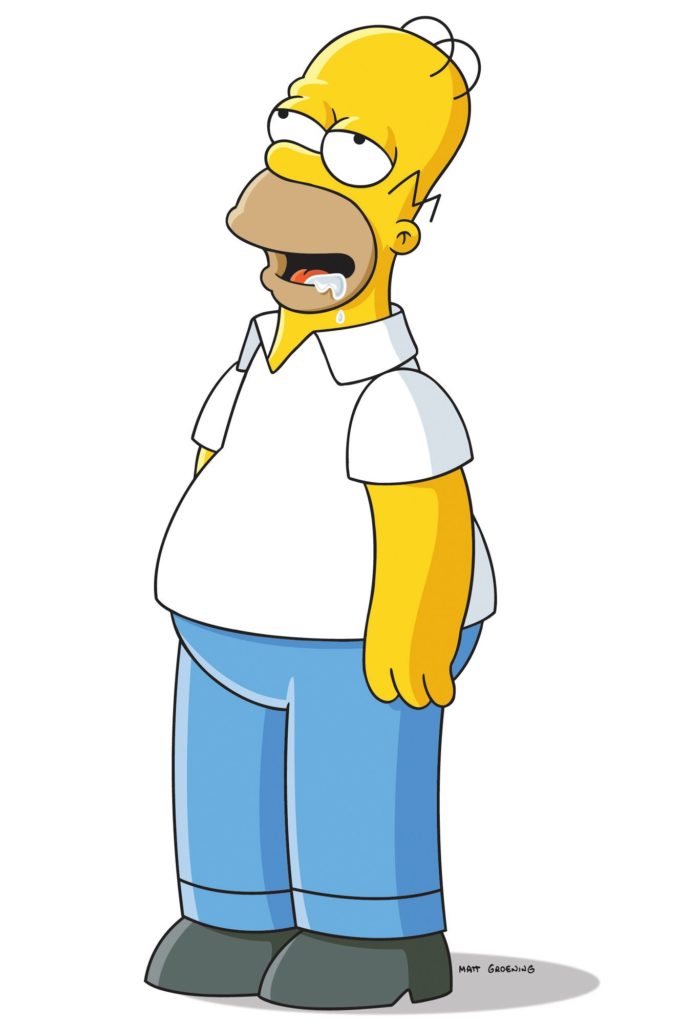
Homer Simpson by Matt Groening
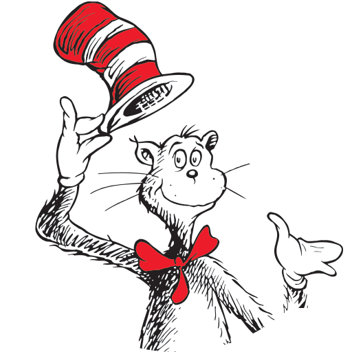
Cat in the Hat by Dr Seuss
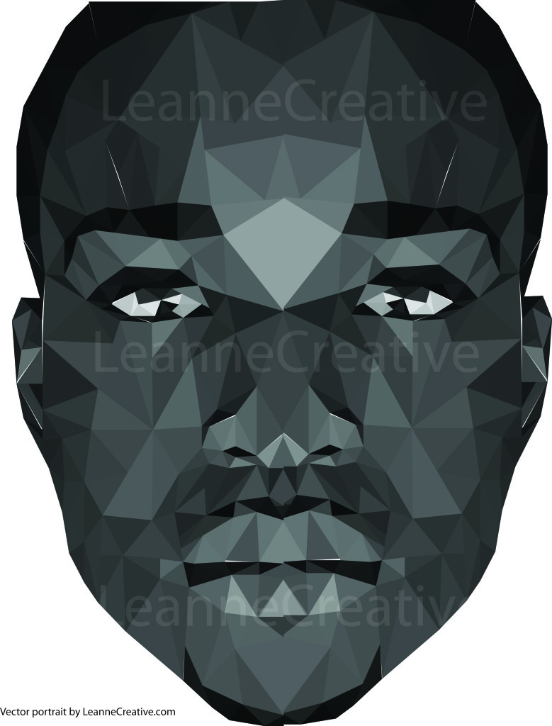
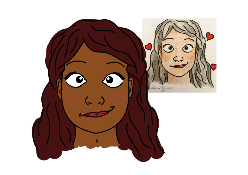
Over the years I have experimented with a few different techniques to create the portraits featured on my greeting cards and gifts. These include:
Polyvector triangles – A time consuming but extremely detailed, decorative and effective technique, great for close-up portraits.
Free-hand digital – Starting from a hand-drawn sketch using a digital pen. This gives the artwork a traditional feel but with a lot more creative flexibility.
Vector illustration– Block colours and shapes put together to create recognisable features with simple shadows and highlights.
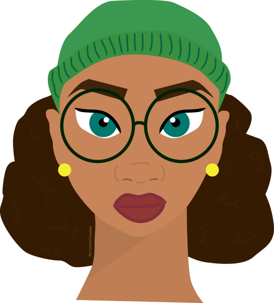
No matter the technique, my personal style uses bright block colours and I tend to embellishing the portraits with shapes and patterned backgrounds, which I believe has given my items their signature look and feel. I also like to use a range of different black and asian skin tones and hair styles to make my brand as representative as I can.
Children’s character design
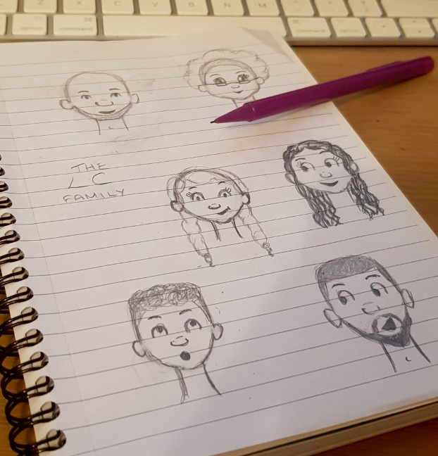
I really enjoy working on children’s books and creating dynamic and expressive characters, so recently, I decided to start developing a style of character that I hope will be recognisable as a ‘Leanne Creative character’ in the future…
Meet my LC family! They will be the basis of my children’s characters (unless the client requests otherwise, of course) going forward. I wanted to create a black family of different ages that can be adapted to the client’s needs but can still be recognised as my artwork.
Here’s the break down:
Crescent eyes – They are simple but effective in portraying different emotions. They also portray an openness and positive engagement, which many children respond well to.
Button nose – It was important to me to capture black features and the nose is one of the them. The rounded shape and shadow above, I believe captures this.
Low ears – This was a cute a playful feature I thought would relate the characters to each other.
I really look forward to developing them further and working on more books and characters.
If you are interested in working with me, feel free to drop me an email and we can start to bring your ideas to life!
Written by Leanne Armstrong
This website uses cookies to improve your online experience. Please let me know if you agree to these cookies. Cookie SettingsI accept
Cookies Policy
Privacy Overview
This website uses cookies to improve your experience while you navigate through the website. Out of these cookies, the cookies that are categorized as necessary are stored on your browser as they are essential for the working of basic functionalities of the website. We also use third-party cookies that help us analyze and understand how you use this website. These cookies will be stored in your browser only with your consent. You also have the option to opt-out of these cookies. But opting out of some of these cookies may have an effect on your browsing experience.
Necessary cookies are absolutely essential for the website to function properly. This category only includes cookies that ensures basic functionalities and security features of the website. These cookies do not store any personal information.
Any cookies that may not be particularly necessary for the website to function and is used specifically to collect user personal data via analytics, ads, other embedded contents are termed as non-necessary cookies. It is mandatory to procure user consent prior to running these cookies on your website.