Tag: illustration

Visiting the Motherland

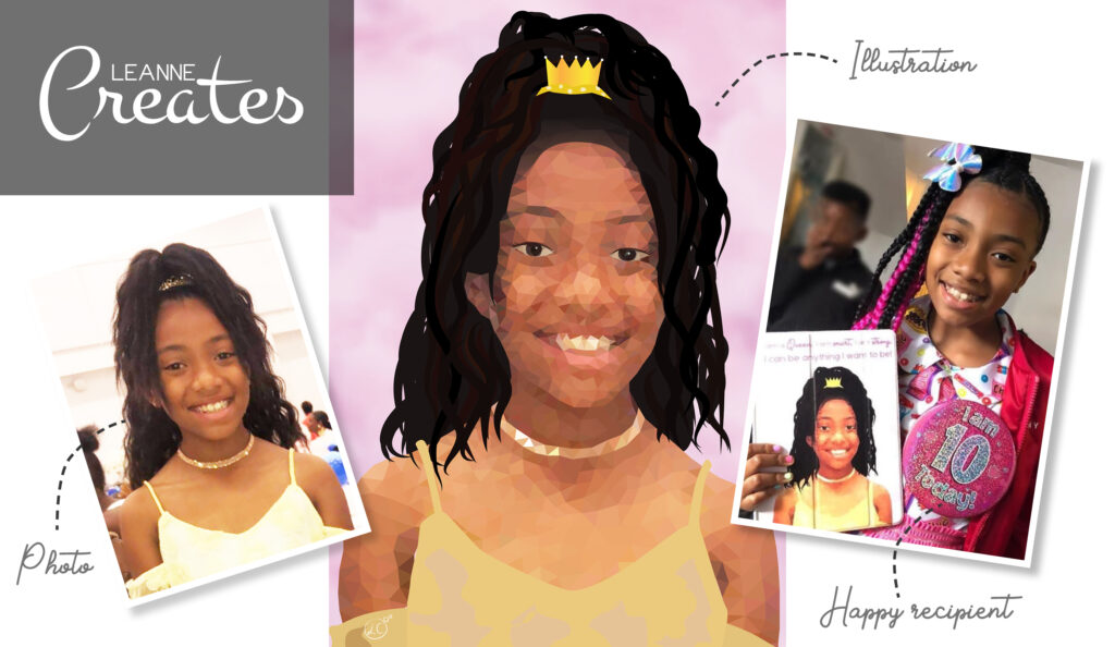
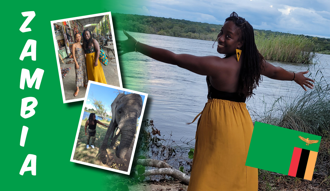
In April, I was fortunate enough to spend two weeks in the picturesque country of Zambia with my sister and cousins. The 18-hour journey to Southern Africa via Doha was definitely worth it, and I’ve returned feeling inspired, accomplished and humbled.

In this blog, I will be sharing some of my memories and experiences but, because we did so much, I have kept it extremely brief. Please do take note of some the inspirational and gorgeous locations I am going to mention and make it your mission to visit this stunning country for yourself…

And We’re Off!

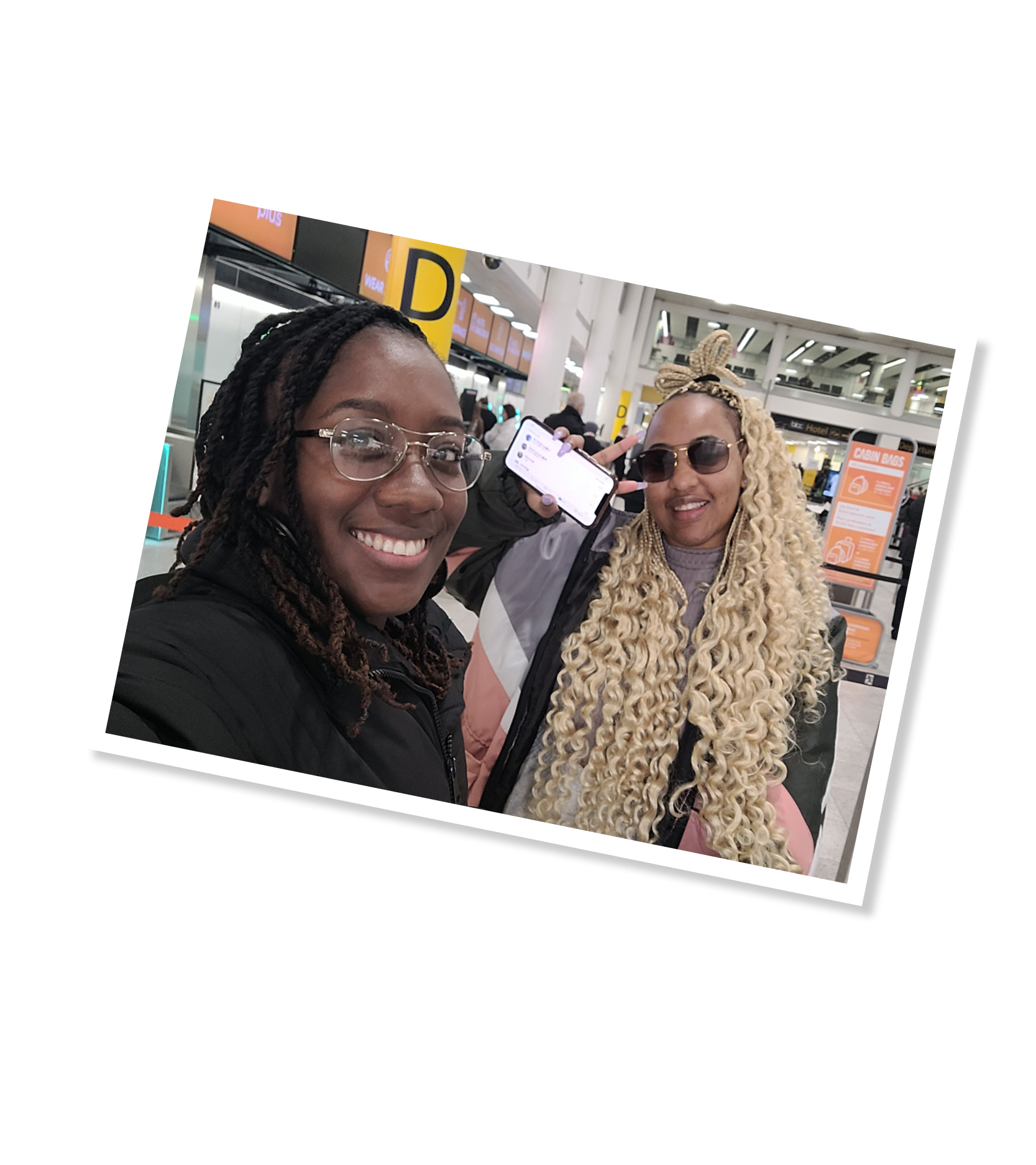
Fifteen hours on a plane (plus a three hour stop-over in Doha) was to be the longest I’ve ever spent travelling and, to be honest, I wasn’t looking forward to that part! Thoughts of how uncomfortable the seats or how tasteless the food would be on the plane fluttered through my mind, but when I arrived at Gatwick Airport and saw the girls, that anxiety quickly turned into excitement!

Touch Down

When we got off the plane at Lusaka Airport, we were greeted by a welcome slap of warm air and beaming sun – something I’d been craving for months! The sky was blue with barely any clouds and we made our way to Kuku’s house (Grandma and Grandpa) in Roma.

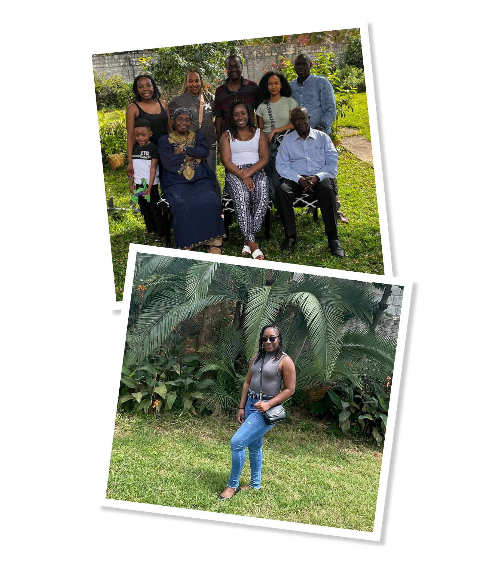
It had been such a long time since I’d seen them and it felt great to finally be able to visit them (and my uncles) at their home. I learnt of stories how my cousins and step-mum would play in the garden and pools and imagined how different life would have been there compared to the grey bustle of London.

Being surrounded by greenery and open space made such a difference to my mental health and I almost instantly felt myself relax and forget about the work waiting for me on my return. The only thing I missed about being in London was the absence of mosquitos (and any other creepy crawlies) but I guess they come with the territory and was a tiny price to pay for being in such a lovely place!

My Tribal Name

I’m very proud to say, that during my time with Grandma and Grandpa, they gave me my very own tribal name! Zambia has over 70 tribes including Lozi, Tonga, Nkoya and Subiya, with my grandparents being part of the Lozi tribe. Grandpa gave me the name Tabo (with a light ‘b’) which means ‘happiness’ because they were so happy to finally see me in Zambia. I felt so touched and honoured to receive this name and I will use it with pride from now on!
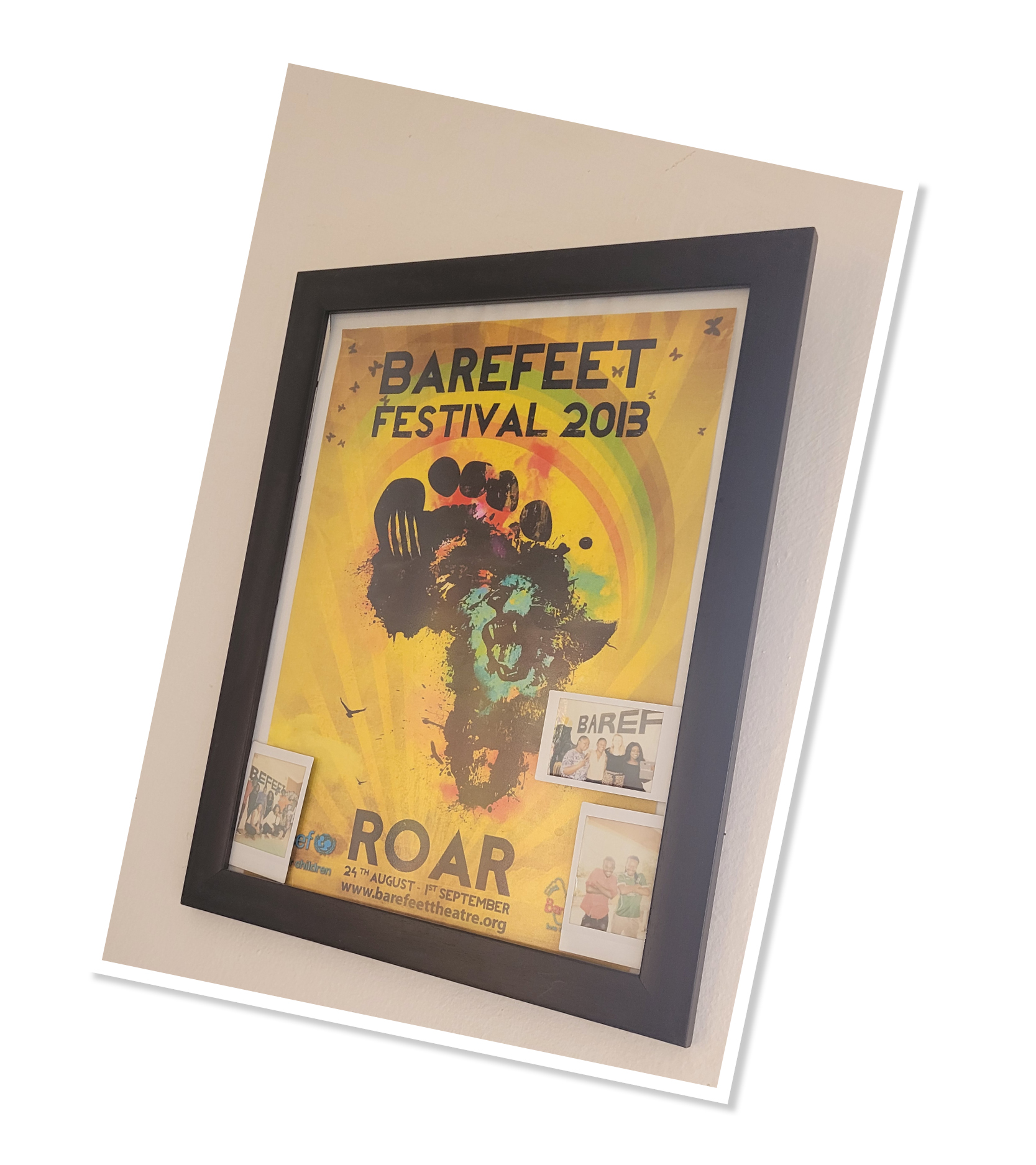
Barefeet Theatre

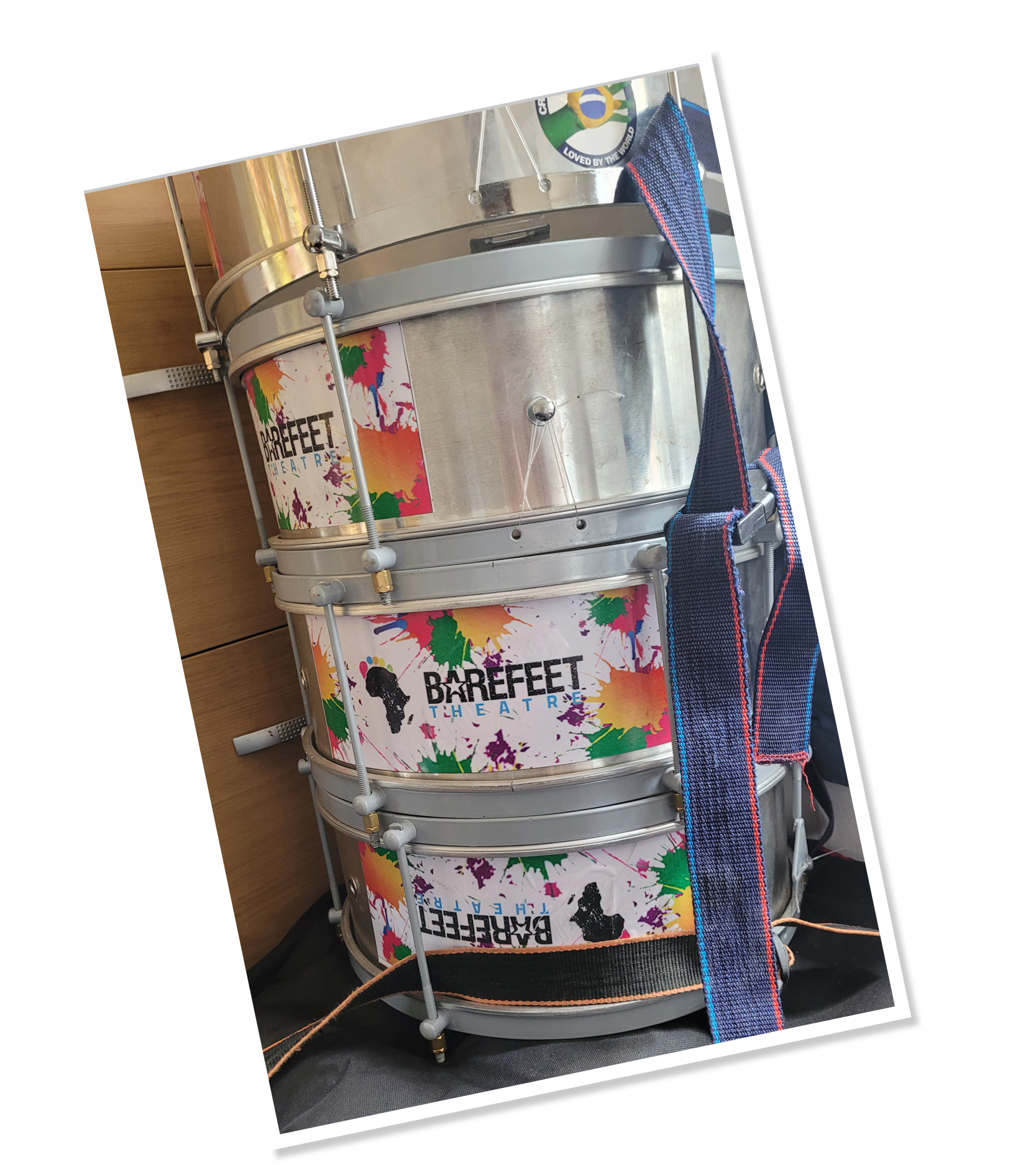
Barefeet Theatre is an organisation that was set up in 2006 by young Zambian artists, former street children and Irish artists to help empower and protect vulnerable children living in the streets of Lusaka. I had the pleasure of meeting Grace, who told me about their outreach work, workshops, showcases, interventions, festivals and more! They even have a children’s council which gives young activists a voice to articulate their ideas and pass on their knowledge.

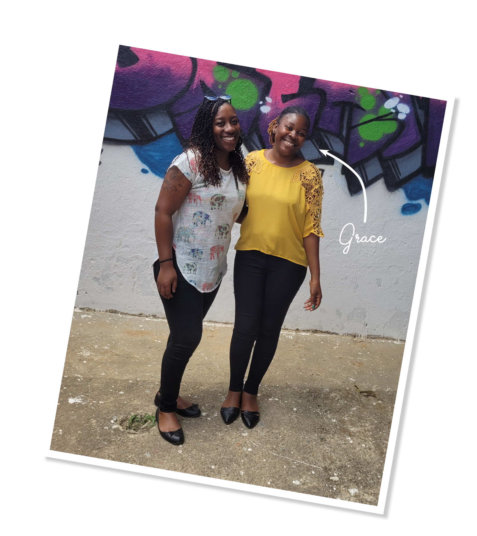
Because I have a background in dance and other performing arts, I was particularly drawn to their award-winning performance company, which is an ensemble of some of the most talented creatives in the country. I hope to one day visit again and share what I have learnt during my dance journey, whilst learning different styles and techniques from the children and teachers too.

Please donate to this fantastic cause or even volunteer your services and skills with them if you can.

Livingstone

After a few days in Lusaka, we took the eight hour coach journey to Livingstone – the tourism capital of Zambia. Arriving at the bus station, we were bombarded by people trying to help us with our bags or offering snacks, which was quite overwhelming but I’d been warned about this experience, so I stayed strong!

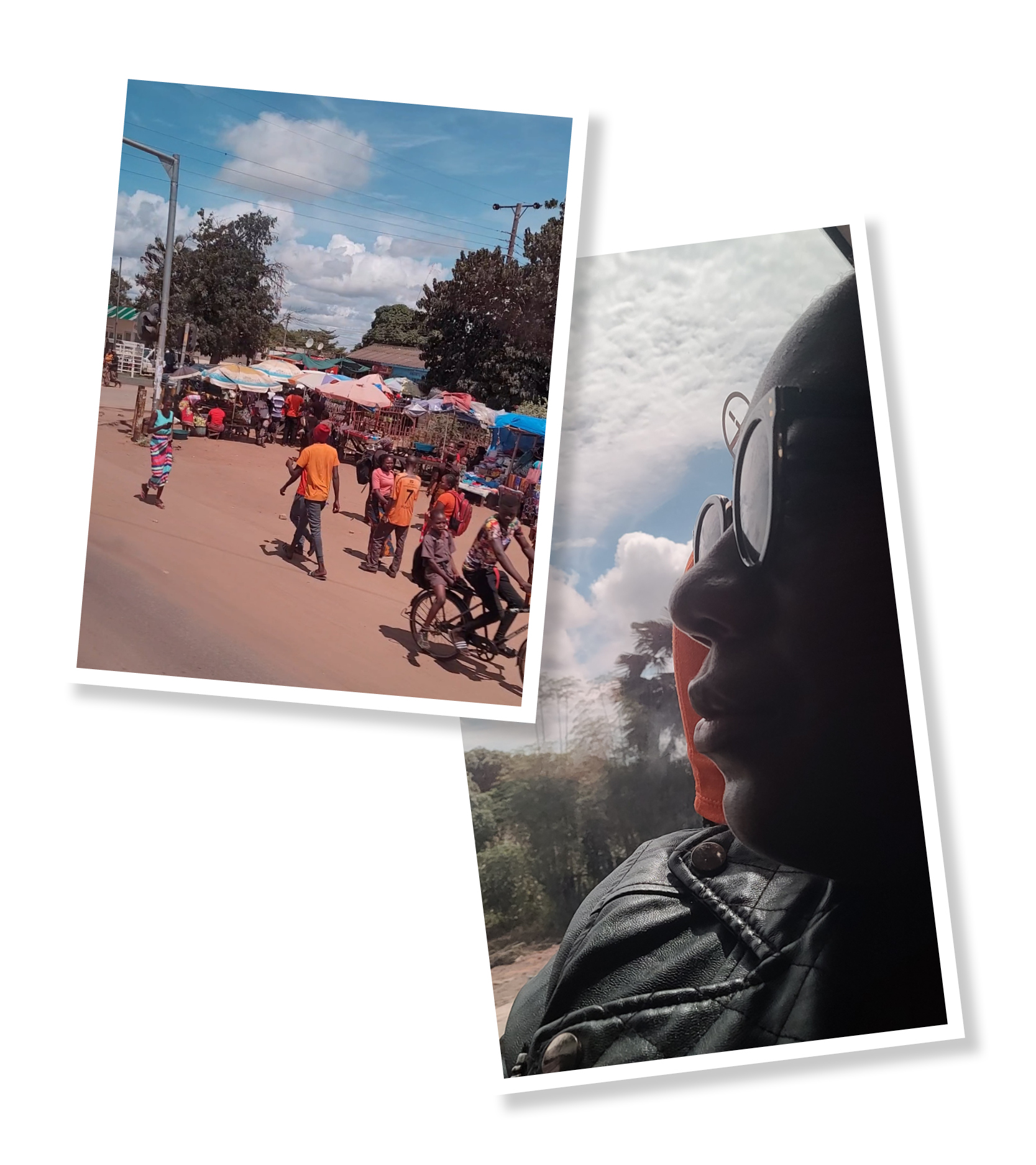
Along the way, we past fields and farms as well as people selling their crops and items on the roadside. I loved when we passed over train tracks which seemed to appear out of nowhere. Where do they go? I’d love to take a train journey when I go back as they make great inspiration for potential storylines and adventures!

Halfway through the journey, we stopped off at Monze Bus Station for much needed refreshments and another four hours later, we arrived in Livingstone.

We were greeted with a warm smile and hug from my Aunty and when we got to the house, we were even presented with a personalised ‘Welcome Home’ cake with our images on – so sweet (and it tasted great!). My Aunty and Uncle have such a beautiful home with guava, bananas, pomegranate and custard apples growing in the garden and stunning view of the town.

Learning About Zambia

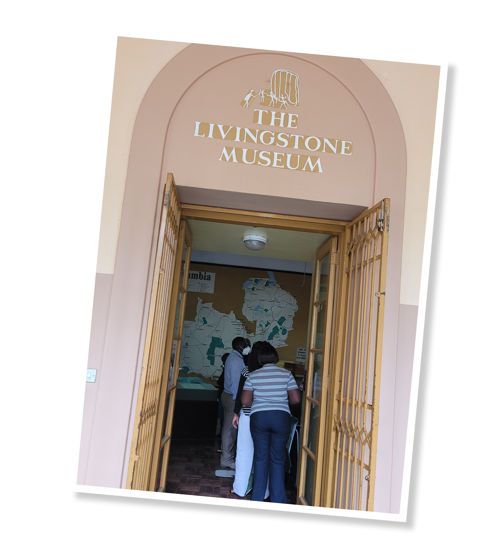
The Livingstone Museum was a great place to start with our day trips as it gave me huge insight into the country. I learnt about the plethora of tribes, Broken Hill Man of Kabwe (the first historically significant human remains found in Africa), the different rights of passage ceremonies and ethnic groups and even how to say “Thank you for visiting” in Tonga: Twalumba kutuswaya. As elephants are my favourite animal (which you will hear a lot about later in this blog), I also found it interesting to know that it was believed that they were composed of different meats (snake, lion, dog, owl etc) and therefore was not eaten by anyone. Although, these majestic animals still aren’t eaten by humans now, it’s an intriguing folktale!

Something special I was in the country in time for, but unfortunately didn’t get to visit or take part in, was The Kuomboka Festival which is a cultural event that draws tourists from all over the world. Kuomboka means ‘coming out of the water’ and takes place in the area of the Liuwa Plain after the rainy season. It’s a three-day celebration that marks the passage of the King of the Lozi people, from Barotse to Limulunga. It includes drumming, canoeing and processions in the King’s black and white barge, which is adorned with a huge elephant statue. I was only able to watch the proceedings on TV, but next time I hope to visit in person!

Wild at Heart

Of course, you can’t visit Africa without making a point of going to see the array of wildlife it has to offer, and we definitely did that!

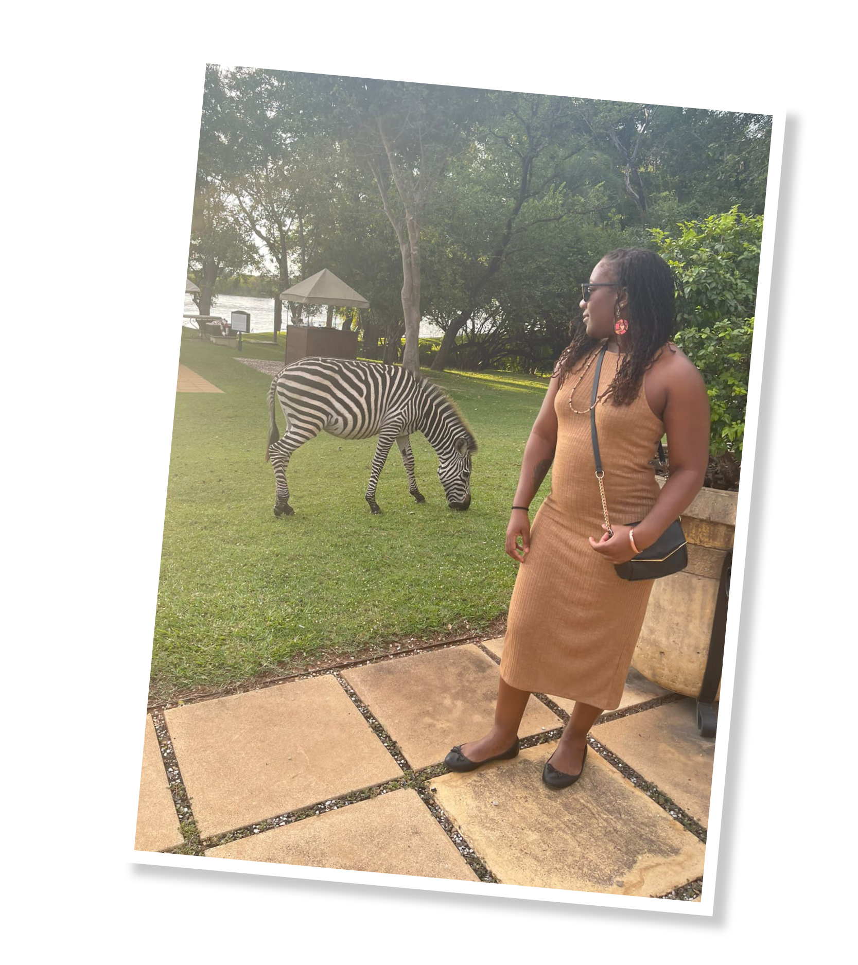
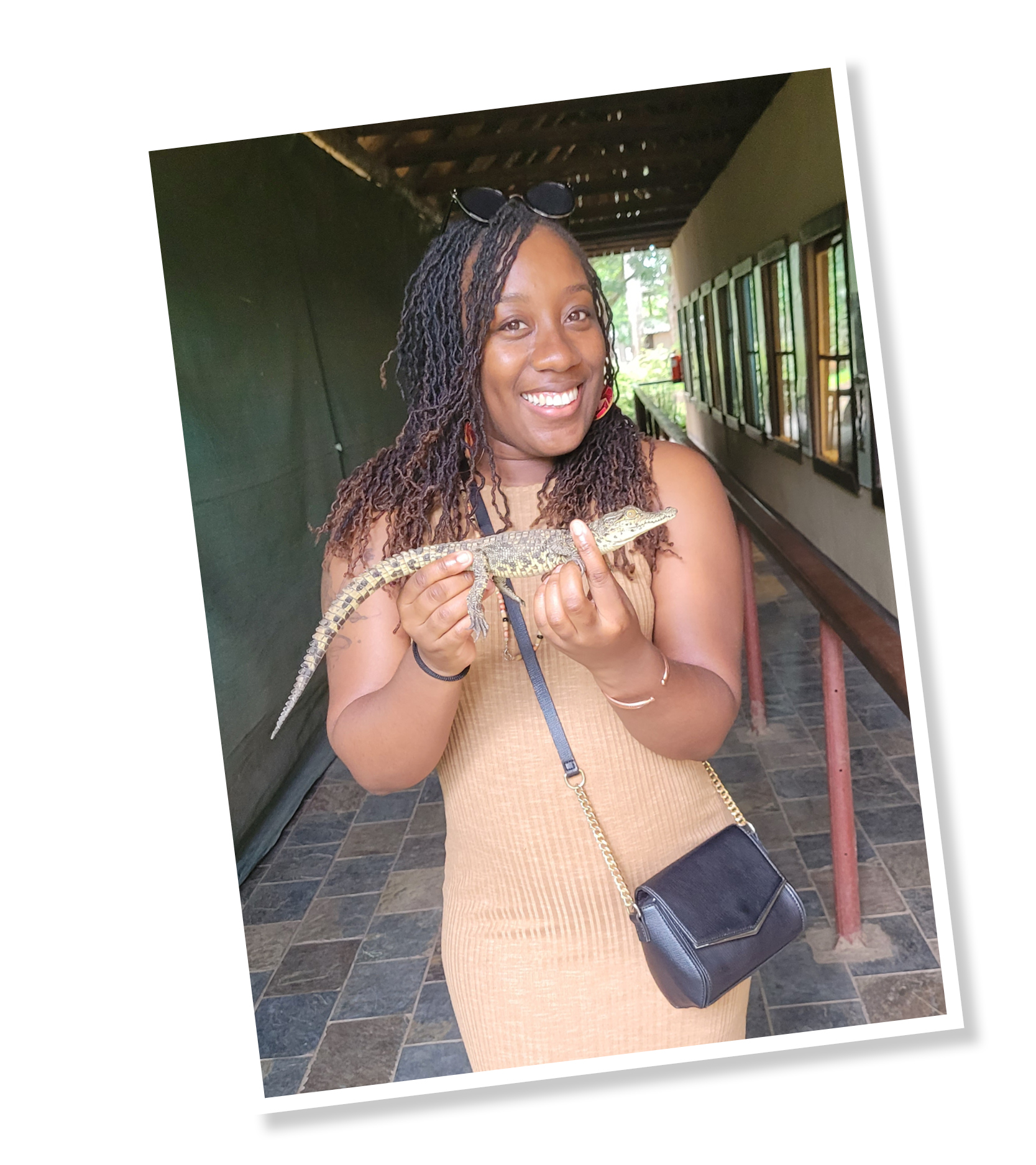
We visited the croc park, where I held a baby crocodile and was graced by the presence of ‘Man-Eater’ (you can guess why he got his name); the largest crocodile I’ve ever seen! We also went to the Royal Livingstone to watch the sun set over the Zambezi river and were approached by antelope, monkeys and zebras. This was so amazing in such a great location but the absolute highlight for me in terms of wildlife would be the elephants!

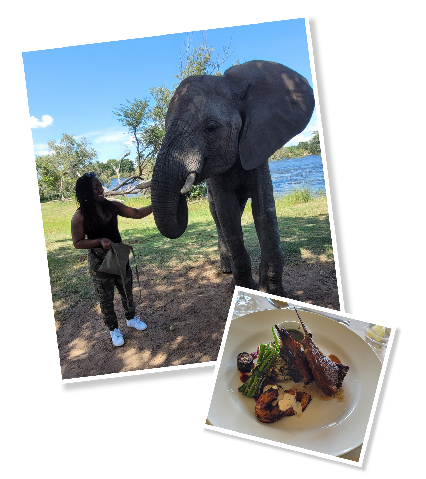
We visited The Elephant Cafe, which is a sanctuary and five-star luxury restaurant. Here I got to live out my dream of meeting, petting and feeding elephants, including an 8-year-old 30 tonne ‘baby’ and his humungous 70-year-old father! We learnt about the conservation and how they look after these graceful animals, then had a delicious three-course meal made from locally sourced ingredients with unlimited drinks.

The surroundings were perfect, the staff were knowledgeable and attentive and I couldn’t have asked for better company… I could have stayed there all day!

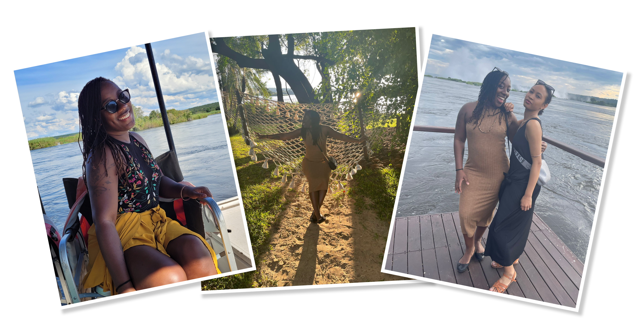
The Smoke That Thunders

Victoria Falls, also known as ‘mosi o tunya’ (‘the smoke that thunders’ in Lozi), was another great highlight from my trip. Despite getting completely soaked through, I loved every second of it. The power, the sounds and the view was intense and it just made me appreciate the beauty of nature even more. If you visit around this time of year, I recommend that you resign yourself to the fact that you will be drenched and just enjoy the experience – and bring a ziplock bag for your phones!

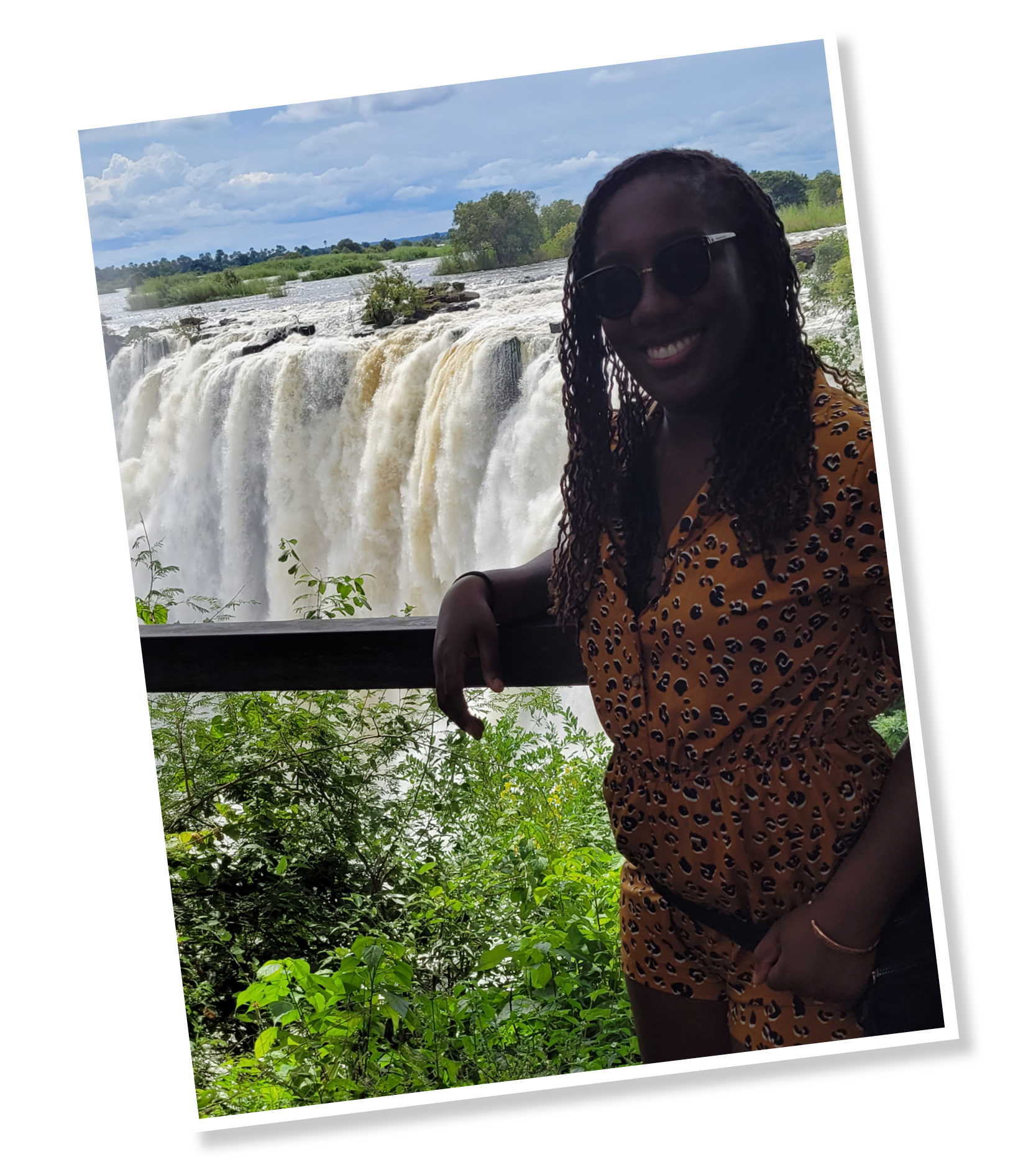
The ‘spray’ (more like deluge) was relentless but don’t let that put you off from going. The heat will quickly dry you off and you can always take a walk down to the Boiling Pot to pass the time.

The Boiling Pot looks exactly as it sounds; swirling and churning waters at the bottom of the falls. It’s a good 15 minute trek down to the bottom and, depending on how fit you are, a challenging 30 minute walk up! It’s not a walk for the faint hearted, especially in the heat, but if you are able to, definitely give it a go – the view at the bottom is just as stunning as at the top!
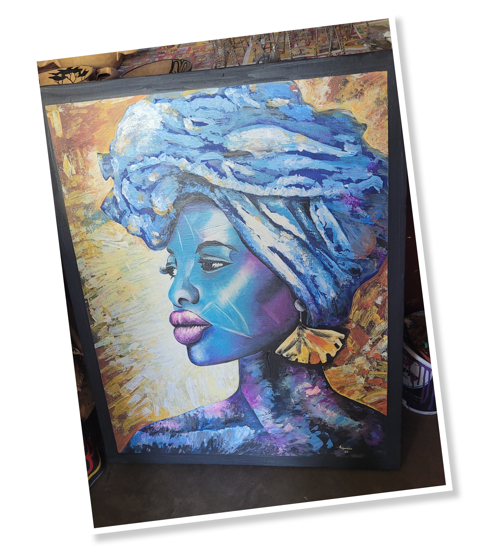
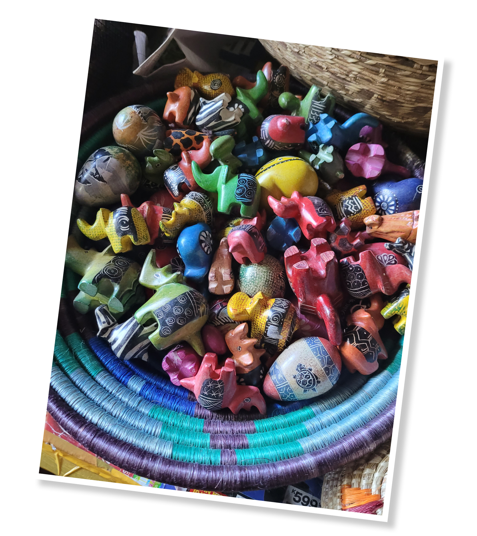
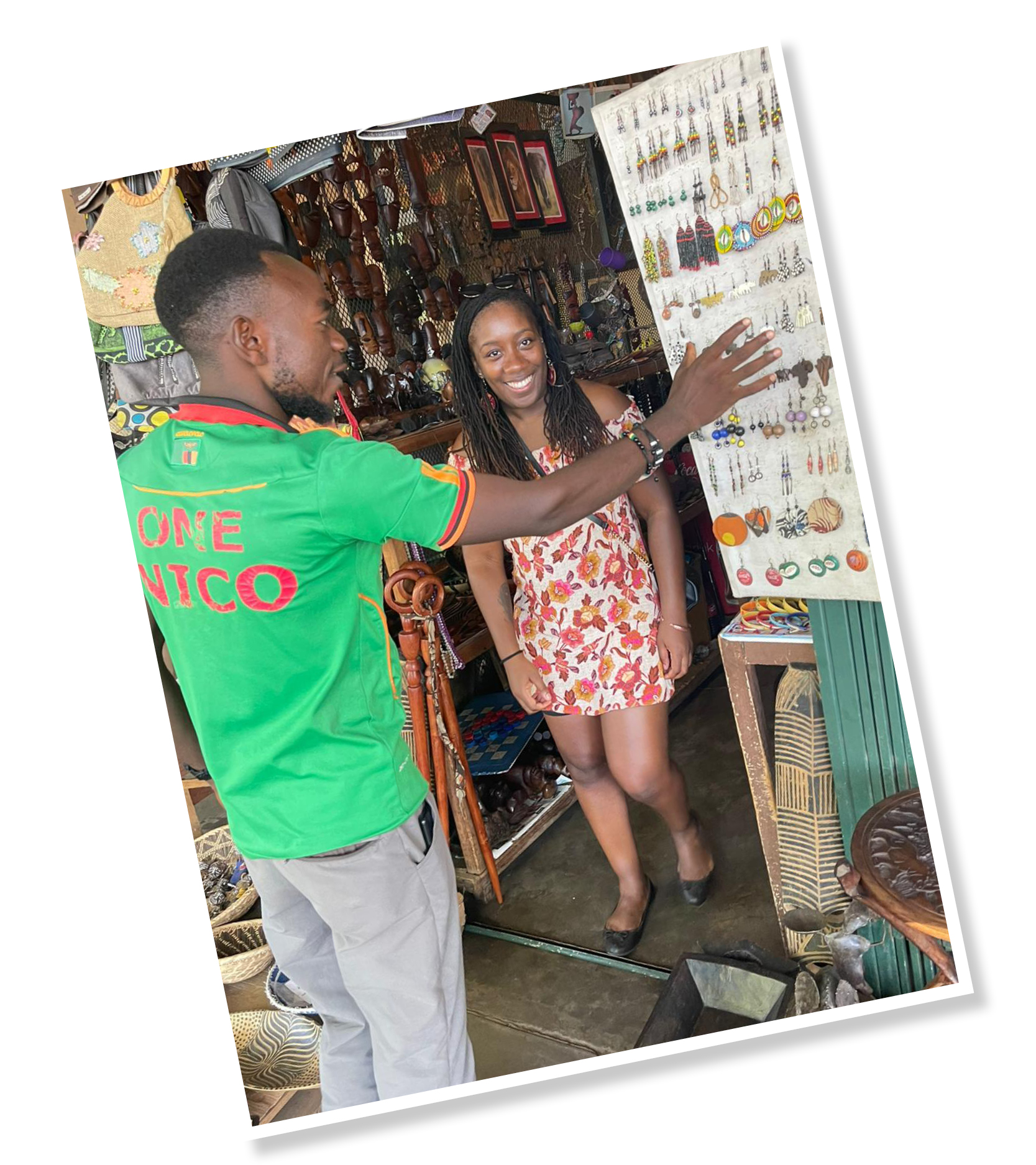
Arts and Crafts

As a small business owner myself, I couldn’t leave Zambia without supporting some of the local traders. We visited the Mukuni Park Curio Market, which is home to some of Zambia’s art and crafts. We saw so many unique pieces, so I bought some sculptures, utensils and jewellery.

Siankaba Islands

If you have access to a car, please try to visit the Islands of Siankaba. To avoid getting stuck in the sand (like we did), I suggest hiring a jeep or a high car because you will need to go off road to access the entrance!

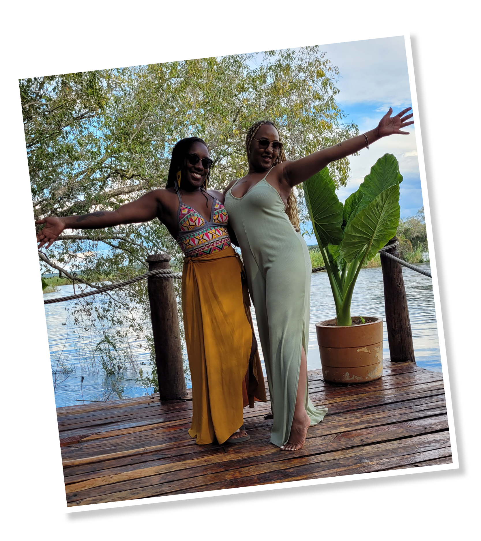
It then opens up to the peaceful part of the Zambezi river and you are taken to the islands via boat. It is so calm that you may be lucky enough to see some hippos or the rare African fish eagle which features on the Zambia flag – we were fortunate to see both!

With a pool, private lodges, and delicious food, it is somewhere I would definitely like to visit again and maybe stay over. There is something special about being secluded and surrounded by water.

See For Yourself

If I’m honest, this is blog hardly does the country of Zambia justice! There is so much to say, do and express but I don’t want you to still be reading for the next few weeks, so below is a quick list of some of the places I recommend visiting and some of the words and phrases I learnt whilst there. Please do visit this beautiful country for yourself and feel the warmth of the Motherland.

Where to go…

LUSAKA (CAPITAL CITY)

  • Chicago’s nightclub – If you’re looking for a place to enjoy music, well-priced cocktails and shisha.
  • Capones nightclub – It was busy but great music and it’s VVIP, so dress to impress!
  • Barefeet Theatre – Volunteer and support the children and young people of Lusaka.
  • Manda Hill shopping centre – For all of your essentials; currency exchange, supermarkets, restaurants etc.

LIVINGSTONE

  • Royal Livingstone Hotel – For luxury, great views of the Zambezi river and Victoria Falls, sunset and the chance to see zebras, antelope, monkeys and giraffes.
  • Livingstone Museum – Learn about Zambia and its rich history.
  • Croc Park – Be brave and hold baby crocodiles, tortoises and snakes as well as seeing the larger crocs being fed.
  • Fairmount Hotel club – For eclectic music and a friendly vibe.
  • Victoria Falls – A fantastic experience, especially during rainy season. Don’t forget protection for your phone and a spare set of clothes or raincoat! Descend to the Boiling Pot if you can.
  • Avani Hotel – A good place for a meal and some entertainment.
  • Jollyboys – A hostel with a small pool that is open for use. Nice chilled vibes with drinks and small meals available to order.
  • Mukuni Park Market – For art and crafts but local creatives.
  • The Elephant Cafe – Elephant interaction and luxury food and drink.
  • The Islands of Siankaba – Beautiful lodges and enjoy a sunset cruise on the Zambezi river.
  • Smoke House Restaurant – a lovey rooftop restaurant with live music and a BBQ.

Extras…

  • Nshima – pounded maze usually accompanied by stew or vegetables.
  • Amarula fruit – elephants love it and liquor can be made from it.
  • Kwacha/Ingwe – Zambia currency.
  • Chitenge – fabric similar to a sarong that’s worn around the waist or chest.
  • Kuku – grandma or grandpa (unisex)
  • Robots – also known as traffic lights!
  • Nyami Nyami – the protective Zambezi River God or Zambezi Snake Spirit of the Tonga people.

Happy World Book Day!

The 3rd of March is World Book Day and this year it’s celebrating its 25 year anniversary with the theme “You are a reader”. World Book Day is a day recognised in over 100 countries across the world and is a charity sponsored by National Book Tokens which aims to promote reading for pleasure, offering every child and young person the opportunity to have a book of their own.

In 2021, 54 thousand books were donated to children by publishers, to support World Book Day with their mission.

worldbookday.com

This year, I was honoured to have been invited to St Luke’s Church of England Primary School in West Norwood to read and discuss the themes of my debut children’s book, My World – Mackilli and Seeva’s Switcheroo! I had the pleasure of sharing my book with Years 2, 3 and 4 and loved the feedback and ideas I received from the children (or ‘learners’ as they are known in this school).

Morning assembly at St Luke’s

The day started with a fantastic assembly where I was introduced to the whole school. It was great to see such diverse faces in both the teaching staff and the pupils as my book touches on themes of differences and people being unique and special in their own way.

Entertainer, MC Grammar

MC Grammar kicked off the day with an energetic song about books and story-telling, followed by Nadia Shireen, who went on to read a short story from her book Welcome to Grimwood. It was encouraging to see these more established creatives present their work and really geared me up to hold my workshops later on.

Author & Illustrator, Nadia Shireen

The children’s (and teacher’s) costumes were fantastic! They were asked to dress up as characters from books they’ve read already or planned to read. I saw a few Rockets (from Look Up!), an Oompa Loompa (from Charlie and The Chocolate Factory) as well as children dressed up as Rosa Parks and Cruella Deville.

https://twitter.com/WorldBookDayUK/status/1499401977133948928

My World Workshops

After assembly, I made my way through through the school, starting with Year 2. I began by introducing myself as a children’s book illustrator and author and asked the children what they knew about these professions. I was very impressed by the answers and how enthusiastic they were about drawing, writing and creativity in general.

Before I started reading the book, I asked the learners what they thought the book was about. They observed the cover and the title and Year 3 in particular were very accurate in their response, stating that it could be a story about two aliens who switch places. This was very reassuring as the illustrator/writer!

During the reading, I asked them if they would prefer to live in the colourful and busy world of Stiplop (where Seeva lives) or the quiet and relaxing world of Mimpal (where Mackilli lives). The majority of the learners said they preferred the bright colours and activity of Stiplop but appreciated the need for some time out and peace and quiet in Mimpal.

A teachable moment

Part way through the story, I asked the class what they thought of these unique looking alien characters.

A few of the learners said that they didn’t like Seeva’s grey afro and that it looked weird. Here, we paused and reflected on how it might be hurtful to comment negatively about the way somebody looks.

We looked around the room and discussed how we all have different hair, skin, heights and personalities and that was OK and something to be celebrated!

By the end of the discussion, we were all in agreement that we should respect and appreciate people’s differences. It was lovely progress!

It was important for me to explain that differences are part of what makes them who they are and they should be proud of these things. We all look different and have different skills and abilities but we can still be friends and inspire each other, just like Mackilli and Seeva do in the story.

Thank you!

It was great to see how excited the children were about reading, the fantastic costumes and how much value imagination and creative expression has in their lives!

The fact that the school’s vision is that “every child is a unique gift from God” fits so well with the themes of individuality and loving ones differences found in my book, which made it even more of a rewarding experience for me.

The day was also filmed by World Book Day, which was quite nerve-wracking but I’m so glad I was able to be part of this day. Reading and writing has always been something that’s interested me and has lead me to writing blogs like this as well as poetry and children’s books, so I hope that my visit has inspired the children of St. Luke’s to have a go at writing their own stories in the future.

I’d like to thank Ms Francis (Deputy Headteacher) and Miss Madden (Early Years teacher) in particular, for having me and I look forward to seeing the children’s love for literacy grow!


Future workshops

My time at St Luke’s felt so rewarding and positive, that I would love to continue holding similar workshops in pop ups, schools and community groups.

If you would like me to host a session(s) at your establishment (or virtually), please do get in touch. The workshop (30 mins to 1 hour) would include the following, adjusted for the ages of the children:

  • Reading through parts of My World – Mackilli and Seeva’s Switcheroo!
  • Discussing themes of difference and acceptance
  • Understanding literacy techniques
  • Drawing aliens and giving them a personality (character development)
  • Writing a short poem about the alien the child draws
  • Q&A
  • Opportunity for parents and guardians to purchase a copy of My World and any accompanying merchandise
  • Free signed copy of My World for your organisation, if applicable.

If you’d like to know of any open events I hold in the future, please do sign up to my newsletter here.

Case Study: Activity book design – rant.academy

Original brief

Client: rant.academy (previously RANT Kids)
Project: 28-page activity book/workbook design and character illustration
Target audience: 8 – 17 year olds


The project

This client already had an existing brand under the ‘RANT umbrella’ – RANT Kids; a child-friendly empowerment brand that focussed mainly on producing stationary and merchandise. The rant.academy was due to be a new project under this umbrella, with more of an educational focus for young people.

The workbook was briefed in to be a written course that young entrepreneurs could work through. They (or their parents) would purchase the workbook and it would have activities inside that encouraged personal development and instilled business knowledge and tips.

The child characters already existed on previous merchandise for RANT Kids, but I was asked to rework them in my style of illustration. The original illustrations looked good and were well designed but in order to fit the new branding and style of illustrations due to go into the workbook, they needed to be updated.

Challenges and solutions

Challenge: The initial target audience age range was too wide. Having such a wide range meant that the content and the illustrations would struggle to appeal to either end of the spectrum.
Solution: Reduce the target audience age range to those most likely to have an entrepreneurial spirit, be able to fulfil the tasks/activities and appreciate the content. It is now aimed at 10-15 year olds who would benefit most.

Challenge: Too much content for 28 pages. As I was putting the creating the flat plan and laying out provided content, it was becoming increasingly clear that, in order for there to be enough space for the children to write in their answers, we needed more space.
Solution: Increase the page count to produce a much user-friendly design. This does increase print costs but it will make the workbook more appealing to the users. It is now 56 pages long.

Challenge: The client wanted to later incorporate more interactivity and have a website linked to the course. In order to keep young people engaged in a digital world, the client felt it was important to have an online element to the course. A great idea!
Solution: I recommended a web design agency (Guessdesignhouse.com) who were able to create a functional and well branded site with interactive elements, a shop (to purchase the workbook from) and more information on the brand in general. We then included bespoke QR Codes into the physical book design which took the children to the supporting website at the click of a button. Guess Design House then used my illustrations and icons to make the site visually coherent.

Design decisions

Module colours: I was provided with the 8 brand colours and decided to allocate a different colour for each module for quick visual recognition when flicking through the book.

Page placement: I highlighted to the client that having module cover pages will help the user easily recognise that they are entering a new chapter of the course. These covers are all on the right hand page so, again, it is easy to spot when flicking through.

Contents page: With the book now being over 50 pages and it being something the children will start, leave and come back to, I felt it very important to have page numbers and a contents page. Being user-friendly is very important.

QR Codes: I wanted the QR codes to integrate smoothly into the page designs so I created illustrations to sit around them and got the characters involved.

Icons: Another great way to make quick visual links is to create icons. I went for a hand-drawn feel to relate to the fact that children will refilling the book in by hand.

Video illustrations for animation: The client needed some illustrations to go into the promotional and instructional videos. These were created once the book was complete in a way that could be animated by the web team.


Conclusion

I and the client are extremely happy with the final product. It has had wonderful feedback from the children and young people who have taken part in the course so far and it is a visually striking and functional book. I love the link to the online elements and enjoyed the challenge of making a text heavy document look engaging and inviting.

What the client says:
“Huge shoutout to the insanely talented Leanne Creative for the amazing illustrations and layout of the workbook and bringing my vision to reality.”

Understanding your designer

As Chris Tucker said in Rush Hour… “Do you understand the words coming out of my mouth?” I hope so but as creatives with technical minds, designers are sometimes guilty of throwing in ‘jargon’ (or buzzwords) when we speak to our clients. We don’t mean it – honest – but these words help us gain clarity from a brief and will also help make sure the designs are fit for purpose.

In this blog, I will be breaking down some of the ‘buzzwords’ that often come up when I’m speaking to clients. It should help you understand us better and you can even impress us by throwing in a few words yourself! Feel free to bookmark this page and use it as a ‘glossary of terms’ to refer back to at a later date.

20 design & illustration buzzwords

Knowing these words will help you to communicate your design requirements accurately, resulting in a quicker turnaround and better fulfilled brief. They may also help you understand why we make certain design decisions… so really, it’s a win for both of us!

Animation
A moving drawing or computer generated image. Animation is a method in which figures are manipulated to appear as moving images. An animation if typically created by an animator.

Body copy
Copy‘ is another word for the text used in a document or book. ‘Body copy’ therefore refers to the main chunk of text in said document, so everything other than headings, titles or captions.
Your designer might say: “What font would you like your body copy to be in?

Brand Identity
The visible elements of a brand. This included the colour palette, fonts, shapes and logo design. Each element helps consumers identify your brand and distinguish from others. Have a look at the brand identities I have developed for clients here.

Carousel
In the context of social media, carousels are posts that have multiple images that viewers can swipe through. These are great for conveying multiple ideas or sharing large chunks of information without over-crowding a single image.

Case
Most people know about upper- and lowercases, but there is also sentence case and title case. Sentence case refers to lines of text starting with a capital letter (a grammatically correct sentence) and ending with a full-stop. Title case refers to a formal way of writing a title where each word starts with a capital letter (a part from joining words) for example, The Magical City of Mumbai.

Colour code
The ink or light colour combination required to produce a specific colour. In print, every colour is made up of a certain percentage of 4 primary ink colours known as CMYK: Cyan, Magenta, Yellow and Key (black). In web, every colour is made up of 3 light colours known as RGB: Red, Green and Blue (For web, the code may also be called Hex). Knowing the code of your desired colour will ensure consistency across your brand.
Your designer might ask: “What is the colour code for your brand’s dark blue?”

Contrast
How much colours look different from each other. High colour contrasts work best for legibility of text, for example, black text on a white background.
Your designer might say: “Those colours won’t work because there isn’t enough contrast”

Crop marks
Lines in the corners of your page to show the printer where to trim the paper. Also known as trim marks, they are usually required by commercial/professional printers and will not show on the final printed document.
Your designer might ask: “Does your printer require crop marks?”

EPS
A very high quality vector file. An EPS (Encapsulated PostScript) file is considered the best format for high resolution printing of illustrations or logos. It can be resized from a postage stamp size to a billboard size and would not lose quality!

Flat illustration
A minimalistic approach to illustration. “Flat” design focusses on simplicity and tends to feature plenty of open space, crisp edges and bright colours. See more examples of my flat illustrations here.

Flat plan
A diagram used to plan where the illustrations, images or text will go in a multi-page document like a magazine or book. It is useful when working out the page count and how your content will flow across the pages.

Illustration
A static drawing or computer generated image. A visual interpretation of a story, concept or process usually integrated into printed media such as flyers, magazines, books and teaching materials. An illustration is typically created by an illustrator like me!

Open/design files
Files that can be manipulated/edited using professional design programmes such as Adobe Illustrator or Photoshop. Having these precious files will allow you to take your designer’s creation and give it to someone else to change, essentially compromising their original work, so they will often come at an additional cost.
Your designer might ask: “Would you like to purchase the open files?”

Resolution
The quality of an image. Resolution is measured in either dpi (dots per inch – for print) or ppi (pixels per inch – for web design). The higher the resolution, the better the quality. Screens typically require a minimum of 72ppi, whereas print requires at least 300dpi, which is why it’s so important to tell your designer what the image or design is to be used for.

Reverse
A white or light coloured illustration or logo designed to be placed on black or dark backgrounds. It would usually be the same as the original, coloured version, but edited in a way that will stand out if having a dark background is unavoidable.
Your designer might ask: “Would you like your logo in reverse as well?”

Stock
Another name for paper. There are many types of paper and card to choose from, so it’s important to choose one fit for purpose. You need to consider its colour, thickness/weight (gsm), finish (silk, matte etc), lamination and more! Your designer and/or printer should be able to advise you on this for different purposes.

Typography
The study or production of different fonts. It can also refer to the manipulation of existing fonts or putting complimentary fonts together in a design.

Self-publishing
When an author writes, produces and sells their own book without the use of a publishing house. This route is typically good if you are a new author, want full control over its distribution and design and/or plan on producing small quantities initially (under 2000 copies).

Orphans
Leaving one word one its own on the last line of a paragraph in printed documents. As designers we try our best to avoid these as it’s seen as bad practice and doesn’t look great.
Your designer might say: “I’ve pushed that word down to the next line to avoid having any orphans.”

White space
Space around an image or group of text on a page (not necessarily white). This is needed to stop the page looking to busy and helps readers digest the information easily.
Your designer might say: “I’ve left some white space to avoid over-crowding”


Helpful?

I hope this glossary of terms helps you on your way to creating a killer brief, engaging in slick communication with you designer and impressing friends and family with your new lingo! Of course, if you have any questions or would like to work together on a self-published illustrated book with interesting typography and plenty of white space but no orphans… just get in touch!

Looks like you! Bespoke illustrations

If you’re familiar with the mission behind my greeting cards and gifts, you will know that positive and diverse representation is something I’m very passionate about. And what better way to represent and celebrate a friend or loved one, than a personalised illustration.

As well as my Royalty collection of items, I offer a bespoke service to those who want an extra special portrait illustration. I can create these illustrations using one of two different styles – a poly-vector technique or a flat vector technique.

How it works…

  • Send me the photo of the person you’d like illustrated as well as any wording you’d like featured and any colour preferences you have for the background.
  • Please send an image that is as high quality as possible.
  • I will then illustrate the image in your chosen style and send you the high-quality image for you to print on anything you’d like! (Or, I can send off to print for you at an extra cost).

Poly-vector technique

This style of illustration takes the longest to complete, so please allow up to 5 working days before you need it (longer if you require it to be sent to print).

This technique is best suited for completely front-facing or side-facing close up portraits.

It gives quite a realistic finished product and is my product’s signature style! Watch a video about this style here.

Send an image and get a quote

Flat vector technique

This style is the most versatile. I can work with most photographs and even change the colour of clothing.

It is a great way to revamp old photos or have portraits of multiple people in different poses.

I can produce either a more realistic style or a cartoon version, which is great for kids!

Send an image and get a quote

Although my cards and gifts feature a wide range of hairstyles, ages and skin tones, I will probably never build a collection that represents every single beautiful person in the African diaspora (but I’m trying!), so bespoke illustrations are a great option to get that illustration looking just like the recipient!

PLEASE NOTE: As every illustration is unique and won’t be used anywhere else, prices are more expensive than my existing collection of cards (from £35).

Written by Leanne Armstrong

Character design and illustration

Leanne Creates illustration blog header

I’ve been a professional graphic designer for just over seven years but always had a creative mind from a very young age. I grew up loving to dance, write short stories, paint pictures and sketch animals and fictional characters.

When I left college, I decided to enrol in a Graphic Design Foundation Diploma at the University of Arts. I then went on to do a degree in Dance and Media Cultural studies at Kingston University where I learnt more about the theories and strategies behind media production and marketing. This degree opened my eyes to different techniques for advertising, animation and brand development and I fell even more in love with graphic design during a design module.

Film Africa design by Leanne Creative

Fast forward to 2016 and I entered a design competition for Film Africa, where designers across the world were tasked to create artwork for the front cover of their programme. The above artwork was my submission and I was selected by industry professionals to be one of the top three designers! It then went to a public social media vote and I came second place.

Seeing as this was my first attempt at bespoke illustration, I was extremely proud of myself and my passion for illustration (portraits in particular) grew, leading me to start designing my own collection of greeting cards.

What is Illustration?

Illustration us a strand of design that can be broadly classified into two categories: traditional illustration and modern illustration. Traditional refers to hand-drawn using pencils, pens, paint and paper etc, whereas modern illustration, which I do, is created using software such as Adobe Photoshop and Illustrator on a computer – although my work often does start off with a pencil sketch.

The Magic Bubble Wand by Barbara Adu-Darko. Illustrated by Leanne Creative

Illustrations are pieces of imagery that accompany text to aid understanding or visualisation. They could also simply be purely decorative and used in anything from books to magazines, annual reports to posters, video games and films. Illustrations are an effective way to communicate with readers in a creative and visually descriptive way – as they say… an image can paint 1,000 words!

What’s my style?

Many illustrators have their own unique style of working and drawing. For example, the work of Quentin Blake, Matt Groening, Dr Seuss and of course Disney, are all recognisable simply by their illustration styles.

Matilda by Quentin Blake
Princess Tiana by Disney
Homer Simpson by Matt Groening
Cat in the Hat by Dr Seuss

Over the years I have experimented with a few different techniques to create the portraits featured on my greeting cards and gifts. These include:

Polyvector trianglesA time consuming but extremely detailed, decorative and effective technique, great for close-up portraits.

Free-hand digital Starting from a hand-drawn sketch using a digital pen. This gives the artwork a traditional feel but with a lot more creative flexibility.

Black girl modern hipster illustration by Leanne creative

Vector illustration – Block colours and shapes put together to create recognisable features with simple shadows and highlights.

No matter the technique, my personal style uses bright block colours and I tend to embellishing the portraits with shapes and patterned backgrounds, which I believe has given my items their signature look and feel. I also like to use a range of different black and asian skin tones and hair styles to make my brand as representative as I can.

Children’s character design

I really enjoy working on children’s books and creating dynamic and expressive characters, so recently, I decided to start developing a style of character that I hope will be recognisable as a ‘Leanne Creative character’ in the future…

Meet my LC family! They will be the basis of my children’s characters (unless the client requests otherwise, of course) going forward. I wanted to create a black family of different ages that can be adapted to the client’s needs but can still be recognised as my artwork.

Here’s the break down:

Crescent eyes – They are simple but effective in portraying different emotions. They also portray an openness and positive engagement, which many children respond well to.

Button nose – It was important to me to capture black features and the nose is one of the them. The rounded shape and shadow above, I believe captures this.

Low ears – This was a cute a playful feature I thought would relate the characters to each other.

I really look forward to developing them further and working on more books and characters.

If you are interested in working with me, feel free to drop me an email and we can start to bring your ideas to life!

Written by Leanne Armstrong

Embracing hair loss

Embracing hair loss blog header image

This is my first post and one that is very important to me…

After my mum was diagnosed with leukaemia and lost her hair to chemotherapy, it dawned on me that all of the women I’d illustrated on my greeting cards had long hair or large billowing afros. My cards are all about beauty, celebration, empowerment and representation, but I had left out a group of women who may not have this typical feminine standard of beautiful long locks… and this bothered me.

For 2020, in celebration of my mum’s recovery as well as the diversity of women’s hair, I’ve launched two new cards featuring women with short hair as part of my Crown & Story collection. As my mum had lost her hair due to leukaemia treatment, I’ve also decided to donate £1 from every sale of a card to the African Caribbean Leukaemia Trust (ACLT).

To purchase my greeting cards, please click here.

Below is an interview with my mum, Yvonne, on her journey of hair loss and I hope it inspires you to see beauty in her crown and story...


What was your relationship with your hair?

I had a positive relationship with my hair; I took pride in it. I’d had my locs for 25 years which began as a political stance because there is so much beauty and cultural politics tied up in hair, particularly for women. I had initially shaved off my curly perm in rebellion against the expectation that black women needed to chemicalise their hair in order for it to be beautiful and manageable. I wanted to prove that natural was beautiful and eventually decided to grow locs.

There is so much beauty and cultural politics tied up in hair, particularly for women.

At the time having locs wasn’t something many of my friends and family approved of, however, after seeing how well I looked after them, I would often receive compliments. Having locs for so long meant that they were a visible part of my identity, however, they did not define me and as time went by they became less about politics and more a style choice. I would style them, colour them and trim them, enjoying their increasing versatility as locs became more popular and more specialist salons sprang up. 

How did it feel when you lost your hair? 

I had reconciled myself to the inevitability of hair loss pretty much as soon as I was told that I would have to have aggressive chemotherapy treatment. On the day when the first clumps started to come away in my fingers and the reality began to kick in however, it was still a bit of a shock. On the day of cutting of my locs I was a bit tearful; firstly because it was symbolic of the gravity of my illness and secondly, much as I was ok with the prospect of not having any hair, the fact that I had no choice in the matter was difficult. After that initial sadness, I was fine.

On the day when the first clumps of hair started to come away in my fingers, the reality began to kick in.

How long did it take you to embrace the change?

 I had decided that I would shave my head at the first sign of it falling out as I didn’t want to have to deal with the strange ‘patchy’ look. Unfortunately, I was unable to do this as quickly as I would have liked as my platelets were low but once they were healthy enough my daughter cut off the locs and a few days later my brother shaved off what was left.  

I embraced the bald head immediately. It couldn’t have been a better time to have a bald head as a woman. Increasing numbers of black women were shaving their hair off out of choice, so other than the fact that my scalp was completely clean and shiny and my eyebrows were a bit thinned, there was nothing particularly remarkable about my look. For this reason, I chose not to cover my head and wore my bald head with a sense of pride – unless I needed to keep out the cold with a hat!

I chose not to cover my head and wore my bald head with a sense of pride

I suppose for those who were used to knowing me with a full head of locs, it took them some time to get used to my new look but most said that it actually suited me – apparently I have a good shaped head! The Film Black Panther that had not long been released was also instrumental in promoting female shaven heads and empowered many a black woman to adopt this look, so this helped a lot – WAKANDA FOREVER!

Are you now fully accepting of this change?

Yes,  and have actually chosen to keep it short for the time being. I’ve trimmed it several times since and am experimenting with different colours. I’m still receiving compliments about my hair so it’s all good and just the other day a work colleague told me that this is my best look.   

What advice would you give to women going through this journey?

Each woman’s experience is different and there is a lot of emotion connected with hair. My advice would be that although it is initially upsetting, the consoling fact is that it is only temporary – it will grow back. Your hair does not define you or your beauty.  You may look different but that is not necessarily a bad thing.  Embrace this time and use the opportunity to try different styles, head wraps, hats, bold make up etc. 

Your hair does not define you or your beauty.

Did it affect your self esteem?

Nope – in fact I felt/feel quite empowered. It is the visual of my story of overcoming adversity. A constant reminder of my blessings, that I am still here. 

Do you still think about your hair before?

Yes, at times I have to admit to finding myself looking admiringly at people with beautiful locs and reminiscing about the days of my own.   

Do you feel different now that you have short hair?

I feel liberated! Swimming in the sea on my Caribbean holiday was a whole new, joyous experience as I didn’t have to concern worry about my hair getting wet and ruining a style!

What you do you think of Leanne’s new cards?

I am so pleased that Leanne has included these images to her collection. It’s lovely to see black women with short hair represented and myself reflected – I don’t think I have come across this before. I love that her range depicts black women in their varied splendour, including different  skin tones and hair styles.  Well done and thank you Leanne, you are sending a powerful, positive message not only to black women but to wider society about black women’s diverse beauty. I look forward to seeing what comes next!

To purchase these greeting cards, please click here.