Tag: design

Art or Design – What’s the difference?

Growing up, I loved fine art (still life, acrylic painting and portraiture). I then fell in love with design after completing a Foundation Diploma in graphic design at the University of Arts, London. Some believe that the two disciplines are the same but there are actually distinct differences, which made my transition to design quite a learning curve!

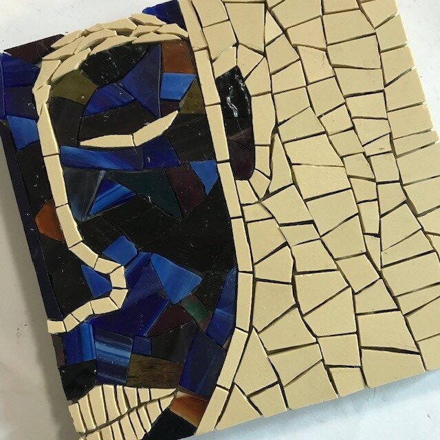
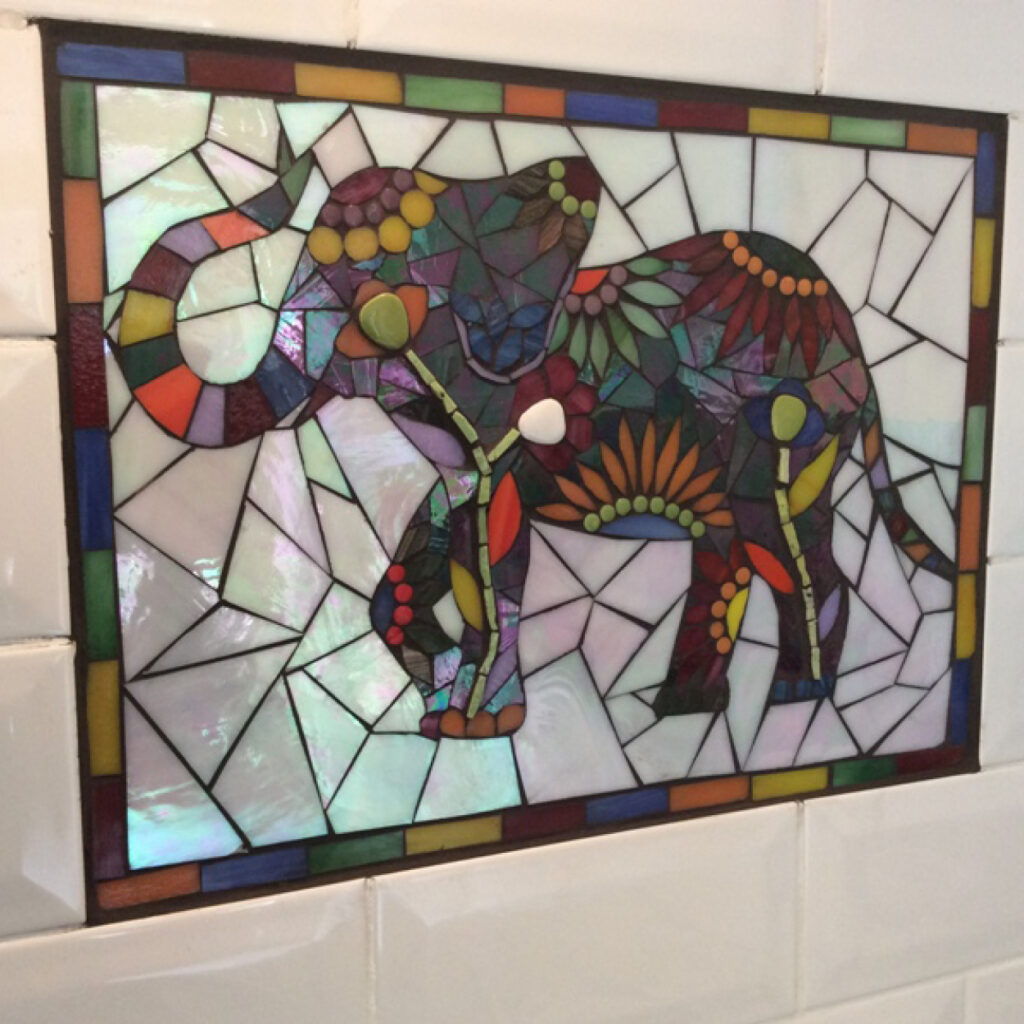
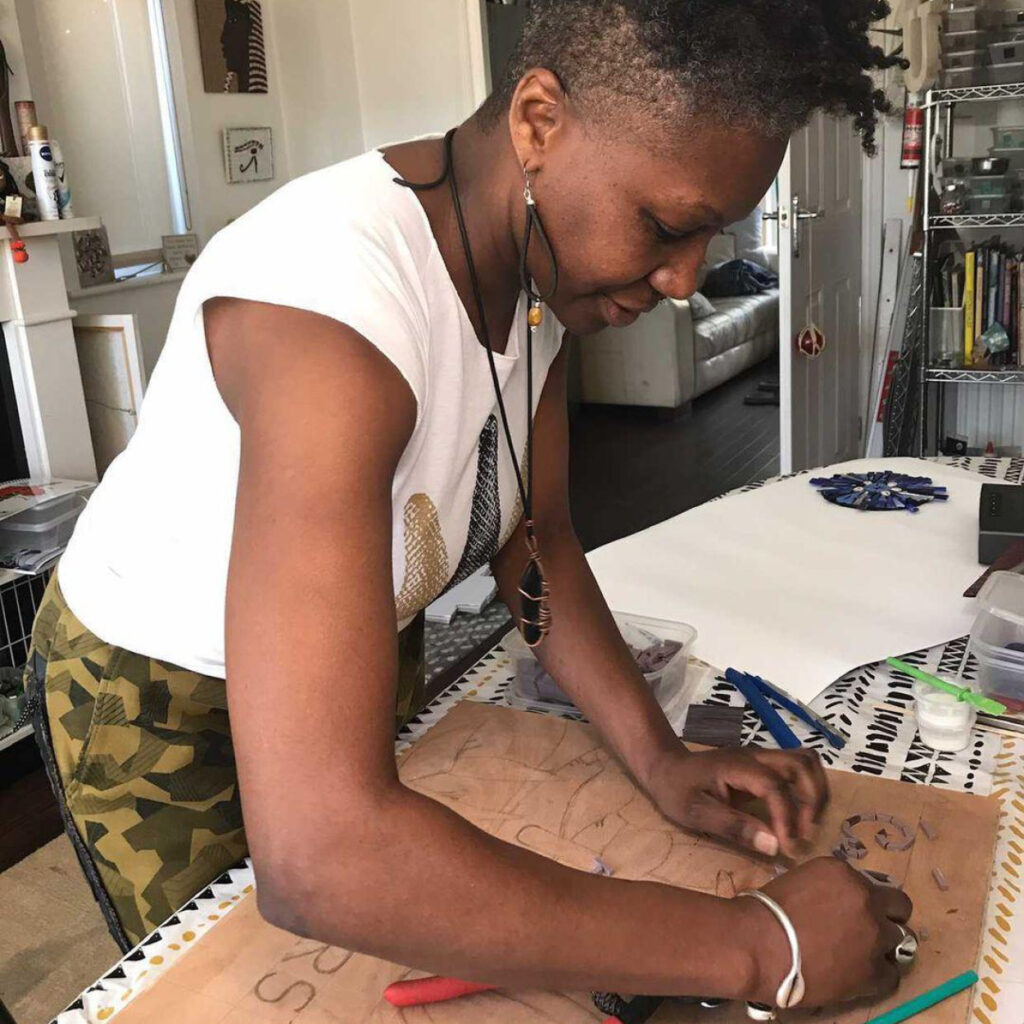
In this blog, I have teamed up with mosaic artist, Dionne – founder of Qemamu Mosaics, a company that produces beautiful mosaic art – to discuss the differences between art and design and our experiences surrounding the two.

“I am a mother of two teenagers, mosaic artist, voiceover artist, ex gymnast and ex athlete and lover of life! As well as immersing myself into my mosaic practice, I love to take walks in nature, listen to a wide variety of music, from Classical to Old Skool hip hop, Soca, Neo Soul and R&B. I enjoy yoga and self-motivation material and my friends would probably describe me as a sweet and gentle soul, who loves a laugh and can be a bit random and crazy on occasion!” Dionne

Art

My experience with art was very fulfilling and explorative; I loved getting my hands messy with paints, inks and printing materials. It was a very experimental and rewarding part of my life and as students we were encouraged to express ourselves subjectively. There was no ‘right’ or ‘wrong’ as long as we could explain our reasoning and concepts behind our work articulately.

Art is a thing of beauty and it can and should be interpreted differently by different people. We bring our own thoughts and experiences to art and the same piece can evoke different feelings for each viewer. For example, have you ever viewed a famous, award-winning piece of art, worth millions and not ‘understood’ it, whilst others were praising it greatly and were able to deduce hidden meanings behind it? Well, that’s a powerful piece of art – its beauty is truly in the eye of the beholder!

“Art to me means total freedom of expression. Art is not confined to one discipline and has the ability to touch people’s soul in ways only felt by the viewer.” Dionne

Art allows you to use your imagination and be as abstract as you like. It can be appreciated at face value for its beauty or analysed and critiqued but there are not rules to be adhered to so get stuck in and enjoy!

Design

Design, on the other hand, does have its rules and restrictions because, generally, design has a function or purpose. For example, posters need to tell the viewers when and where certain events are happening and logos need to communicate whether a brand’s target audience is young children or pensioners. This means it is very important to follow certain design concepts that are universally understood in order to put across the right message to the right people.

As designers, we study universal perceptions of colour, fonts, imagery, hierarchy, sizing and more. For example, it is generally agreed that the colour light blue is calming and gentle, so we could use this colour for a massage therapy flyer. If we used a bright, fiery red with text in capital letters, it would give off the wrong impression to the majority of people, so we need to take this into consideration when designing.

If we break any ‘rules’, we risk the intended message of the design being lost. Have you ever seen a flyer and had no idea what the event was about or struggled to find important information like dates and time? This is probably because of poor design choices and a lot to rule breaking!

Take a look at the designs below. They have the same information on them but the font choices, colours and positioning/size of text has been changed. One follows good design practices making it clear and visually coherent, whilst the other breaks many of the best practice rules and the information is lost or is very confusing for the viewer.

Poor design
Good design

Conclusion…

Both art and design have elements of creativity. Just because there are rules in design it doesn’t mean you can’t place things on a page creatively and use innovative ways to display information clearly – as they say… “Know the rules so you know how to break them properly!” I find design extremely rewarding; I love the challenge of taking information and presenting it in a way that is engaging, persuasive and visually attractive.
Need a designer?

Get in touch with me and I can help you create well-designed documents, flyers, posters, business cards, logos and more!

Need an artist?

If you are interested in buying Dionne’s beautiful work or would like to take part in her mosaic workshops, please visit her website.

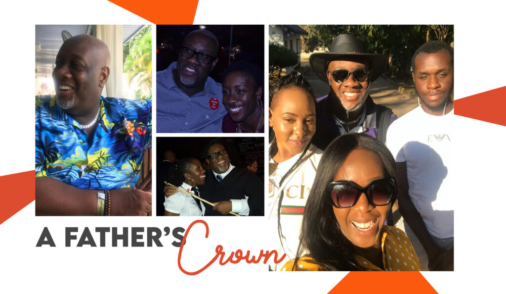
A father’s crown

Losing my dad at the beginning of 2021 was the hardest loss I’ve ever faced.

During a time of turmoil for the entire world, many people were losing loved ones to the pandemic and as much as I knew it was very serious, no one can prepare you for the day you lose someone… and I lost a parent. Although my dad passed from other complications, it was still a huge shock to us all but from that shock and grief I wanted to produce something special in his honour… so I did.

Crown & Story

If you’ve not read my previous blogs, I created the Crown & Story category to talk about black and brown people’s experiences and how I use them as inspiration for my designs. In this blog, I will be honouring my dad, what he means to me and the importance black dads or father-figures which lead to me designing a special greeting card.

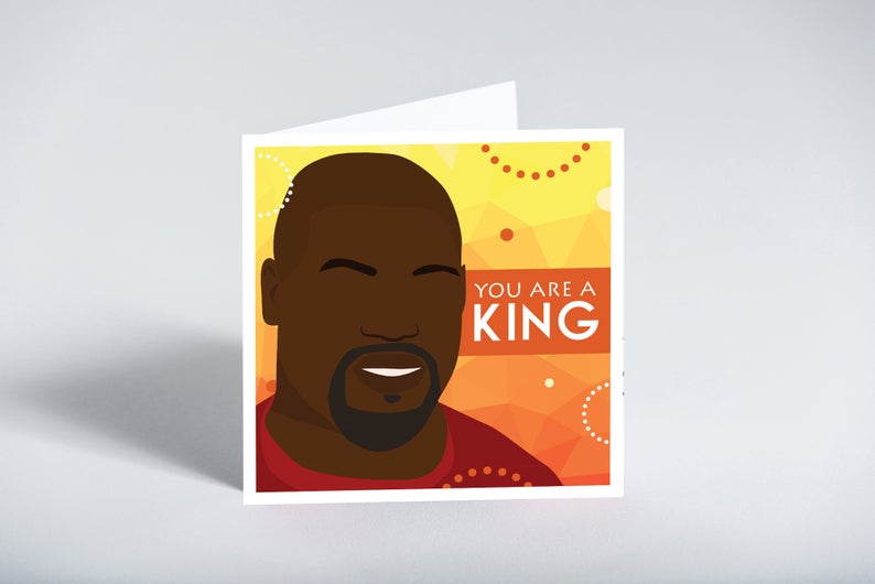
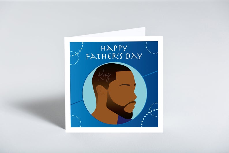
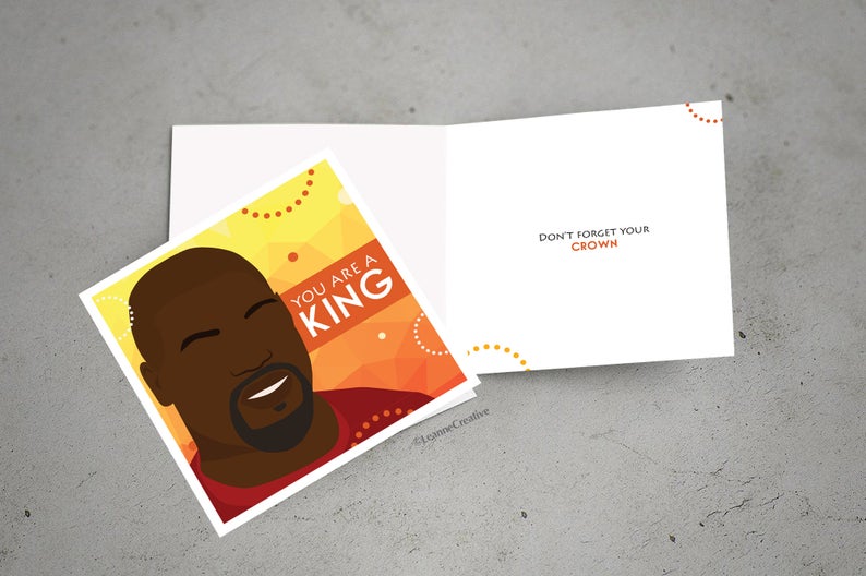
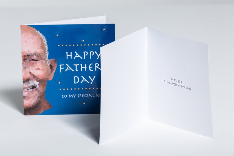
This is the card I designed to celebrate black kings, whether that be fathers, brothers, uncles or father-figures, past or present. I wanted to create a design that would help people let a king know that they are celebrated and valued on any occasion – birthdays, anniversaries and particularly, Father’s Day.

As a special link to my dad (other than creating an illustration that resembles him), I’ve decided to donate £1 from each sale of this card to Unique Football Academy because my dad was huge football enthusiast – Manchester United in particular. Unique Football Academy provides elite training at grassroots level for children and young people in London and beyond. The money raised will go towards supporting the academy and providing free training to those from underprivileged backgrounds.

My dad would take my brother to this academy and supported the work they do for young people.

Black Fathers

Although my parents aren’t together, my dad was present and very supportive of my goals; he would always say “You’re going to be a star!” and I know he was proud of me. I am very blessed to have had this relationship with my dad (and to gain a beautiful step-mum, brother and sister too), so I want to make sure that people who also have this positive relationship have something to show their love this Father’s Day (20th June 2021).

Etsy Bestseller
Raising money for grassroots football
For older fathers

The above cards are available to order from my shop now, so I hope you feel connected to one and can give one to a special person. Unfortunately, many of the fathers I have spoken to recently feel that Father’s Day isn’t celebrated enough and it’s sad to hear when great fathers feel this way. Society celebrates Mother’s Day far more, but I think dads should get just as much recognition for the love and support they also give their children. You don’t have to give a physical gift or card, but an acknowledgement of his presence will always go a long way because black fathers in particular, are unfortunately tarred with a stereotype of not being in their children’s lives but there are plenty of examples that show otherwise!

I love seeing organisations like Dope Black Dads and Stand Up Black Dads who are ‘inspiring, educating, healing and celebrating black fathers’ and aim to ‘educate, empower and transform the stereotypes of the black dads’ and will do my best to promote these positive narratives.

Thank you

I’d like to take this opportunity to thank everyone who reached out to me during this difficult time – I appreciate you all greatly! It’s definitely not the easiest to talk about (especially as someone with introverted tendencies), which is why I decided to write about it.

My way of dealing with grief tends to be keeping busy and expressing my emotions creatively, and I hope these outlets help people who may have also gone through a similar loss. Losing a parent is so hard, especially when it’s sudden and I’m by no means an expert on how to deal with loss but my humble advice would be to do what works best for you! Everyone deals with it differently and there is no right or wrong way, but try to do it in a healthy way.

Wishing all the fathers out there a Happy Father’s Day – we appreciate you. We celebrate you on the day and every day!

Understanding your designer

As Chris Tucker said in Rush Hour… “Do you understand the words coming out of my mouth?” I hope so but as creatives with technical minds, designers are sometimes guilty of throwing in ‘jargon’ (or buzzwords) when we speak to our clients. We don’t mean it – honest – but these words help us gain clarity from a brief and will also help make sure the designs are fit for purpose.

In this blog, I will be breaking down some of the ‘buzzwords’ that often come up when I’m speaking to clients. It should help you understand us better and you can even impress us by throwing in a few words yourself! Feel free to bookmark this page and use it as a ‘glossary of terms’ to refer back to at a later date.

20 design & illustration buzzwords

Knowing these words will help you to communicate your design requirements accurately, resulting in a quicker turnaround and better fulfilled brief. They may also help you understand why we make certain design decisions… so really, it’s a win for both of us!

Animation
A moving drawing or computer generated image. Animation is a method in which figures are manipulated to appear as moving images. An animation if typically created by an animator.

Body copy
Copy‘ is another word for the text used in a document or book. ‘Body copy’ therefore refers to the main chunk of text in said document, so everything other than headings, titles or captions.
Your designer might say: “What font would you like your body copy to be in?

Brand Identity
The visible elements of a brand. This included the colour palette, fonts, shapes and logo design. Each element helps consumers identify your brand and distinguish from others. Have a look at the brand identities I have developed for clients here.

Carousel
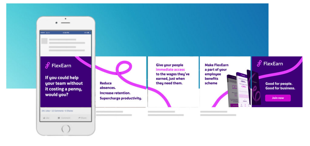
In the context of social media, carousels are posts that have multiple images that viewers can swipe through. These are great for conveying multiple ideas or sharing large chunks of information without over-crowding a single image.

Case
Most people know about upper- and lowercases, but there is also sentence case and title case. Sentence case refers to lines of text starting with a capital letter (a grammatically correct sentence) and ending with a full-stop. Title case refers to a formal way of writing a title where each word starts with a capital letter (a part from joining words) for example, The Magical City of Mumbai.

Colour code
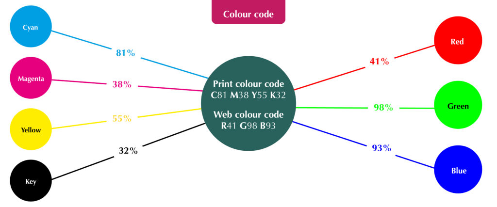
The ink or light colour combination required to produce a specific colour. In print, every colour is made up of a certain percentage of 4 primary ink colours known as CMYK: Cyan, Magenta, Yellow and Key (black). In web, every colour is made up of 3 light colours known as RGB: Red, Green and Blue (For web, the code may also be called Hex). Knowing the code of your desired colour will ensure consistency across your brand.
Your designer might ask: “What is the colour code for your brand’s dark blue?”

Contrast
How much colours look different from each other. High colour contrasts work best for legibility of text, for example, black text on a white background.
Your designer might say: “Those colours won’t work because there isn’t enough contrast”

Crop marks
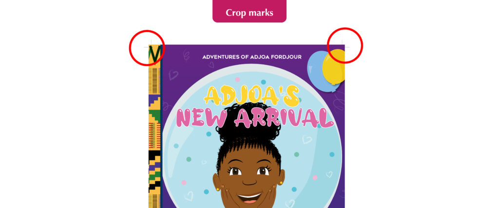
Lines in the corners of your page to show the printer where to trim the paper. Also known as trim marks, they are usually required by commercial/professional printers and will not show on the final printed document.
Your designer might ask: “Does your printer require crop marks?”

EPS
A very high quality vector file. An EPS (Encapsulated PostScript) file is considered the best format for high resolution printing of illustrations or logos. It can be resized from a postage stamp size to a billboard size and would not lose quality!

Flat illustration
A minimalistic approach to illustration. “Flat” design focusses on simplicity and tends to feature plenty of open space, crisp edges and bright colours. See more examples of my flat illustrations here.

Flat plan
A diagram used to plan where the illustrations, images or text will go in a multi-page document like a magazine or book. It is useful when working out the page count and how your content will flow across the pages.

Illustration
A static drawing or computer generated image. A visual interpretation of a story, concept or process usually integrated into printed media such as flyers, magazines, books and teaching materials. An illustration is typically created by an illustrator like me!

Open/design files
Files that can be manipulated/edited using professional design programmes such as Adobe Illustrator or Photoshop. Having these precious files will allow you to take your designer’s creation and give it to someone else to change, essentially compromising their original work, so they will often come at an additional cost.
Your designer might ask: “Would you like to purchase the open files?”

Resolution
The quality of an image. Resolution is measured in either dpi (dots per inch – for print) or ppi (pixels per inch – for web design). The higher the resolution, the better the quality. Screens typically require a minimum of 72ppi, whereas print requires at least 300dpi, which is why it’s so important to tell your designer what the image or design is to be used for.

Reverse
A white or light coloured illustration or logo designed to be placed on black or dark backgrounds. It would usually be the same as the original, coloured version, but edited in a way that will stand out if having a dark background is unavoidable.
Your designer might ask: “Would you like your logo in reverse as well?”

Stock
Another name for paper. There are many types of paper and card to choose from, so it’s important to choose one fit for purpose. You need to consider its colour, thickness/weight (gsm), finish (silk, matte etc), lamination and more! Your designer and/or printer should be able to advise you on this for different purposes.

Typography
The study or production of different fonts. It can also refer to the manipulation of existing fonts or putting complimentary fonts together in a design.

Self-publishing
When an author writes, produces and sells their own book without the use of a publishing house. This route is typically good if you are a new author, want full control over its distribution and design and/or plan on producing small quantities initially (under 2000 copies).

Orphans
Leaving one word one its own on the last line of a paragraph in printed documents. As designers we try our best to avoid these as it’s seen as bad practice and doesn’t look great.
Your designer might say: “I’ve pushed that word down to the next line to avoid having any orphans.”

White space
Space around an image or group of text on a page (not necessarily white). This is needed to stop the page looking to busy and helps readers digest the information easily.
Your designer might say: “I’ve left some white space to avoid over-crowding”


Helpful?

I hope this glossary of terms helps you on your way to creating a killer brief, engaging in slick communication with you designer and impressing friends and family with your new lingo! Of course, if you have any questions or would like to work together on a self-published illustrated book with interesting typography and plenty of white space but no orphans… just get in touch!