Original brief
Client: rant.academy (previously RANT Kids)
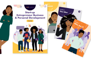
Project: 28-page activity book/workbook design and character illustration
Target audience: 8 – 17 year olds
The project
This client already had an existing brand under the ‘RANT umbrella’ – RANT Kids; a child-friendly empowerment brand that focussed mainly on producing stationary and merchandise. The rant.academy was due to be a new project under this umbrella, with more of an educational focus for young people.
The workbook was briefed in to be a written course that young entrepreneurs could work through. They (or their parents) would purchase the workbook and it would have activities inside that encouraged personal development and instilled business knowledge and tips.
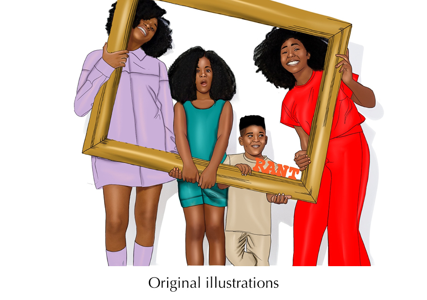
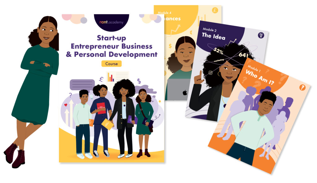
The child characters already existed on previous merchandise for RANT Kids, but I was asked to rework them in my style of illustration. The original illustrations looked good and were well designed but in order to fit the new branding and style of illustrations due to go into the workbook, they needed to be updated.
Challenges and solutions
Challenge: The initial target audience age range was too wide. Having such a wide range meant that the content and the illustrations would struggle to appeal to either end of the spectrum.
Solution: Reduce the target audience age range to those most likely to have an entrepreneurial spirit, be able to fulfil the tasks/activities and appreciate the content. It is now aimed at 10-15 year olds who would benefit most.
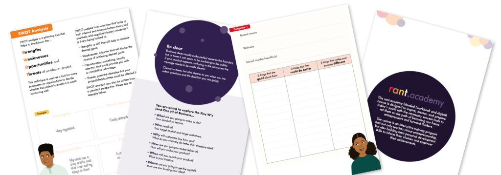
Challenge: Too much content for 28 pages. As I was putting the creating the flat plan and laying out provided content, it was becoming increasingly clear that, in order for there to be enough space for the children to write in their answers, we needed more space.
Solution: Increase the page count to produce a much user-friendly design. This does increase print costs but it will make the workbook more appealing to the users. It is now 56 pages long.
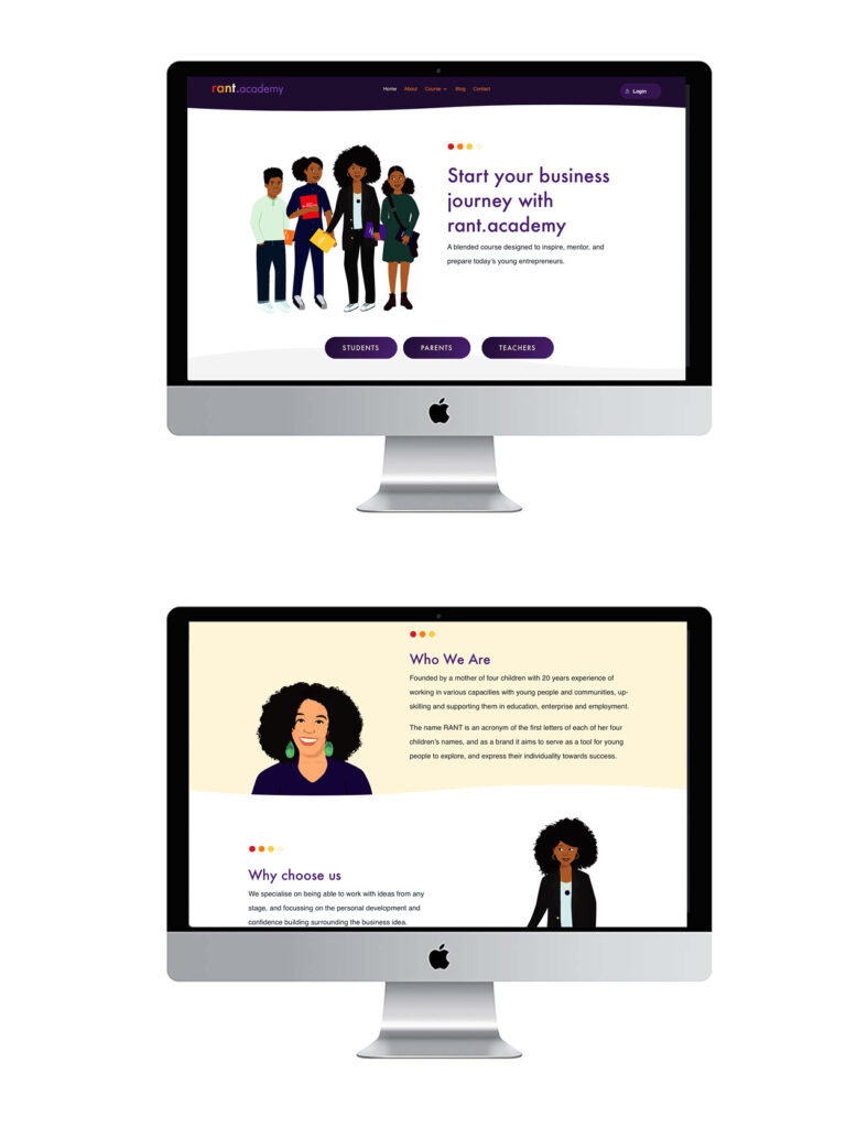
Challenge: The client wanted to later incorporate more interactivity and have a website linked to the course. In order to keep young people engaged in a digital world, the client felt it was important to have an online element to the course. A great idea!
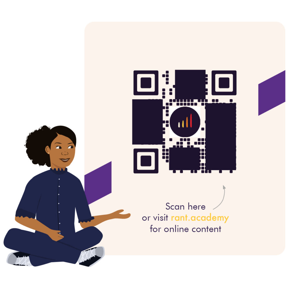
Solution: I recommended a web design agency (Guessdesignhouse.com) who were able to create a functional and well branded site with interactive elements, a shop (to purchase the workbook from) and more information on the brand in general. We then included bespoke QR Codes into the physical book design which took the children to the supporting website at the click of a button. Guess Design House then used my illustrations and icons to make the site visually coherent.
Design decisions
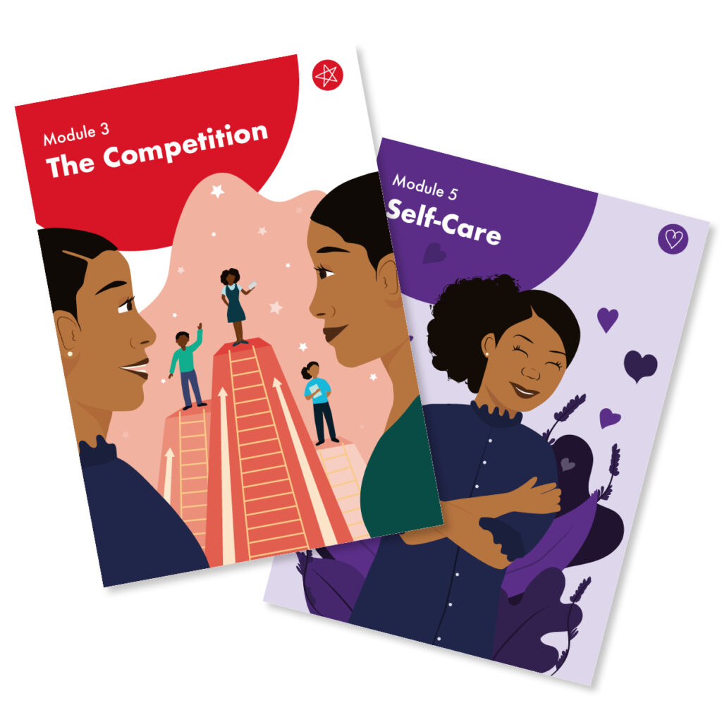
Module colours: I was provided with the 8 brand colours and decided to allocate a different colour for each module for quick visual recognition when flicking through the book.
Page placement: I highlighted to the client that having module cover pages will help the user easily recognise that they are entering a new chapter of the course. These covers are all on the right hand page so, again, it is easy to spot when flicking through.
Contents page: With the book now being over 50 pages and it being something the children will start, leave and come back to, I felt it very important to have page numbers and a contents page. Being user-friendly is very important.
QR Codes: I wanted the QR codes to integrate smoothly into the page designs so I created illustrations to sit around them and got the characters involved.
Icons: Another great way to make quick visual links is to create icons. I went for a hand-drawn feel to relate to the fact that children will refilling the book in by hand.
Video illustrations for animation: The client needed some illustrations to go into the promotional and instructional videos. These were created once the book was complete in a way that could be animated by the web team.
Conclusion
I and the client are extremely happy with the final product. It has had wonderful feedback from the children and young people who have taken part in the course so far and it is a visually striking and functional book. I love the link to the online elements and enjoyed the challenge of making a text heavy document look engaging and inviting.
What the client says:
“Huge shoutout to the insanely talented Leanne Creative for the amazing illustrations and layout of the workbook and bringing my vision to reality.”
